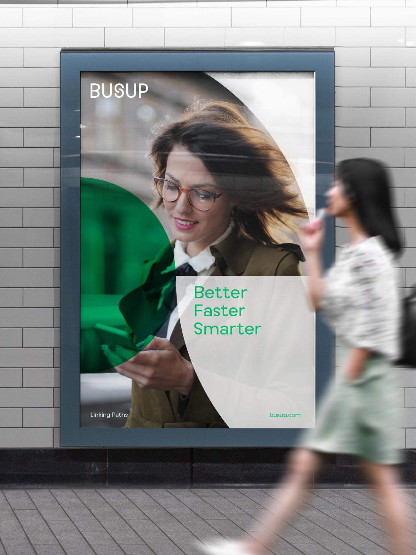
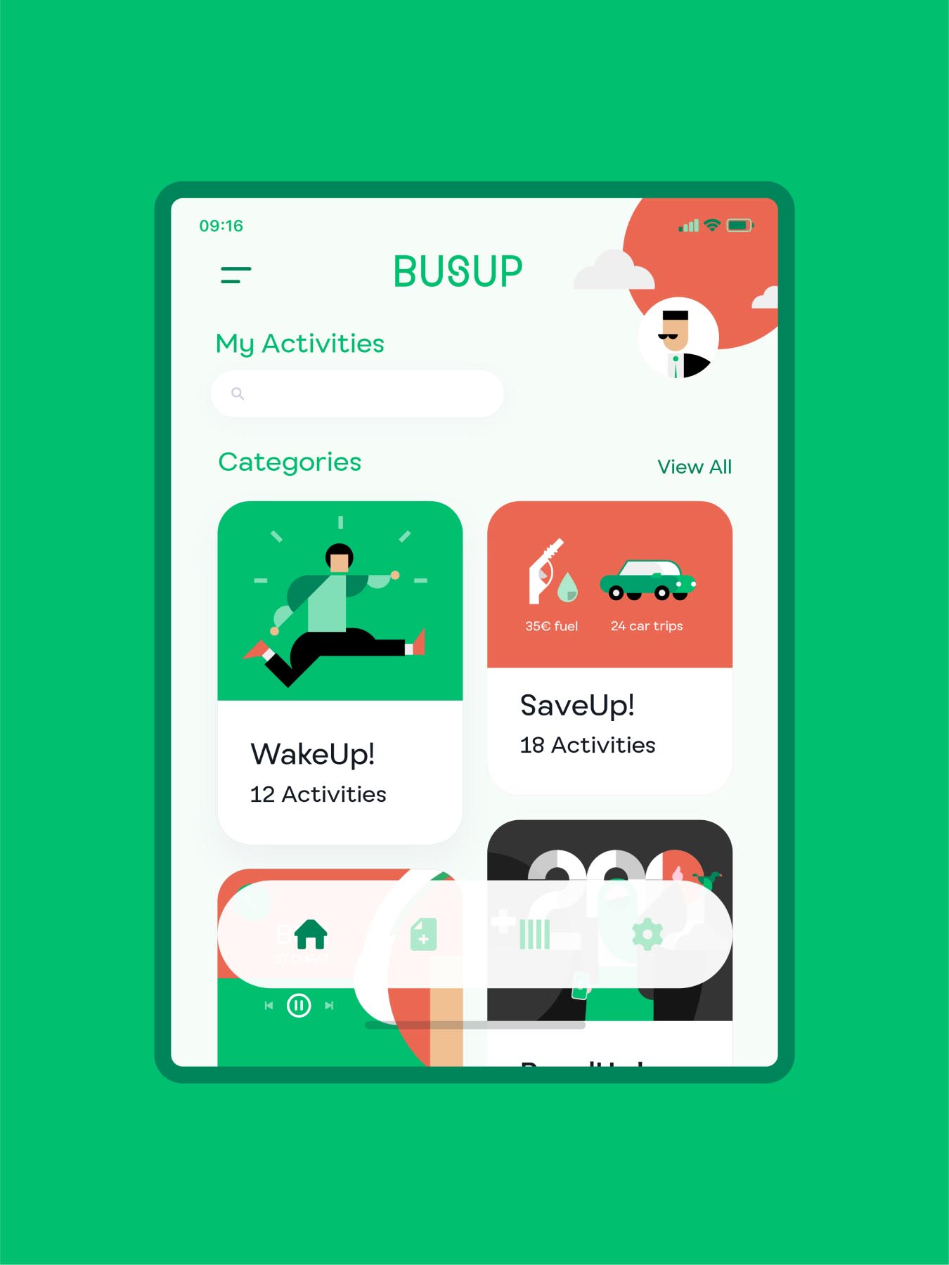
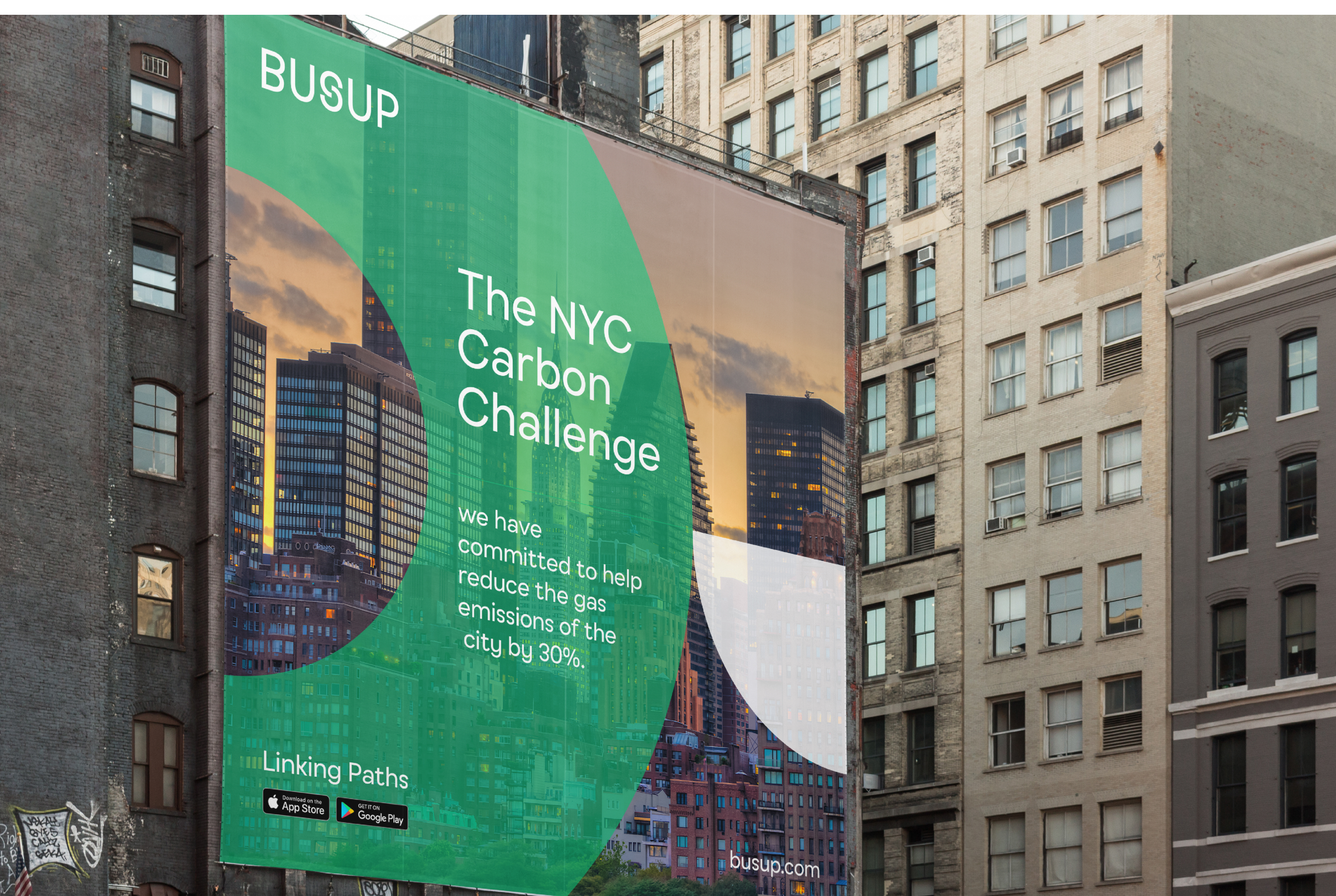
Moreover, in a highly competitive market, it was crucial to explain the key capabilities that the company had acquired since its foundation: data integration and the use of algorithms to optimize routes according to demand, thereby offering greater efficiency to customers and users. All of this came with added complexities: an international expansion into markets with different economic realities that demanded flexibility from the brand and a vision for the future oriented towards first and last mile solutions that required lateral thinking in terms of fully intermodal mobility.
Next stop: smart mobility in B2B
-
Services
- Sales Pitch
- Brand Positioning
- Visual Identity Design
- Sound & Motion Design
- Naming & Verbal Identity
- Brand Purpose & Beliefs
- Communication
- Brand Ecosystem
-
Industry
- Travel, Transportation and Mobility
-
Client
BusUp
Busup was born to bring shared mobility and needed to update its value proposition in order to compete in corporate mobility to workplaces. We intervened in multiple areas to achieve consistency and differentiation.
Challenge
Pivoting from local B2C
to global B2B
The brand was born with the vocation that anyone could have a bus within their reach to make collective transport for events and festivals possible. However, its model has evolved towards corporate commuting that is not adequately covered by public transport. The new identity needed to communicate the solvency demanded by the new target.

-

Research
Reflecting about the future of mobility through an in-depth immersion and benchmark.
-
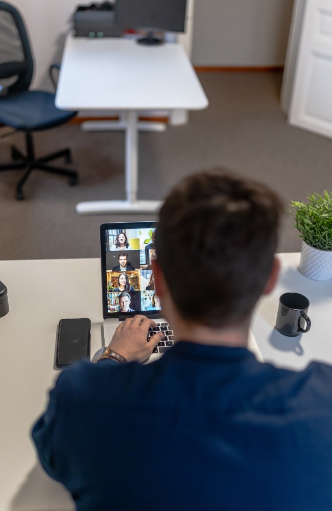
Interview / Zoom
Understanding a complex market required tenths of interviews with different stakeholders.
-

Creative workshop
All the information gathered about smart mobility was summarized by the creative teams.

Before / After
A brand
that connects
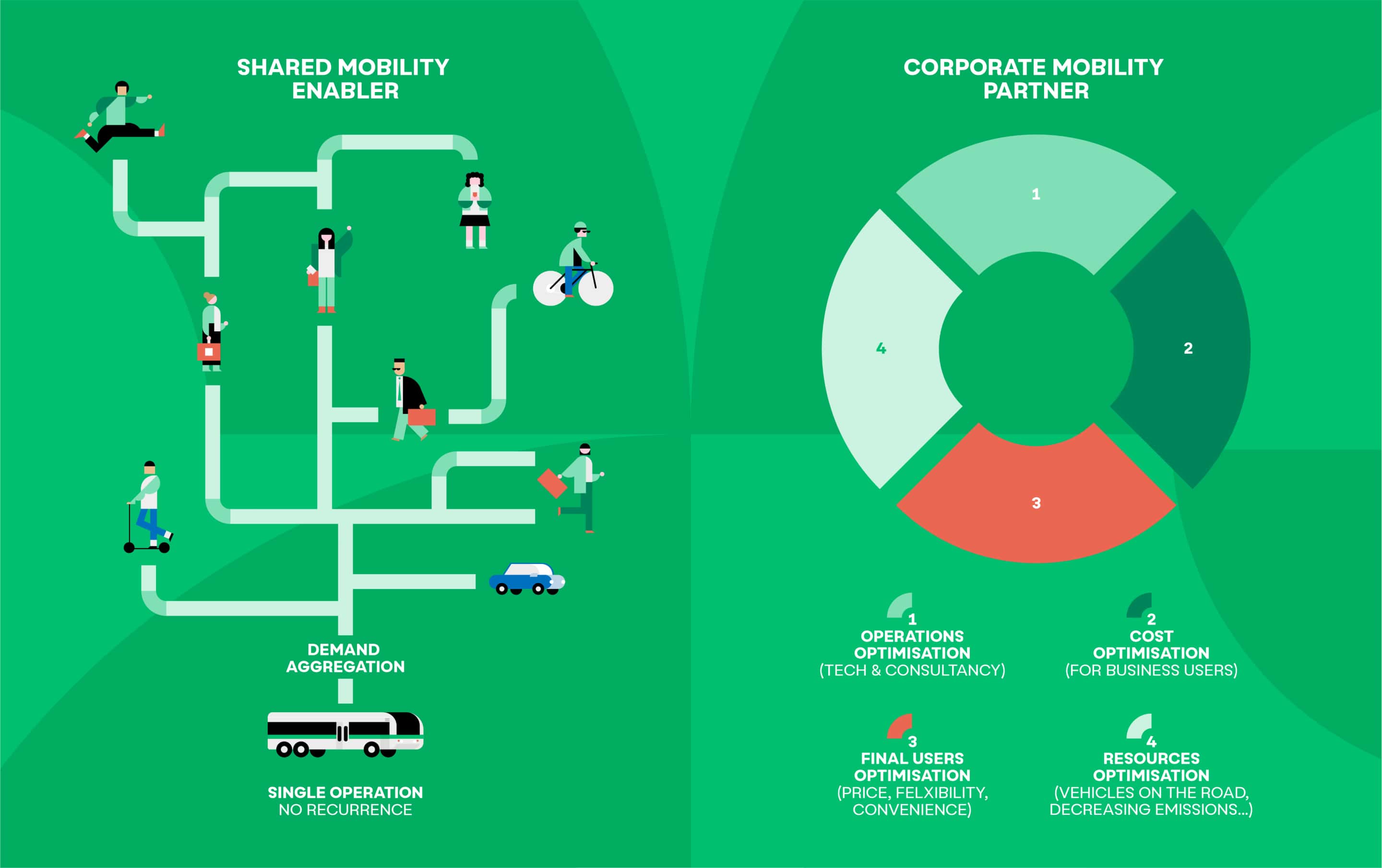
We work under one major concept: Busup as a link. A link between bus operators who wish to optimize their vehicles and companies who require routes to their facilities. A link between city centres and peripheral destinations that public transport does not cover; a link between companies, their employees and their sustainability goals.
A link between the digital world in which the brand operates and the physical world with adaptable and reliable transport.
Solution
The languageof movement
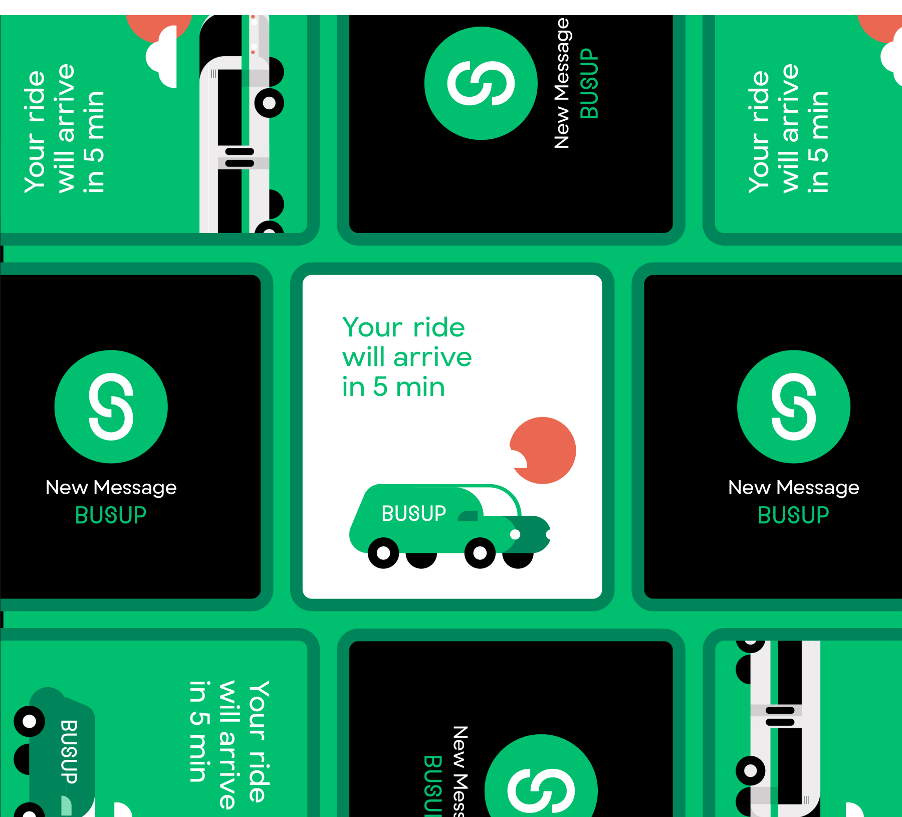
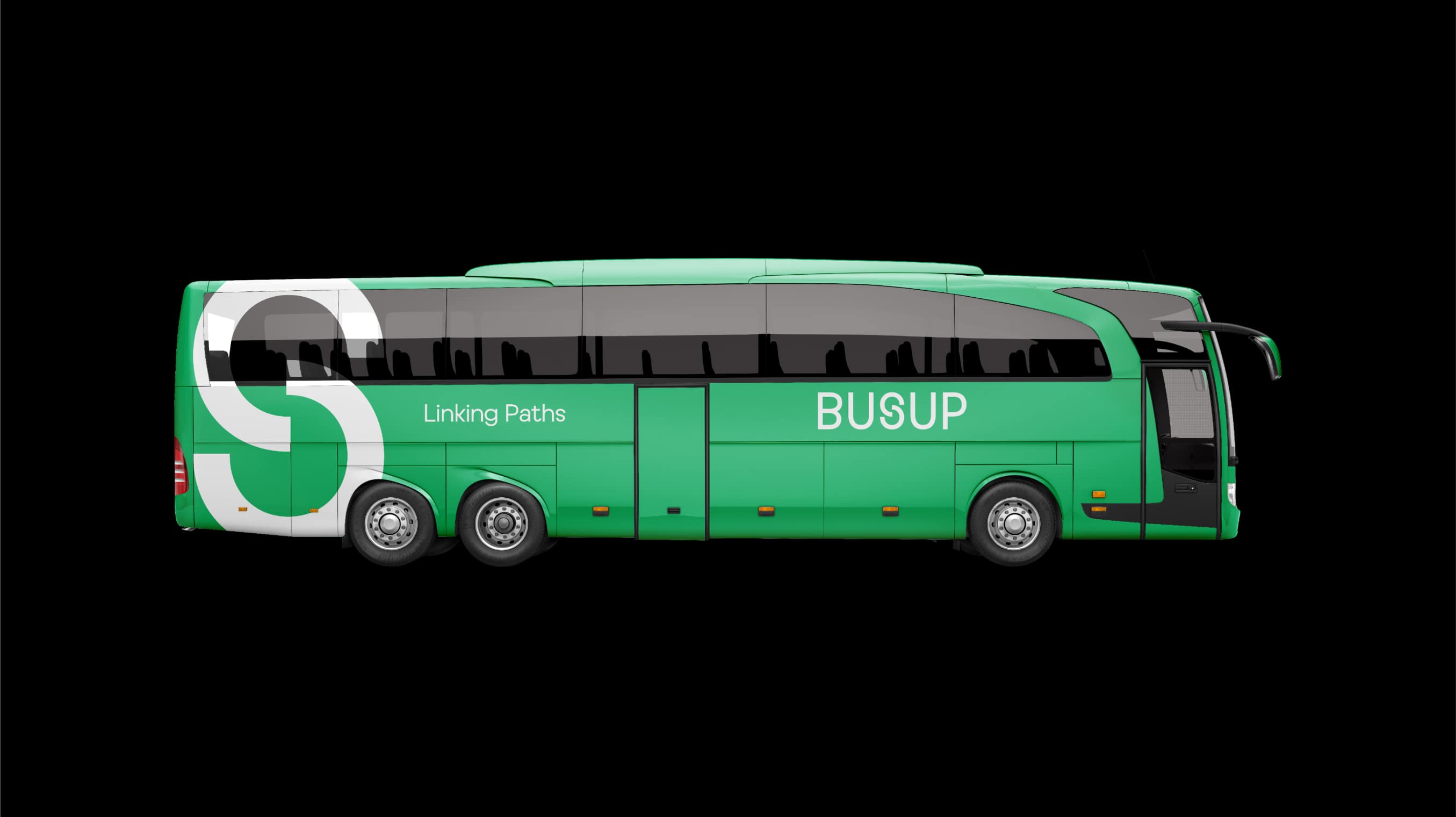
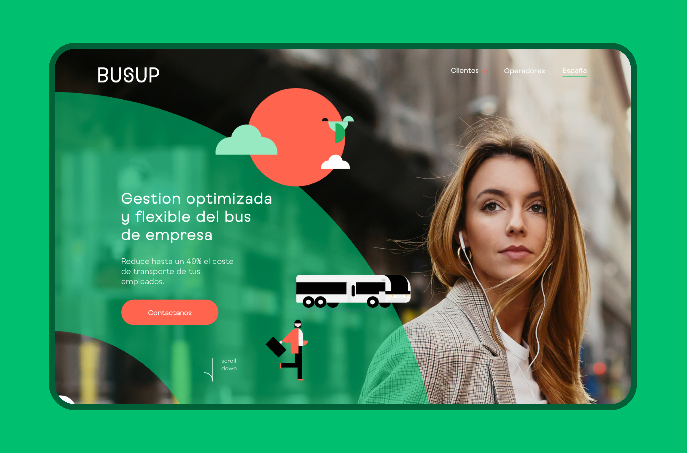
Brands are no longer static and must always go beyond what is expected. The language is constructed from fragments of Busup's “S” symbol that links the two halves of the name but alludes to the symbol of the hyperlink.
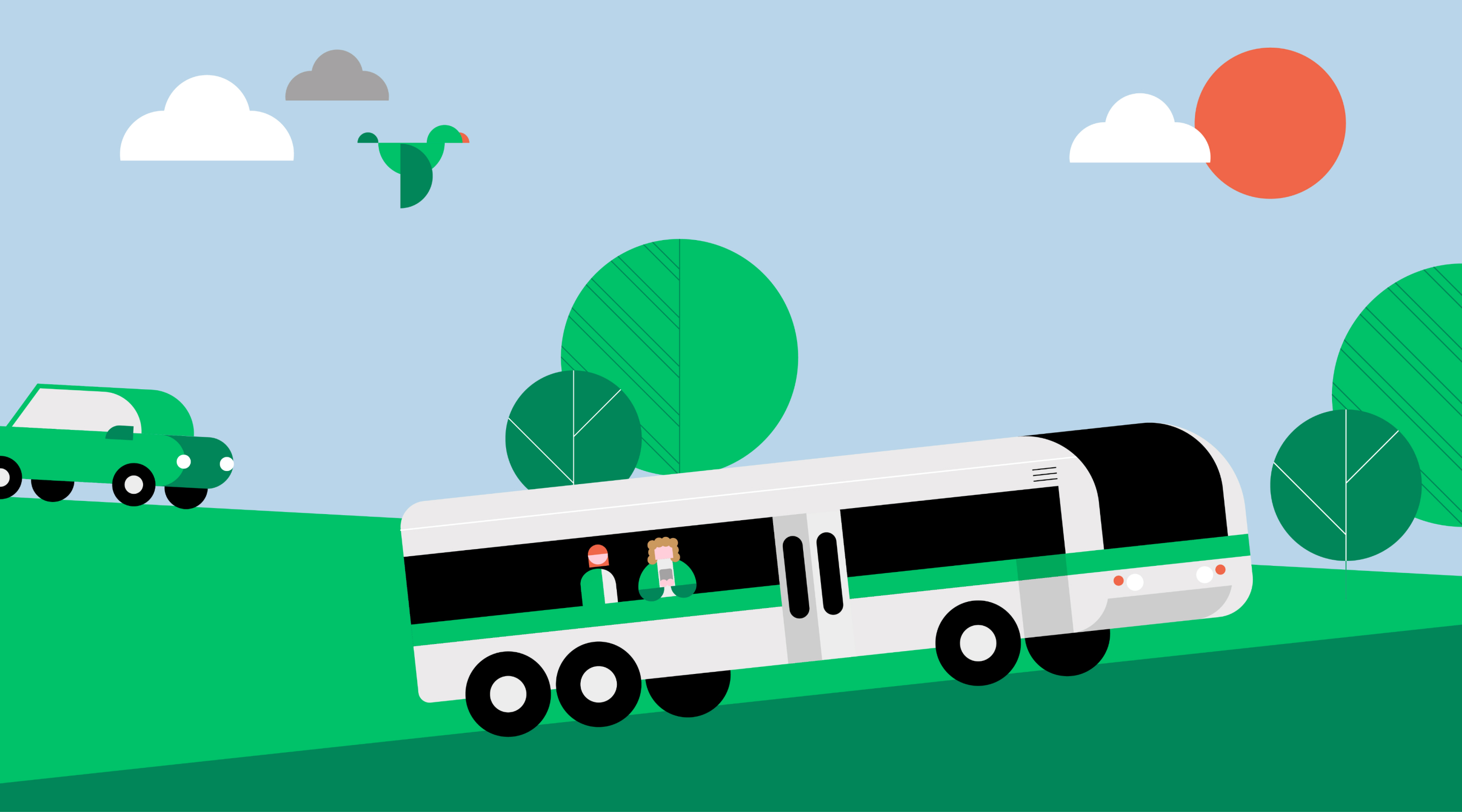
From here, we can build on the concept of a link between multiple origins and destinations, but also between the interests and needs of each of the brand's audiences. This concept was made tangible through ad hoc illustrations to cover the brand’s needs in a recognizable yet outstanding way.

Solution
A typography tailored
to the brand's challenges
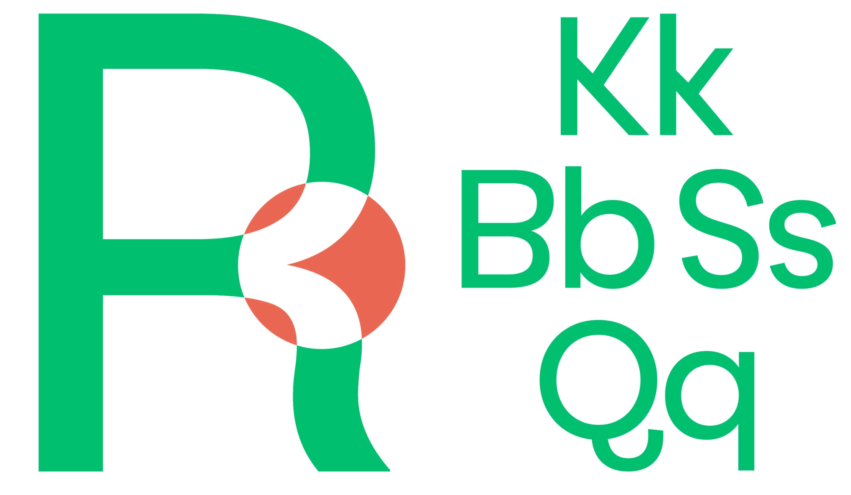
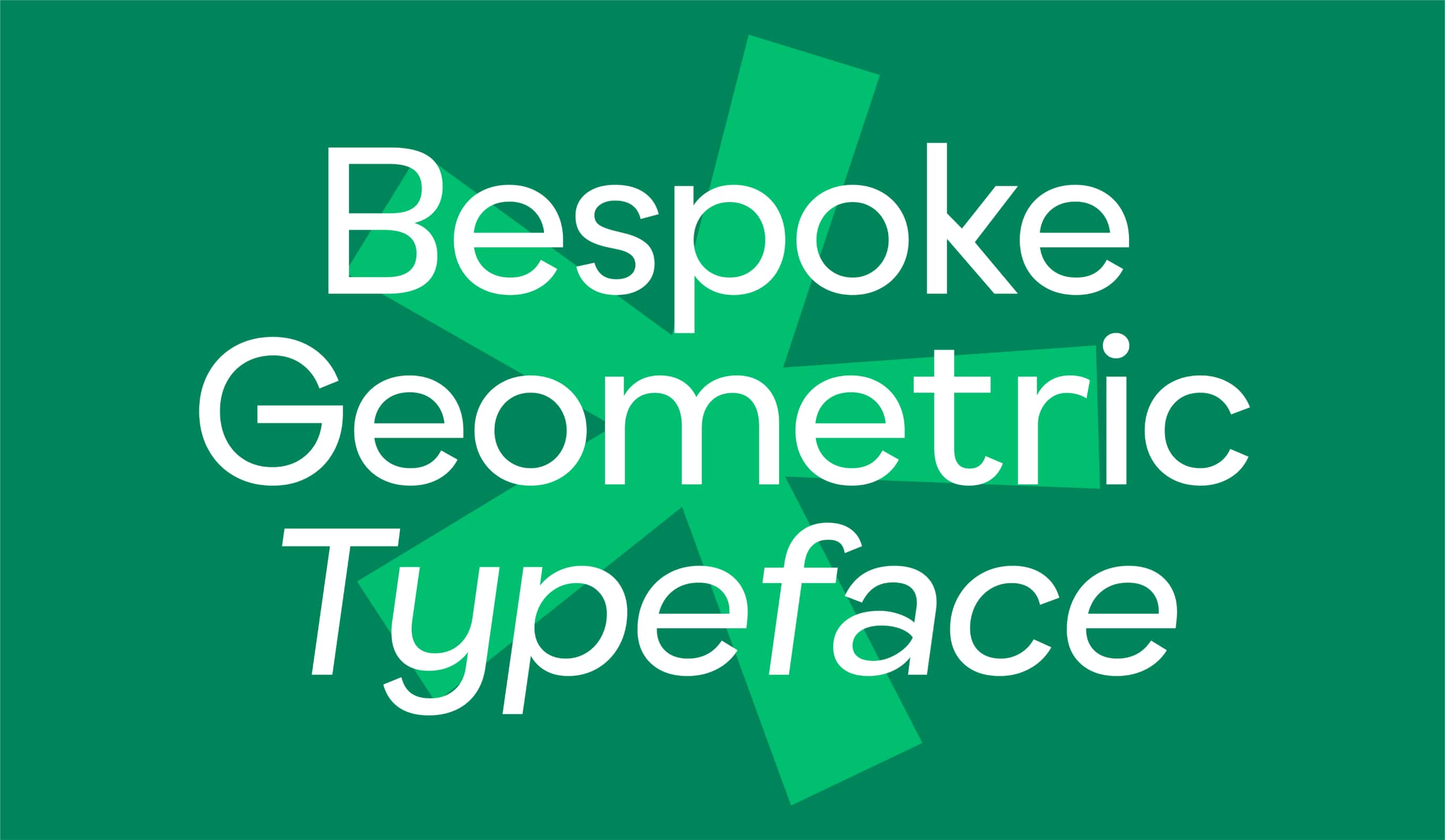
Busup opted for a bespoke typeface to reinforce its visual identity. This is how Busup Sans was born, created in collaboration with Pedro Arilla. It is a geometric, digital-first typeface designed to optimize legibility on screen.
In addition to its wide proportions, it transmits Busup's ground-breaking vocation in a subtle way, with characteristic terminals and with the inversion of some symmetrical characters, such as the K, the S and the 8, in a nod to a brand that has brought a twist to a firmly established means of transport.
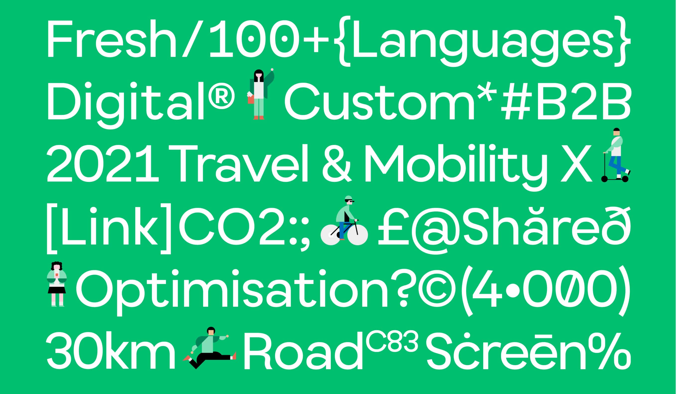

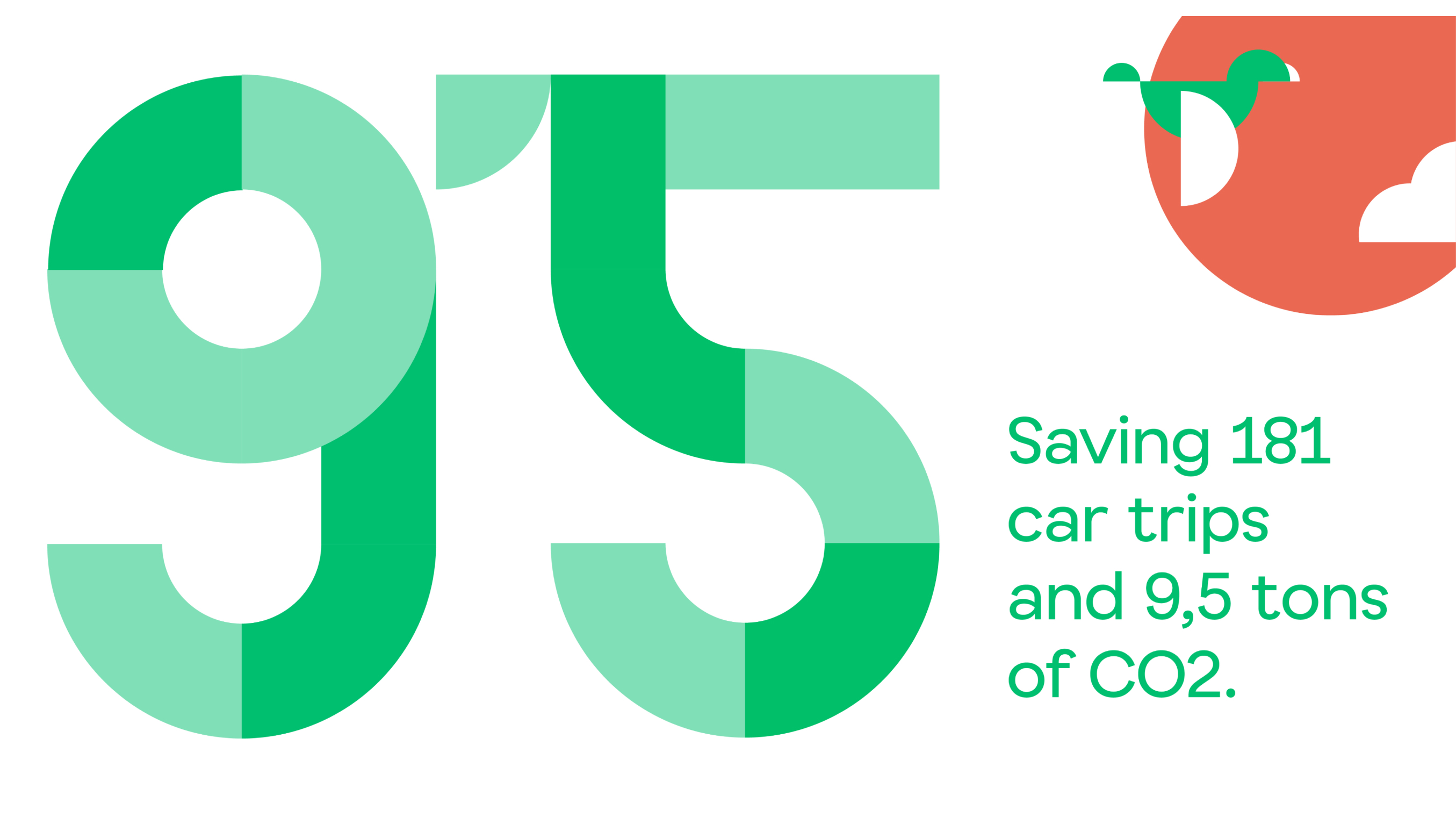
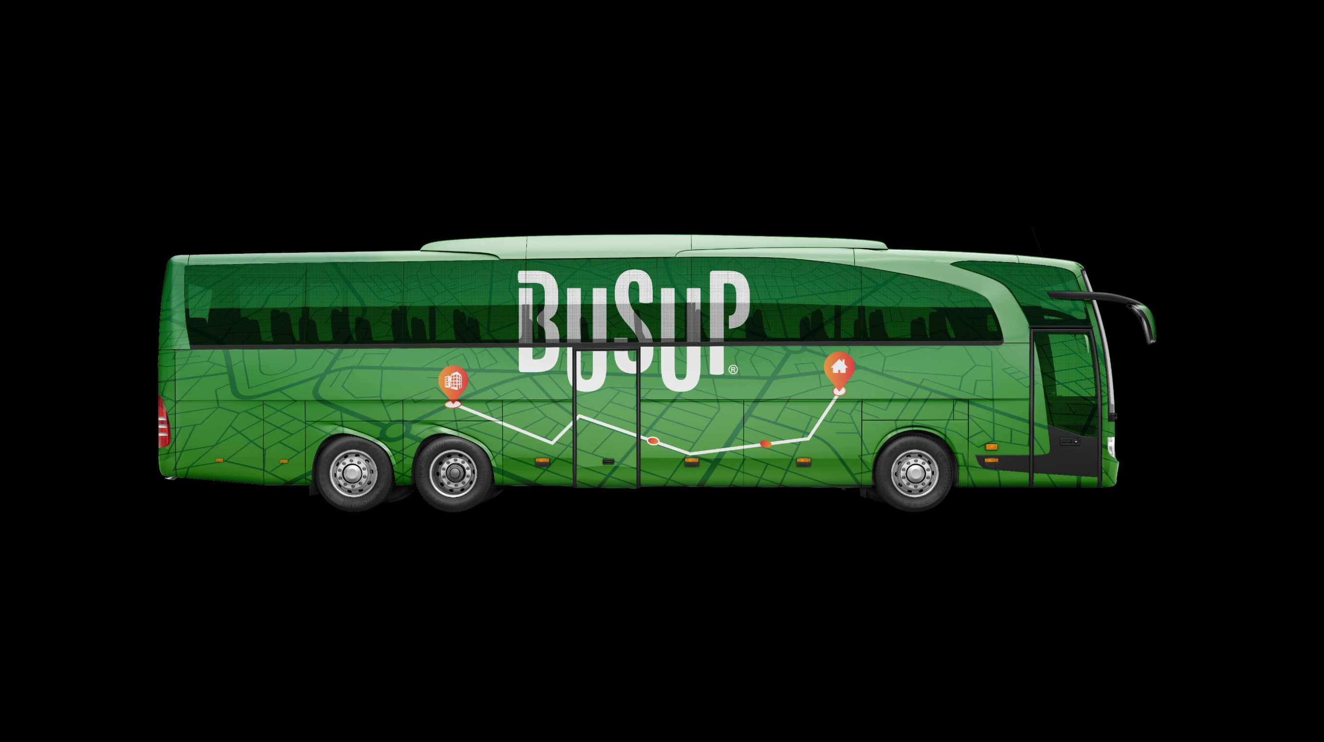
By using its operators' vehicles, the brand's main point of contact is digital environments: from its app to its customer dashboard, passing through its website… which is why the visual language was always conceived with a 100% digital orientation. And it is precisely thanks to its optimization work based on algorithms that Busup has managed to have a very positive impact in the real world.
