Together for the future of energy
-
Services
- Brand Purpose & Beliefs
- Brand Diagnosis
- Brand Positioning
- Visual Identity Design
- Sales Pitch
- Naming & Verbal Identity
- Communication
-
Industry
- Energy and Utilities
-
Client
Sedigas
Sedigas was born to bring together the companies of the gas sector in Spain and to play an active role in the fight against climate change, proposing an energy transition based on its holistic knowledge of energy.

Challenge
A new
energy concept
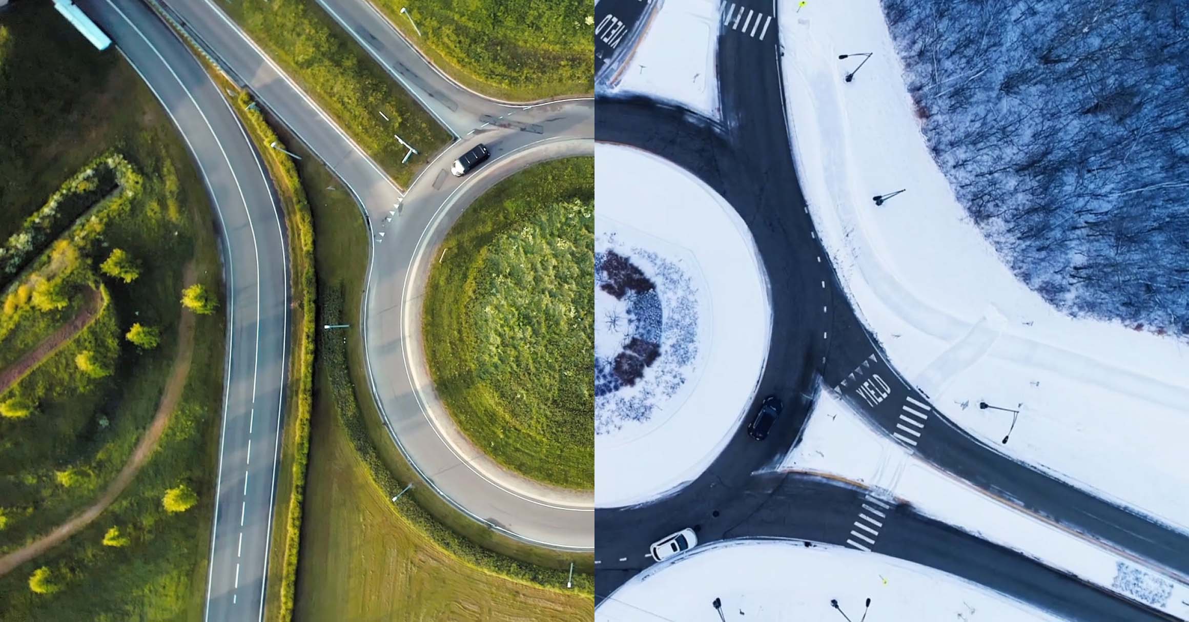
Like any brand representing a collective, Sedigas had to assume a shared and diverse identity which, in this case, needed to represent a global future as well as teamwork with other companies and sectors.

Solution
New claim:
Together
for balance

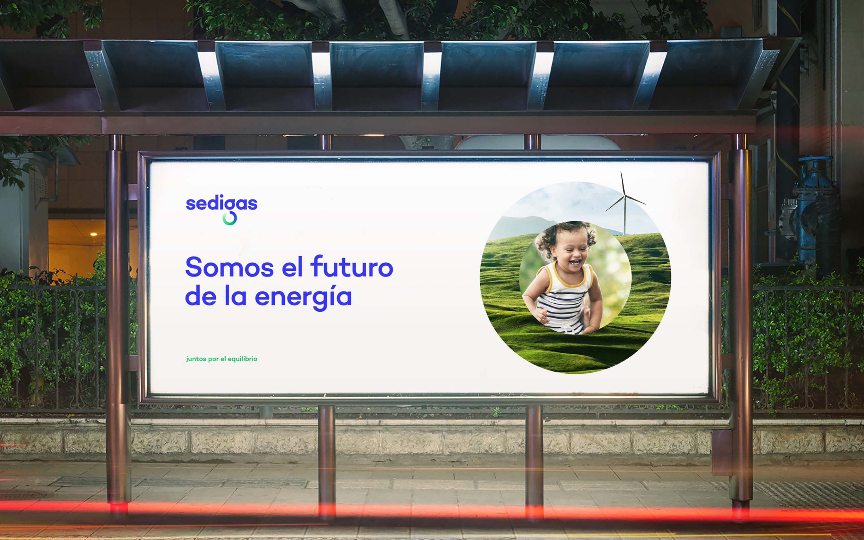
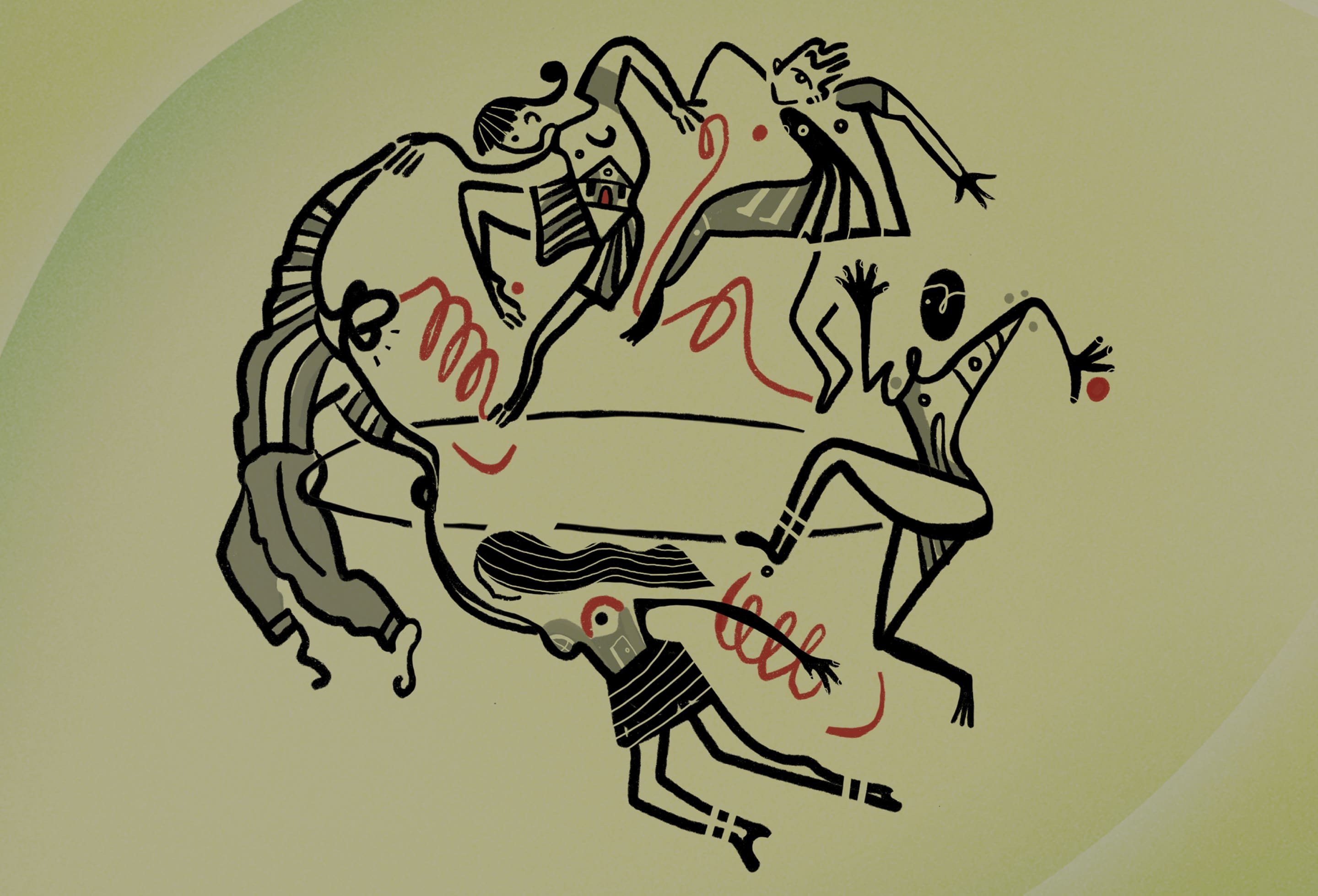
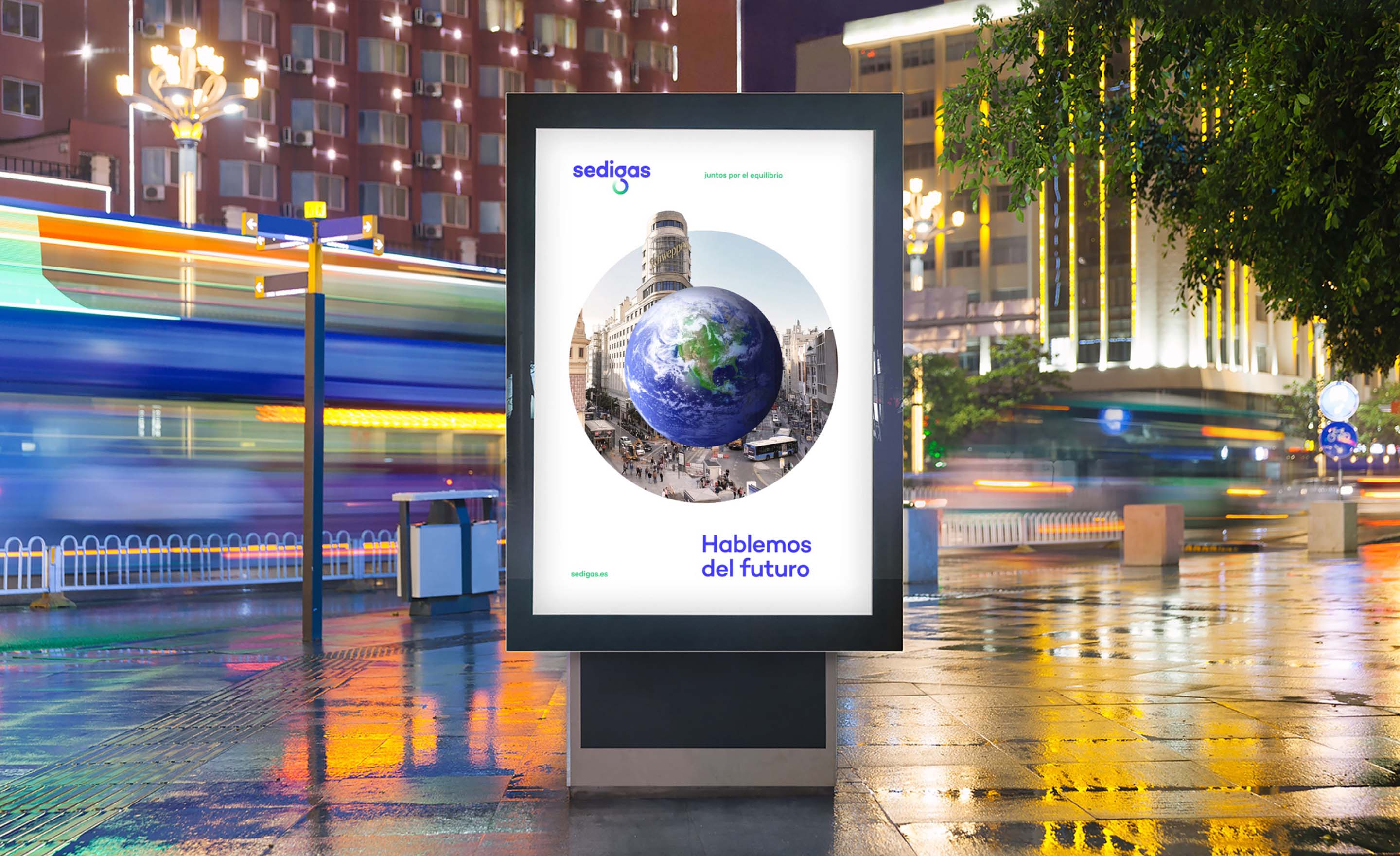
To represent this change, a strong idea was generated around which to unite the sector and society: a concept that does not strive to emphasize the brand's own leadership, but rather to position it as a voice to be heard in a new collaborative paradigm.
It revolves around "energy balance": a reality that transcends the energy mix whereby we consume energy from different sources and in the right proportion.
The energy balance goes further by seeking the most sustainable combination in each circumstance and the use of existing infrastructures, incorporating the key idea of doing it together, in a collaborative, open and consensual way.



Energy as
a constant cycle

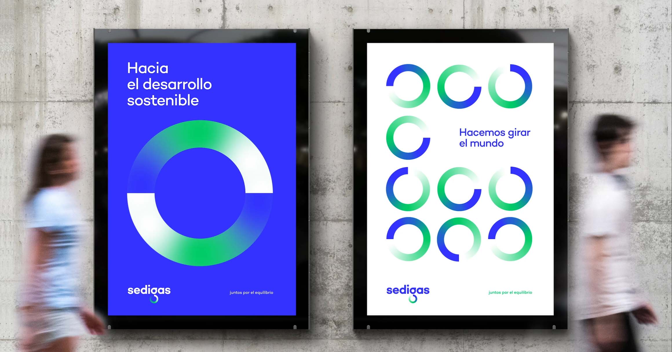
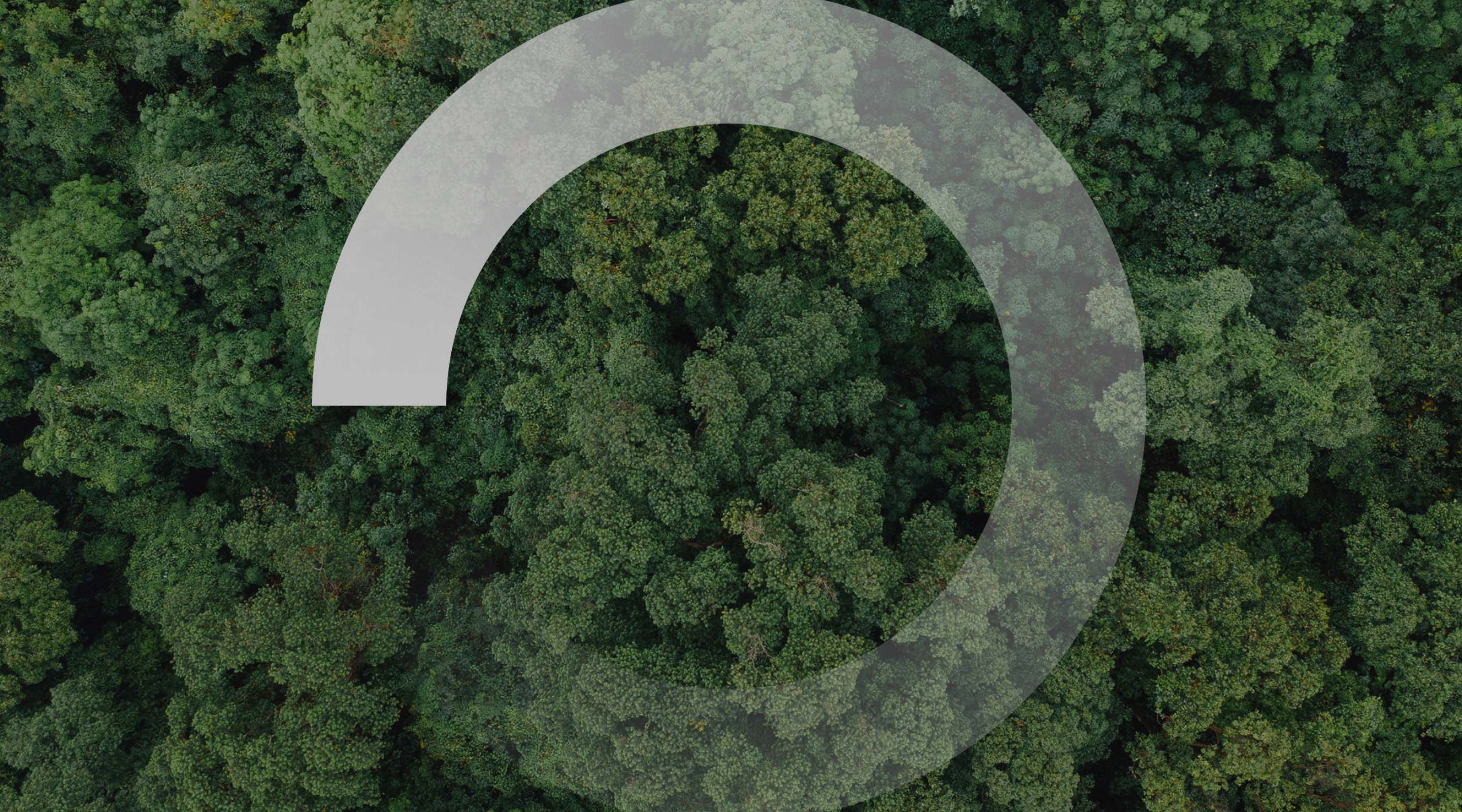
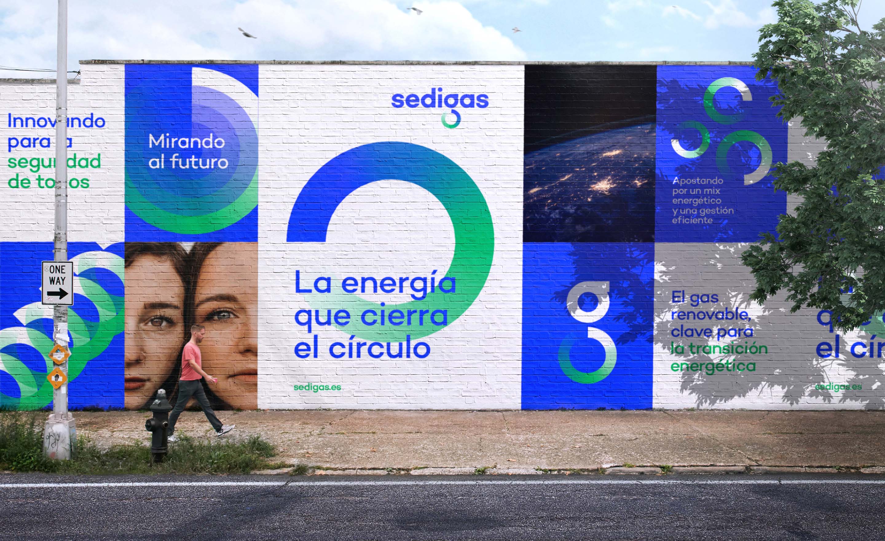
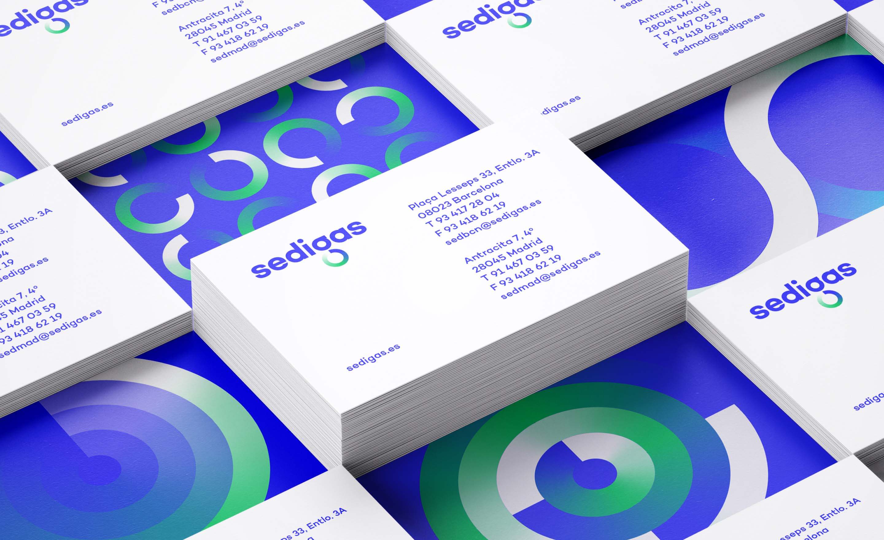
We reached a graphic premise from the idea of balance, to restore what is consumed, give back what is generated. To regenerate energy in a constant cycle. And this is done in a balanced way, which even gives its name to a new economy: the circular economy.
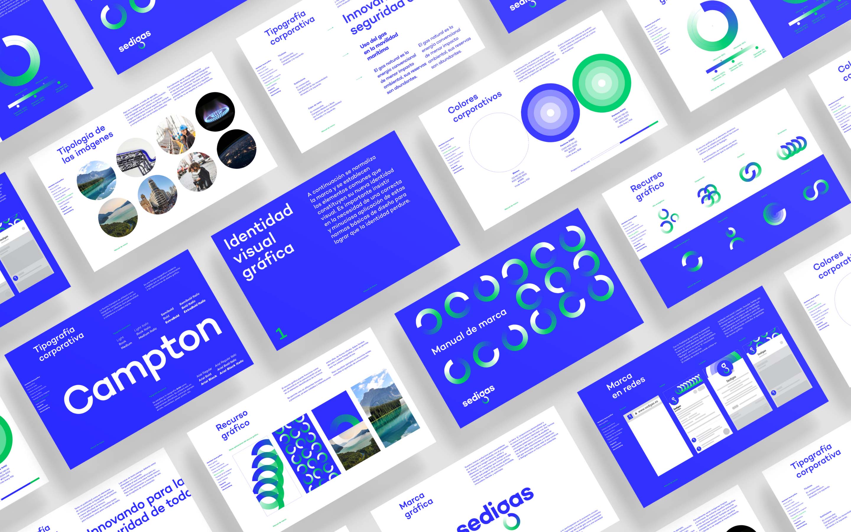
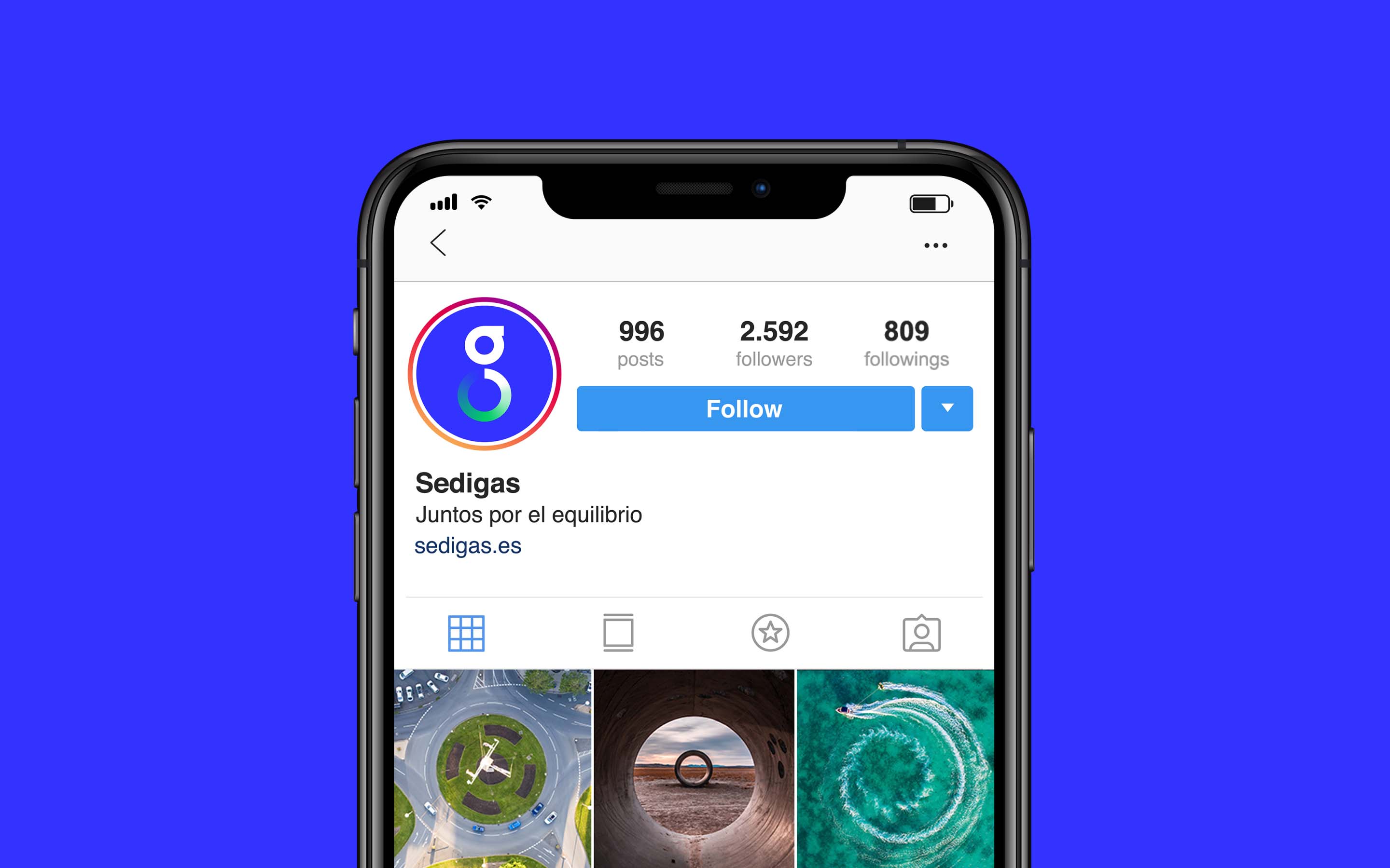
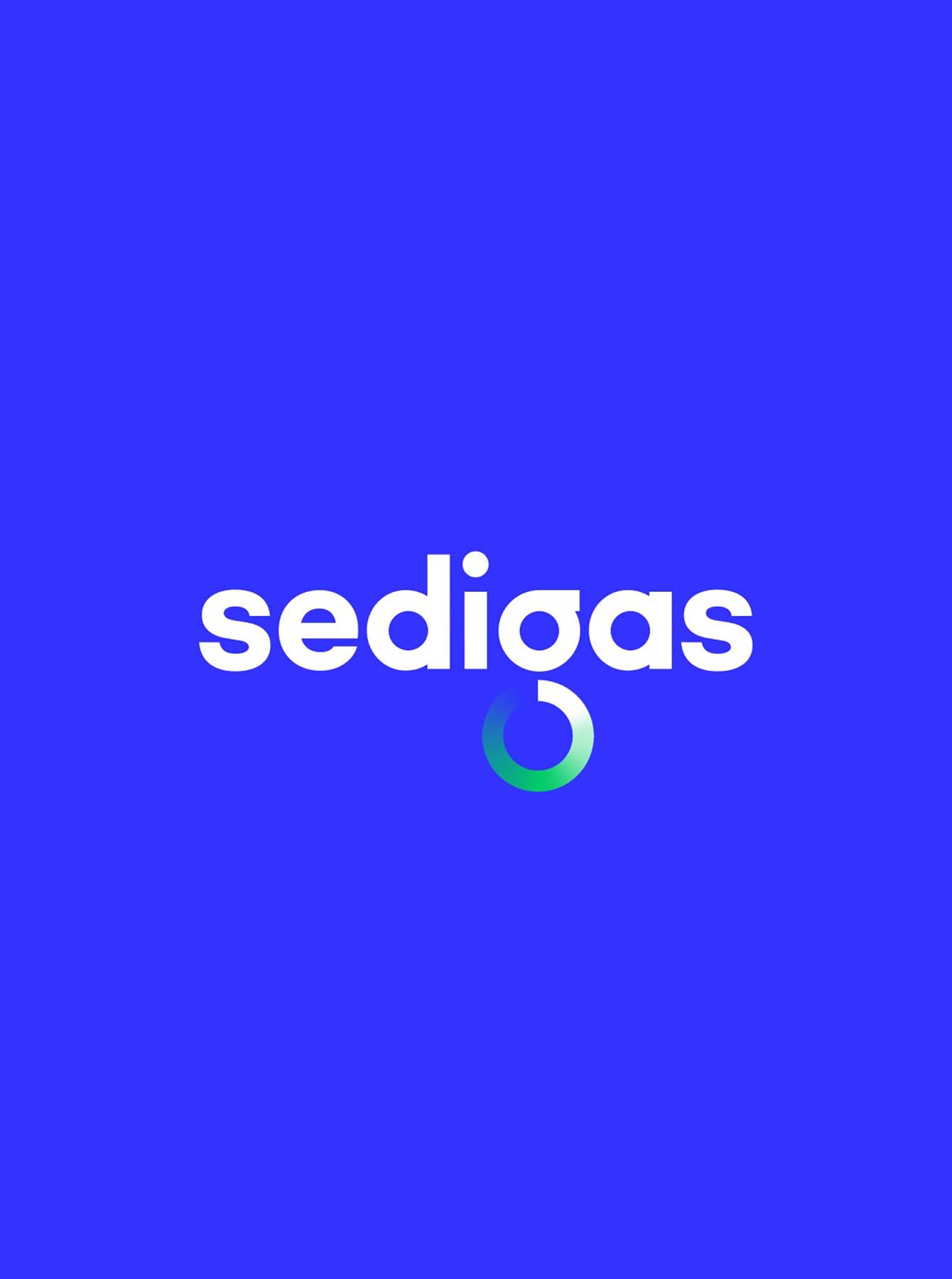
The circular economy is represented in a typographic allusion to a much cleaner, fresher and more adaptable brand. The colour gradient explains the dynamic transition in which the sector finds itself: from the traditional blue flame of gas to the intense green of sustainability.
Based on the circle and its repetition, a modern, metaphorical graphic language is combined with a high symbolic power, through which the versatility of gas as a key energy in the development of a multitude of sectors is represented – inviting us to look to the future with optimism.
Our visual identity has been recognized as a best logo design, one of the best gradient logo designs.

