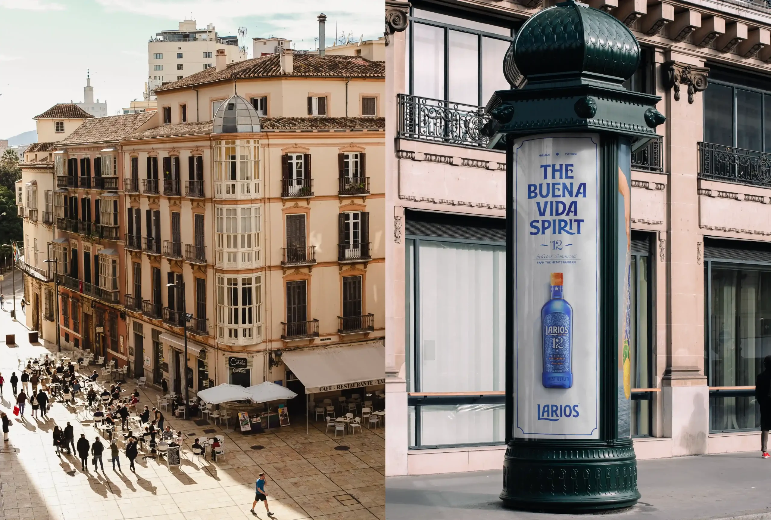
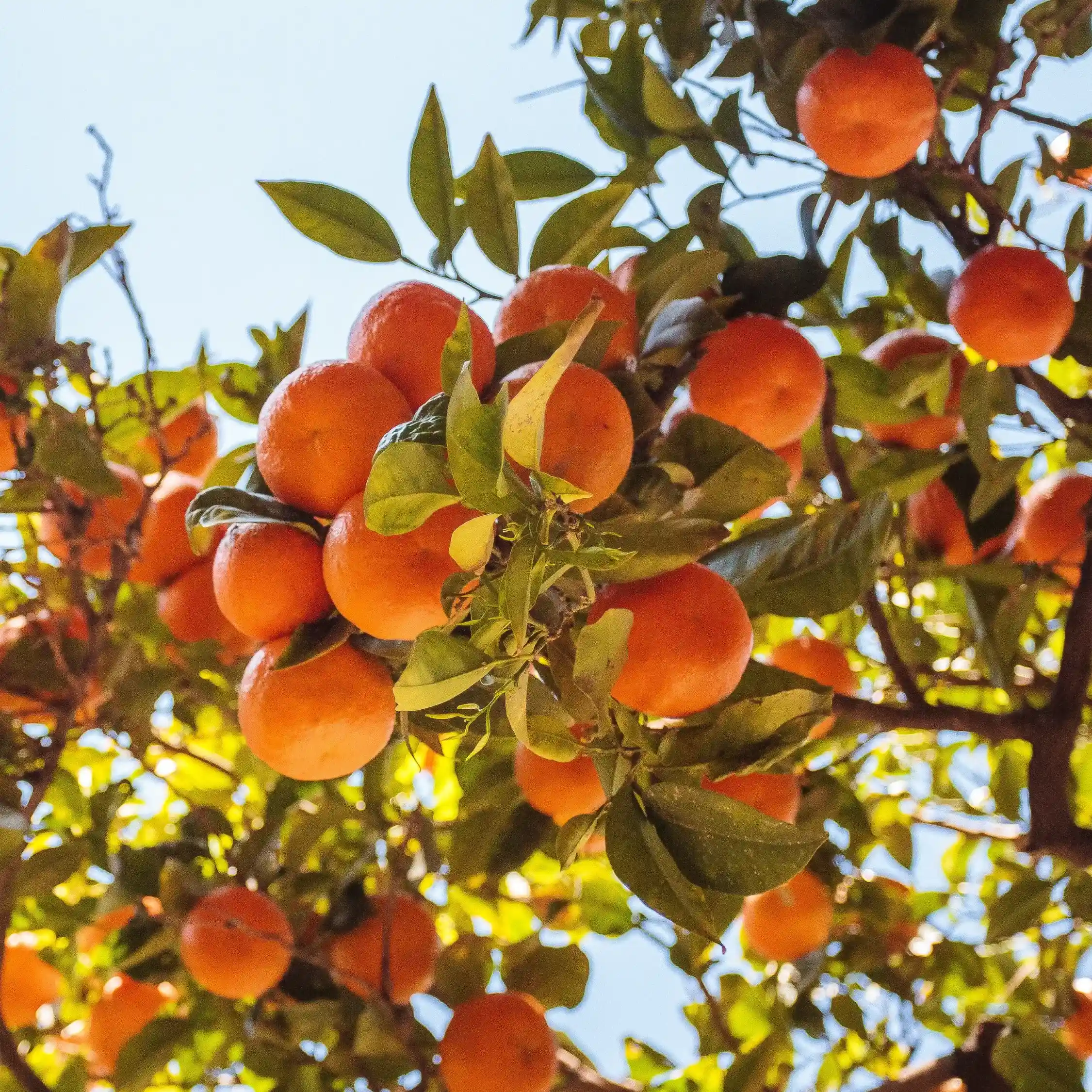
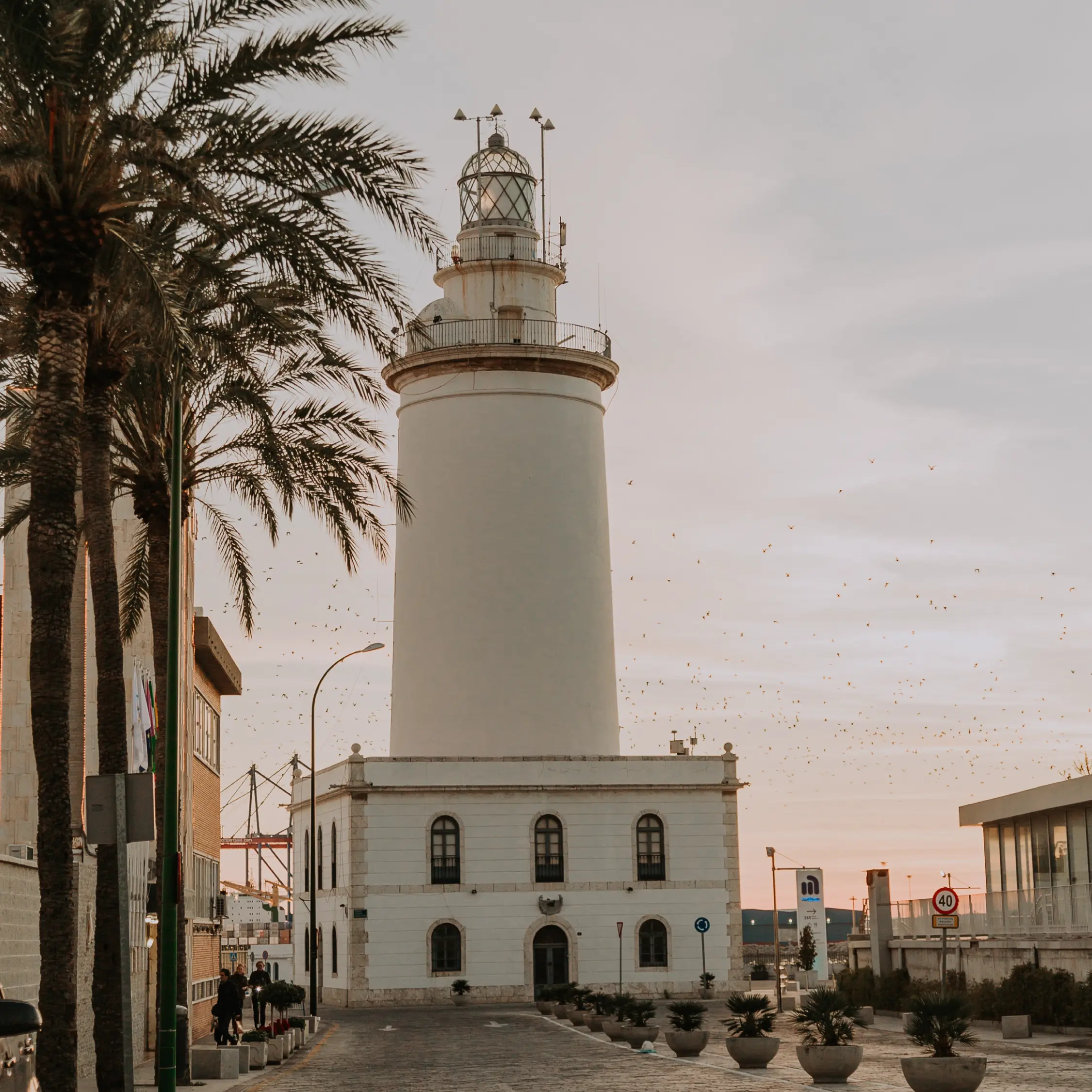
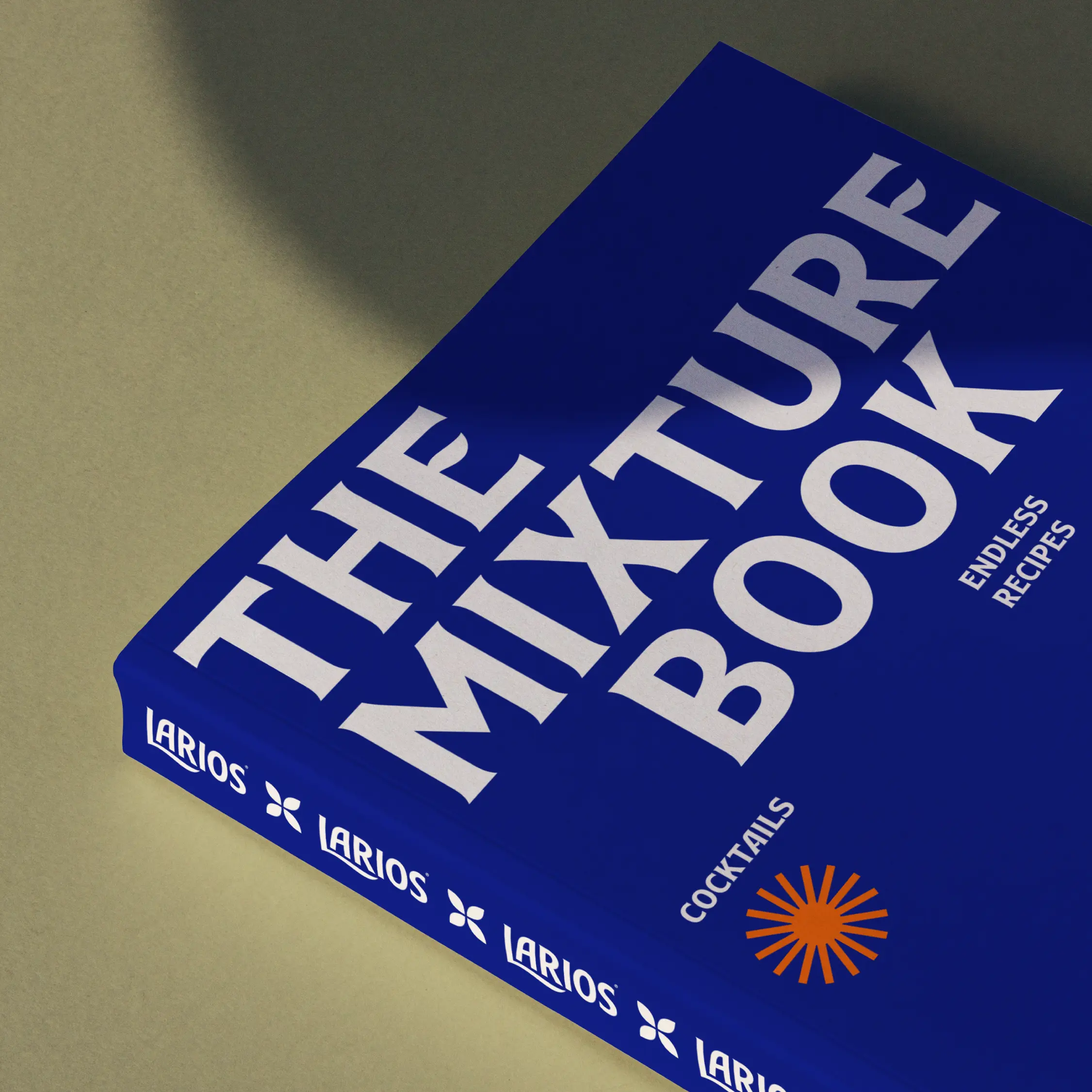
We travelled to Malaga to feel its natural rhythm and the warmth of its people. We immersed ourselves in the unmistakable fragrance of orange blossom and sought to identify all the unique elements of its birthplace that were part of the Mediterranean, and of Larios: something that went beyond a pin in a map and defined a way of understanding and living life.
Larios 12: pure Mediterranean essence
-
Services
- Brand Purpose & Beliefs
- Brand Positioning
- Brand Narrative
- Visual Identity Design
- Naming & Verbal Identity
- Packaging Design
- Communication
-
Industry
- Wines and Spirits
-
Client
Beam Suntory Int.
Larios is a Beam Suntory gin that needed to evolve in its main market, Spain, and to prepare for its entry into new markets. The brand sought a differential positioning to ensure its relevance in different markets.
Challenge
Creating a proprietary
universe for Larios
Originally from Malaga – where everything is an invitation to enjoy the small pleasures of everyday life – Larios stirred our determination to transform it into a reference and catalyst for a unique way of understanding life.
Representing
a lifestyle
A gin that would provoke a state of mind and represent a unique attitude towards life, taking the time each day to enjoy ourselves in good company.
Solution
The
Buena Vida
spirit
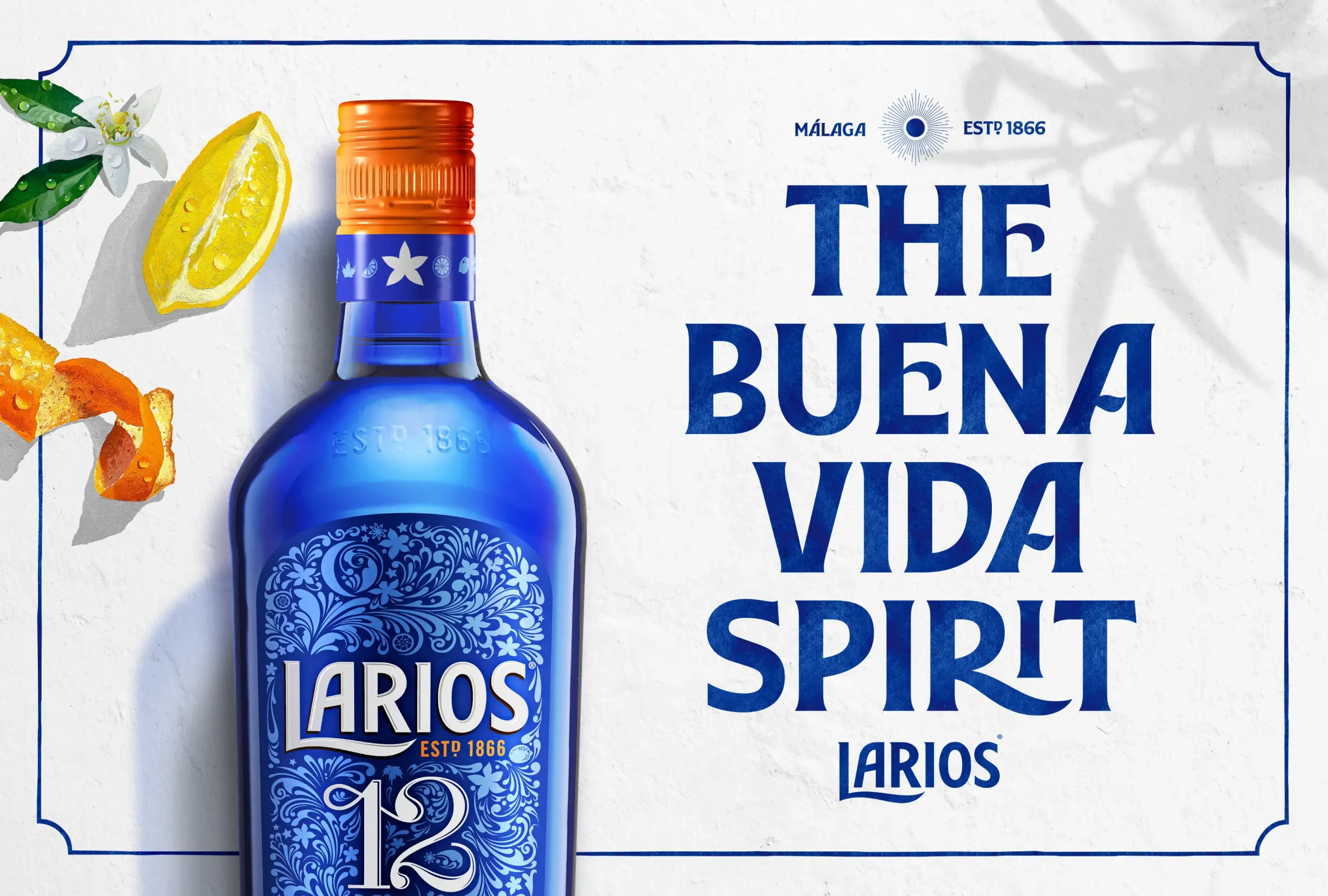
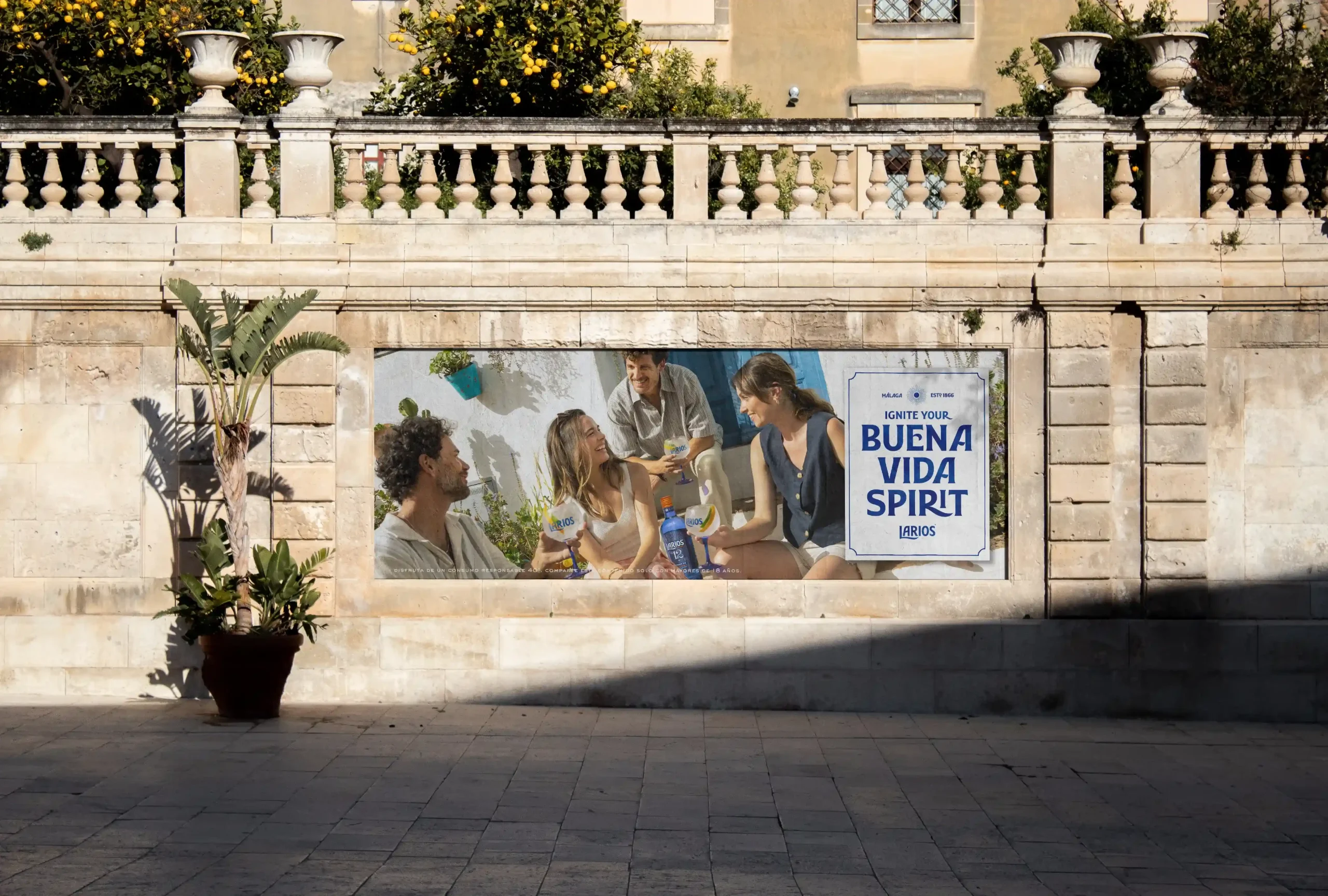
La Buena Vida (The Good Life) by Larios represents a philosophy of relaxed and aspirational living that reminds us of the true meaning of living well and appreciating the beauty of small, everyday pleasures.
Inspired by the mood and concept of the Buena Vida, we defined the design principles that would guide the new, unique visual ecosystem of Larios.
We revealed Malaga’s Mediterranean spirit, with its colours and lights, its fragrances and ingredients, and the carefree attitude of its people, in order to enhance the beauty in life’s details, focusing on contemporary designs and elements, in perfect proportions. The goal was to create a brand universe that would inspire a relaxed energy, inviting everyone, everywhere to let it flow and let go, by following the unique understanding of life that exists in Malaga.
Building
a tailor-made
visual universe
The universe needed a consistent proposal for the brand, one flexible enough to evolve and adapt to different needs and territories to build a unique perception of this corner of the Mediterranean, still unknown to many.
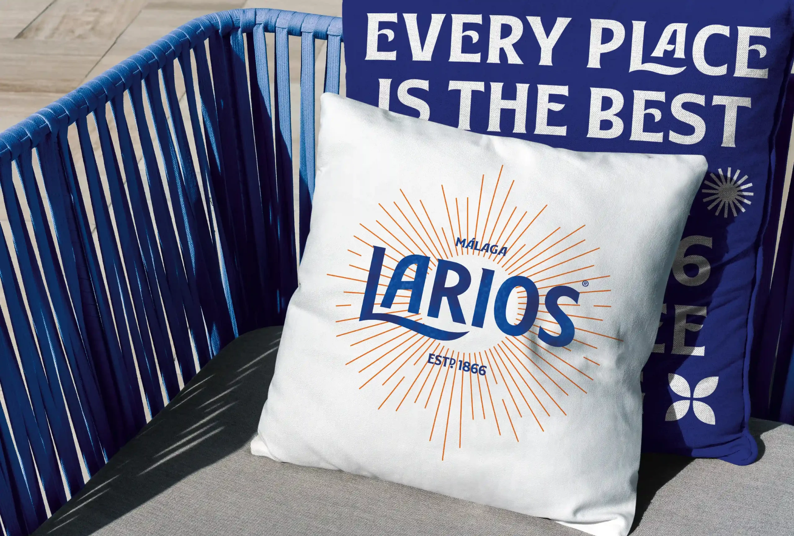
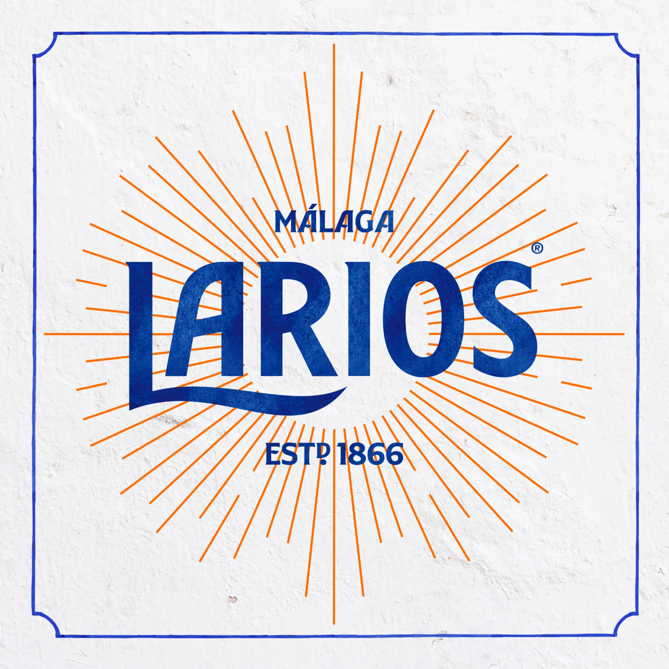
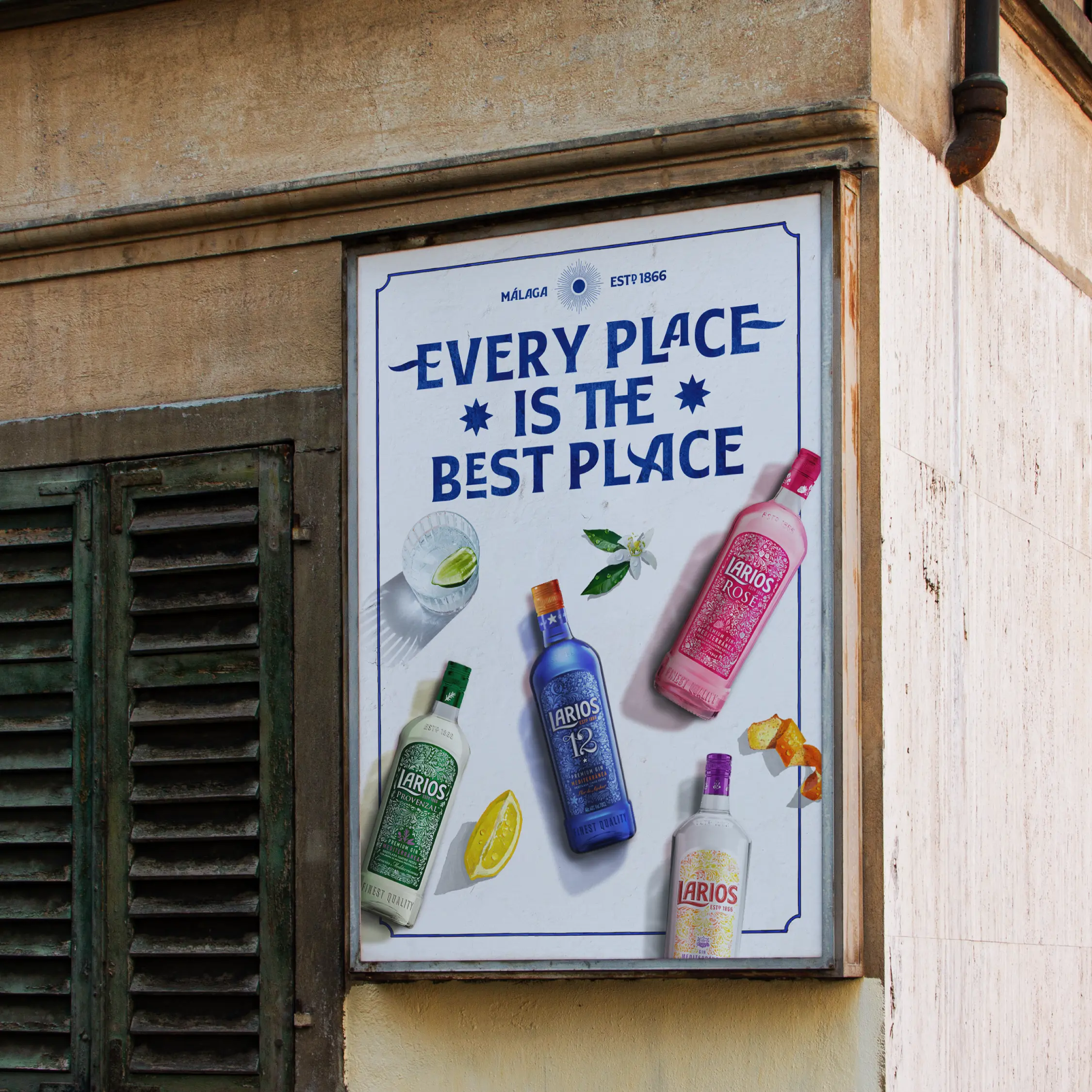
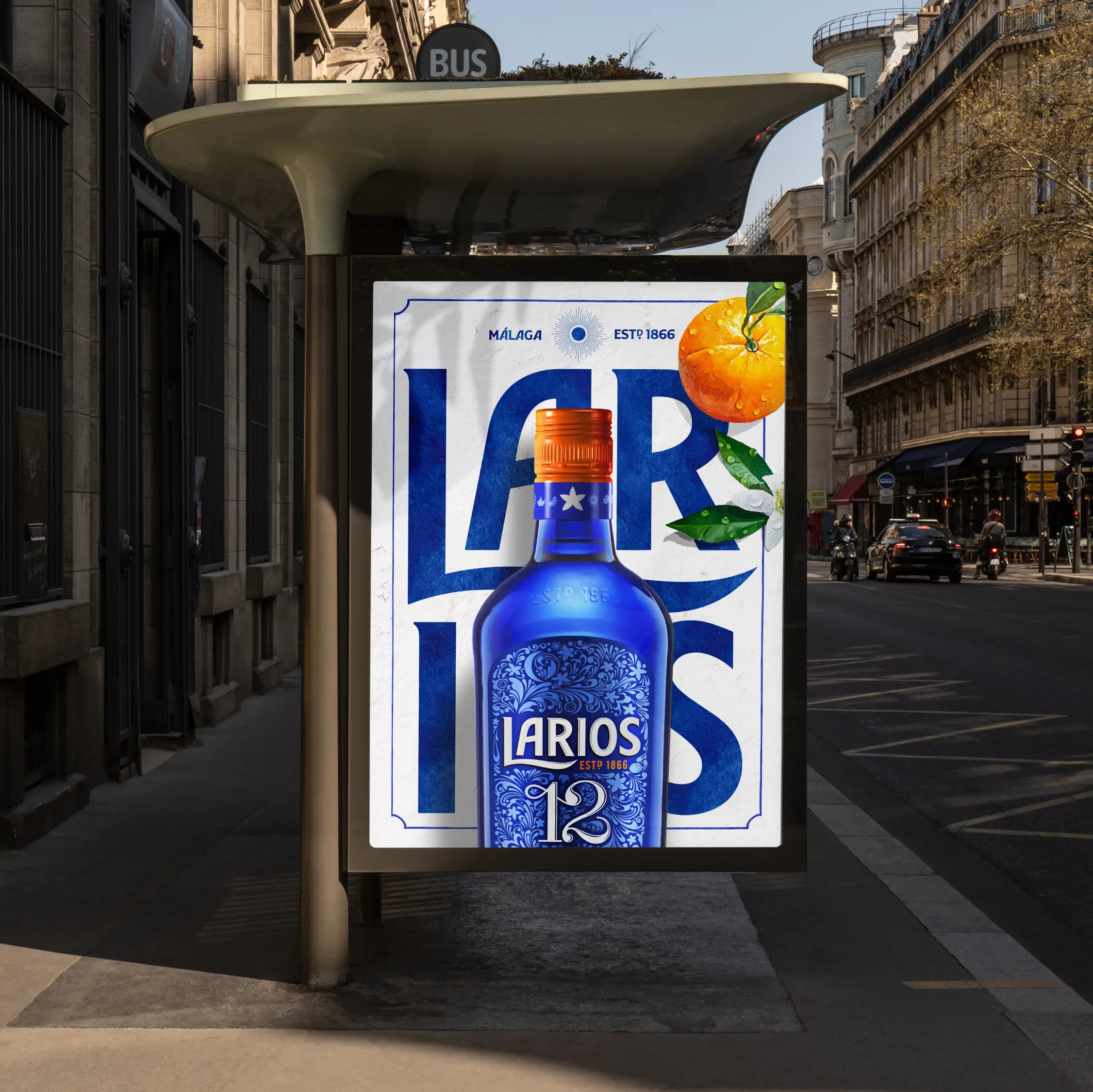
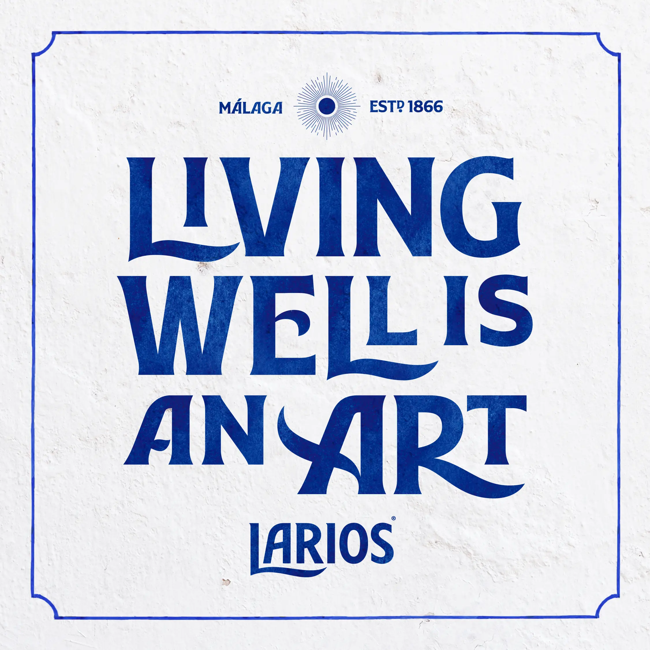
We started by creating a simplified version of the Larios logo with a single ink, and then a textured version with a water-based paint finish, to add freshness and evoke the traditional essence of Malagan tiles and ceramics.
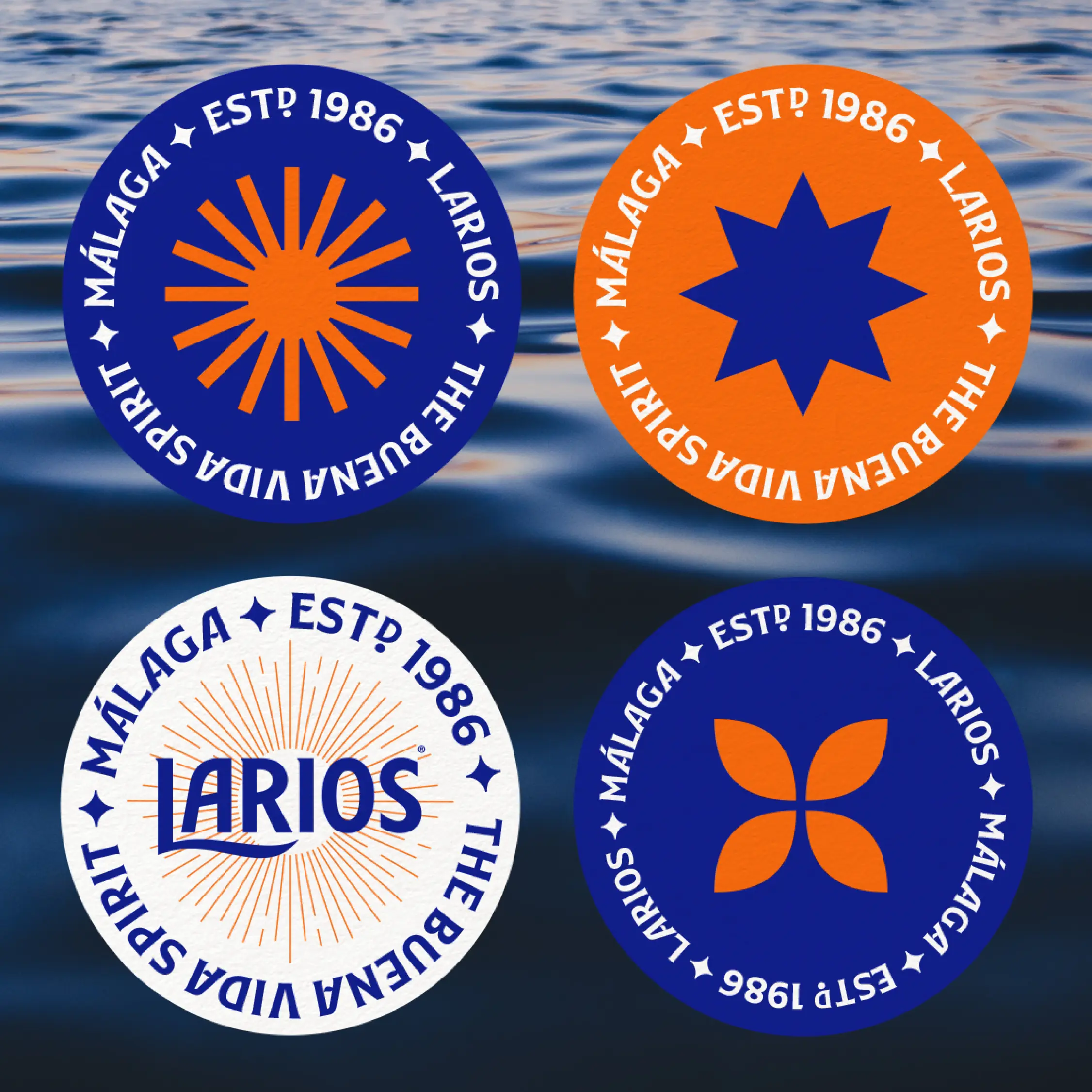
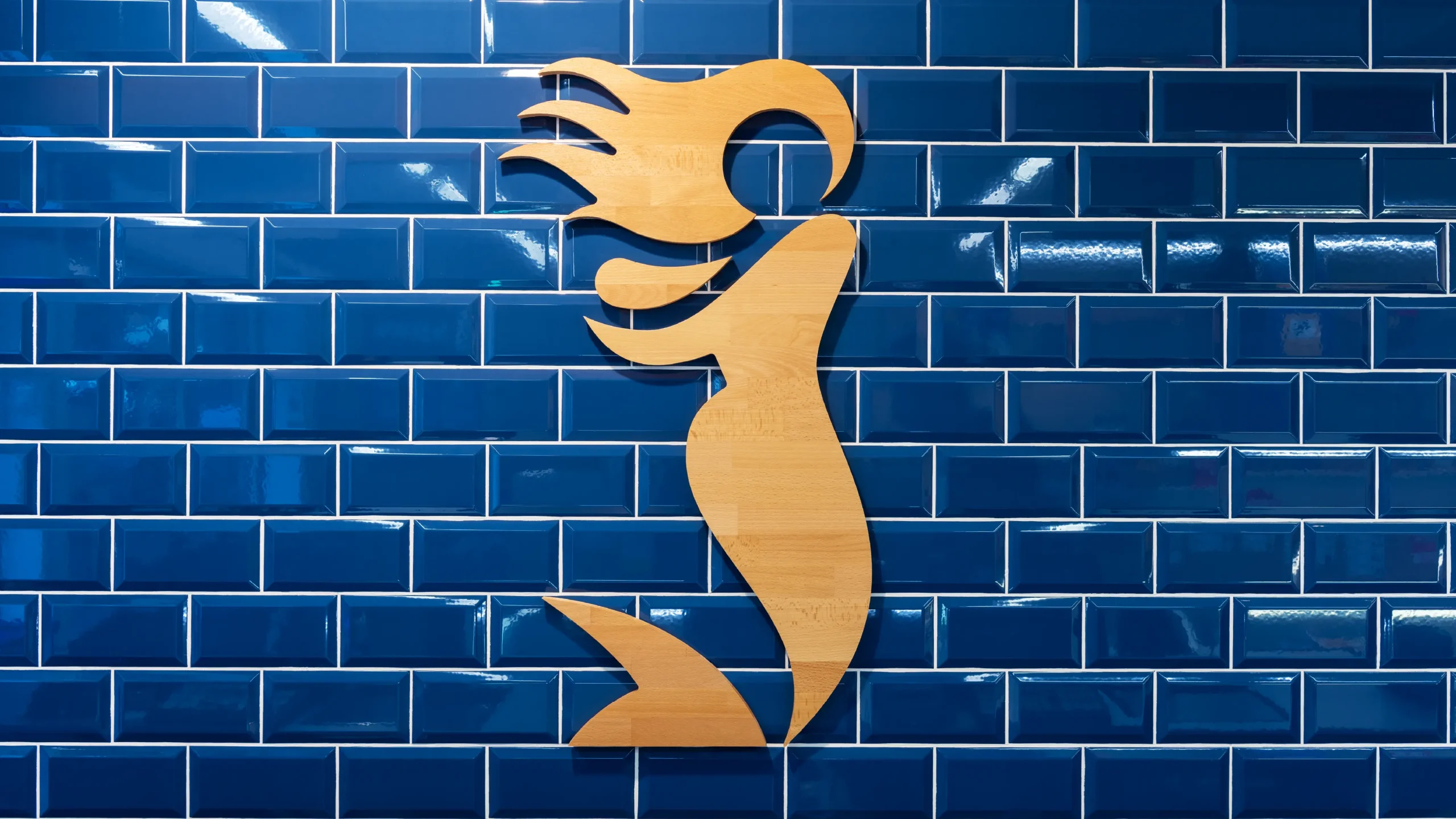
We extracted the iconic L from the Larios logo and turned it into an icon inspired by the fluidity, colours and soft undulating shapes typical of this part of the Mediterranean.
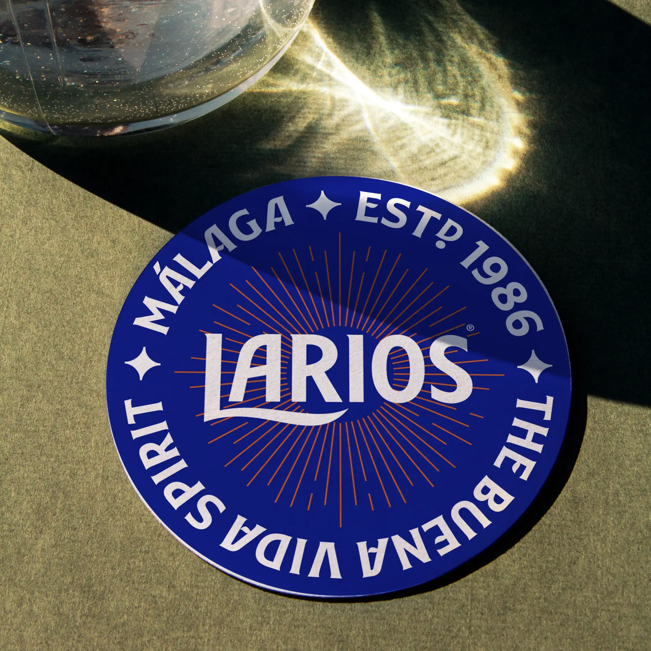
The sunburst details of the design are reminiscent of the everlasting Malaga sunset, the relaxed energy and warmth of the Mediterranean light.
A typeface
that fuses
past and present
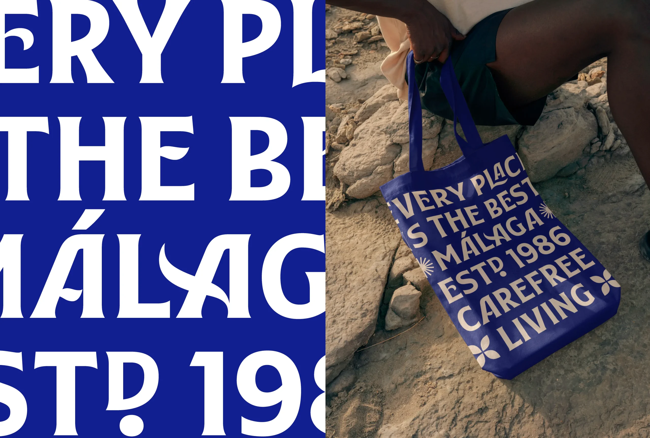
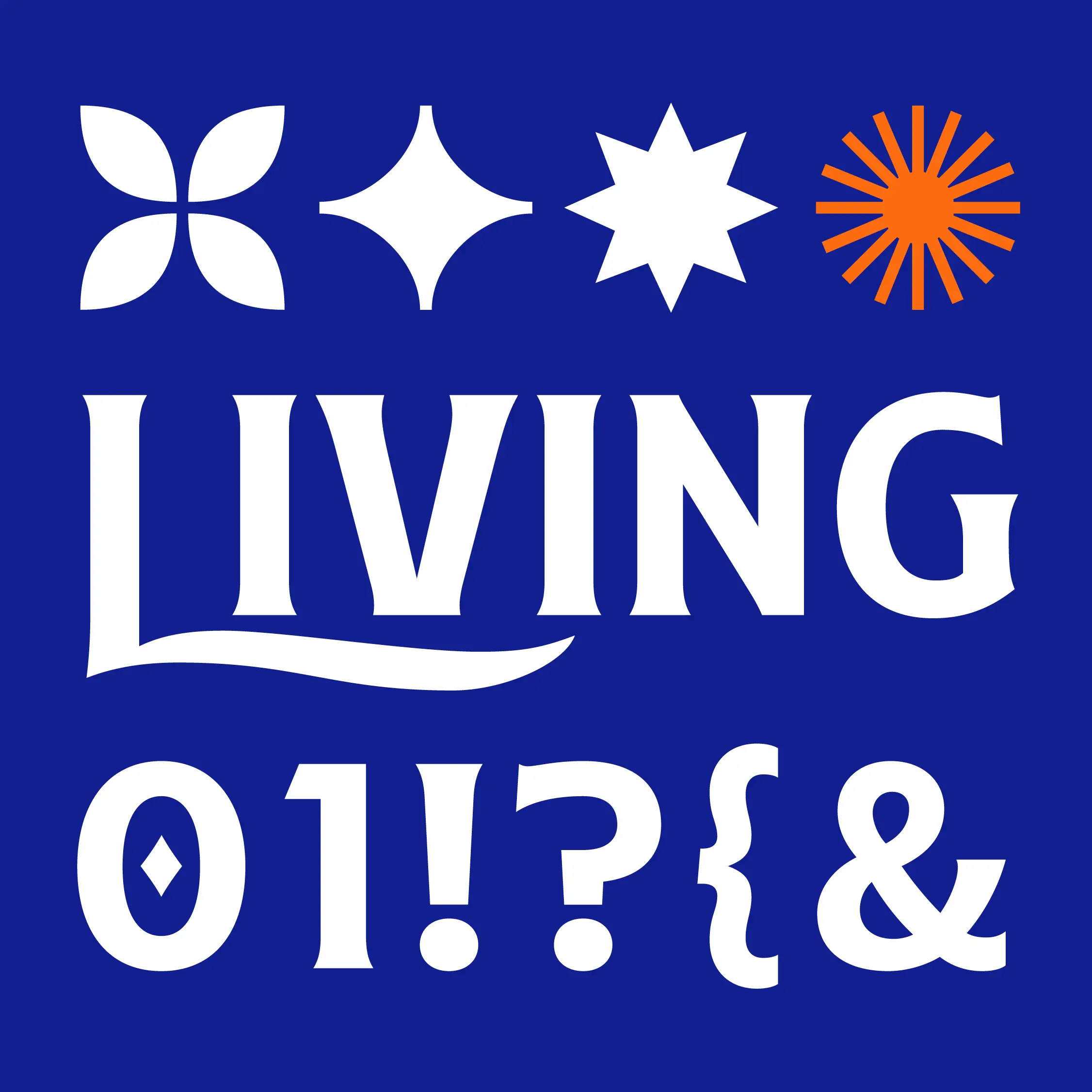
Inspired by the logo and designed by typographer Pedro Arilla Studio, Larios Display is a Bespoke typeface with a strong personality that echoes the traditional style of Malagan street signs.
The new typeface has variants that help to increase the sense of fluidity extracted from the L, enhancing uniqueness and sophistication
Sensoriality
and Mediterranean
naturalness
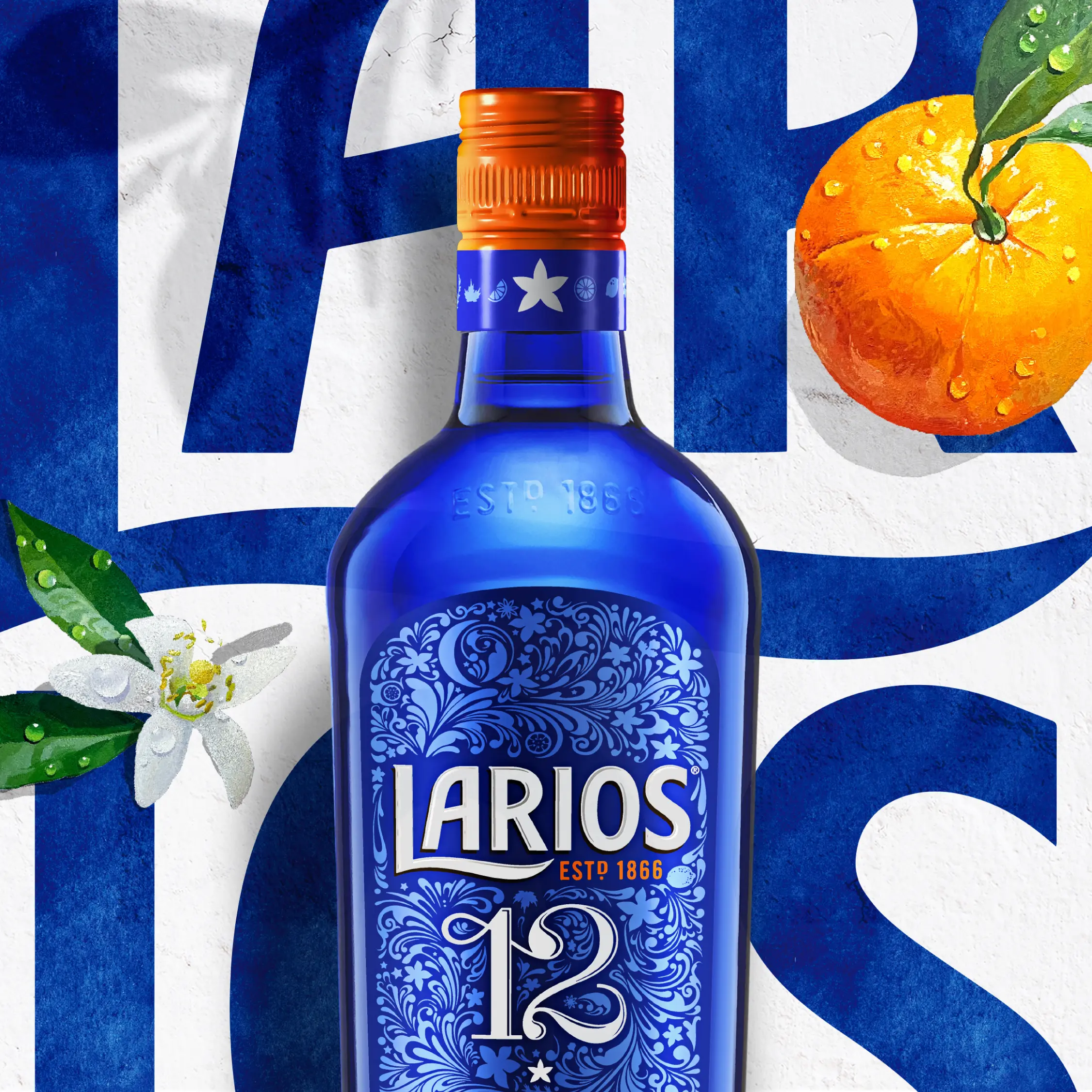
The composition of the colors and their proportions, together with the texture of the traditional stucco of Mediterranean architecture are elements that add sensoriality and naturalness to the Larios ecosystem.
Creating a 360°
brand
experience
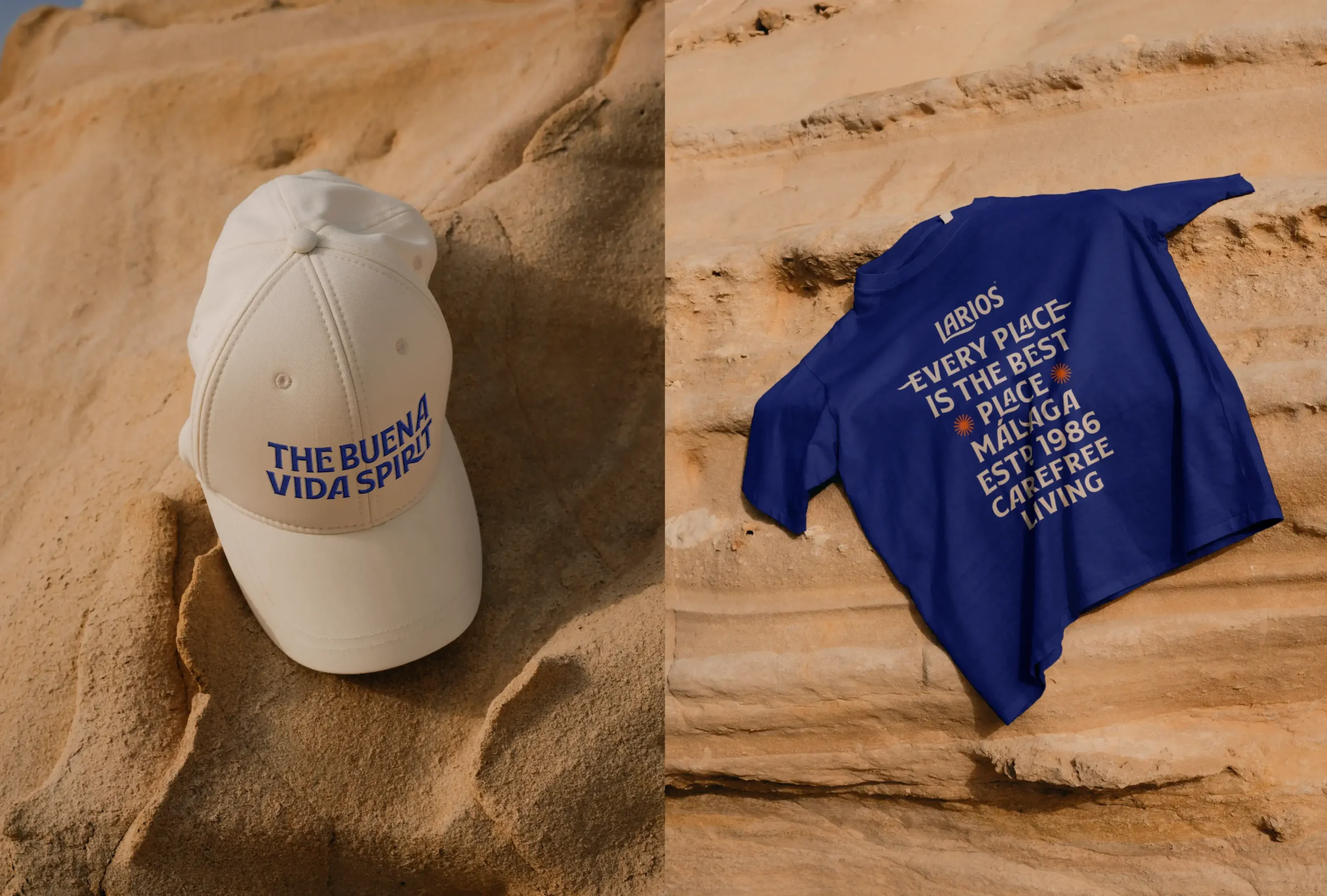
Different materials were explored to inspire future brand activations, both at the point of sale and in HORECA, and to transfer the brand universe to physical spatial elements and the product ritual.
Character
and sensoriality
through botanicals
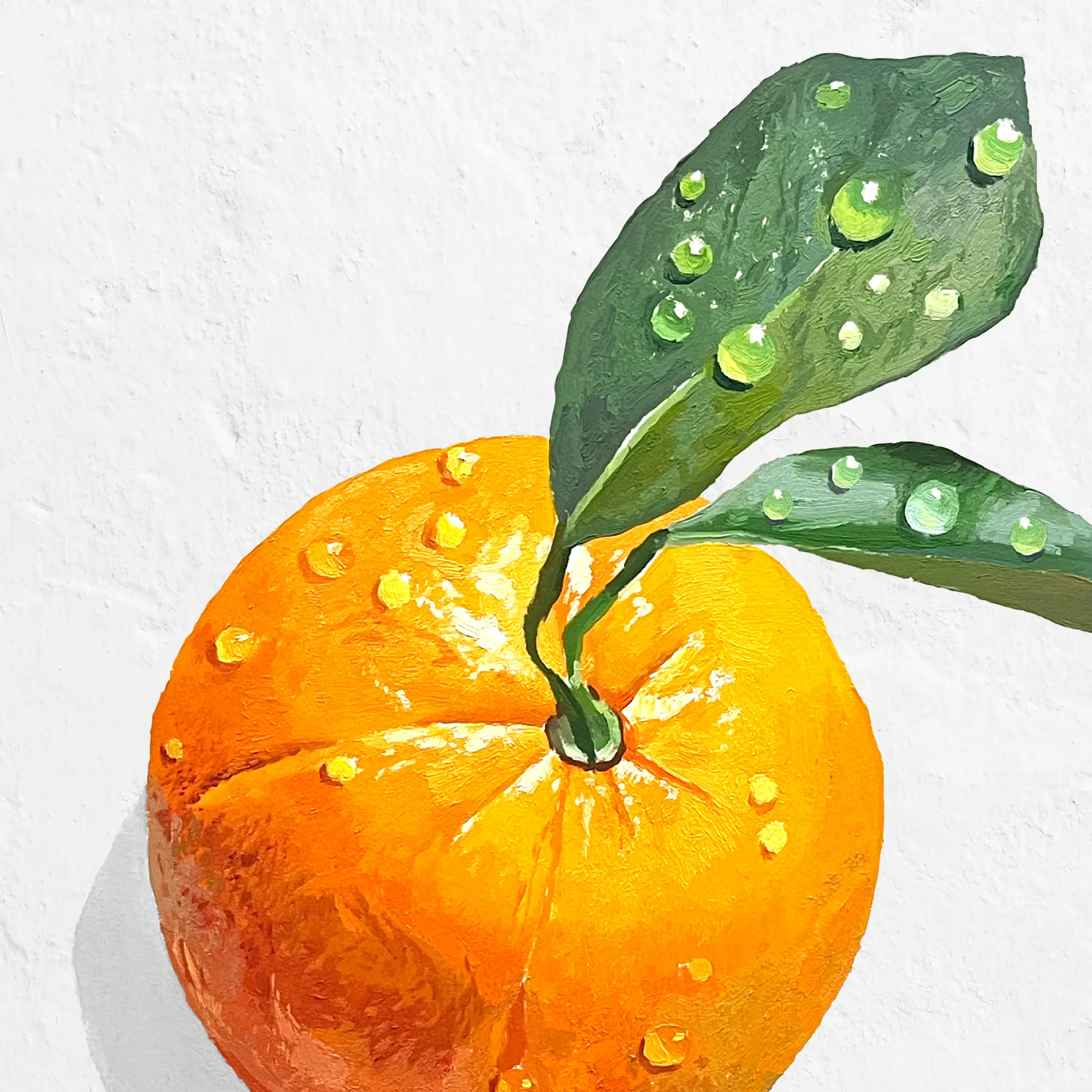
We turned to Antonio Barahona to bring unique artistic touches to the 12 botanical ingredients that star in the Larios visual universe.
These oil-painted illustrations not only bring value and sensoriality to the design, but also help to enhance the quality of the product and represent the aromatic and organoleptic nuances of the different Larios blends.
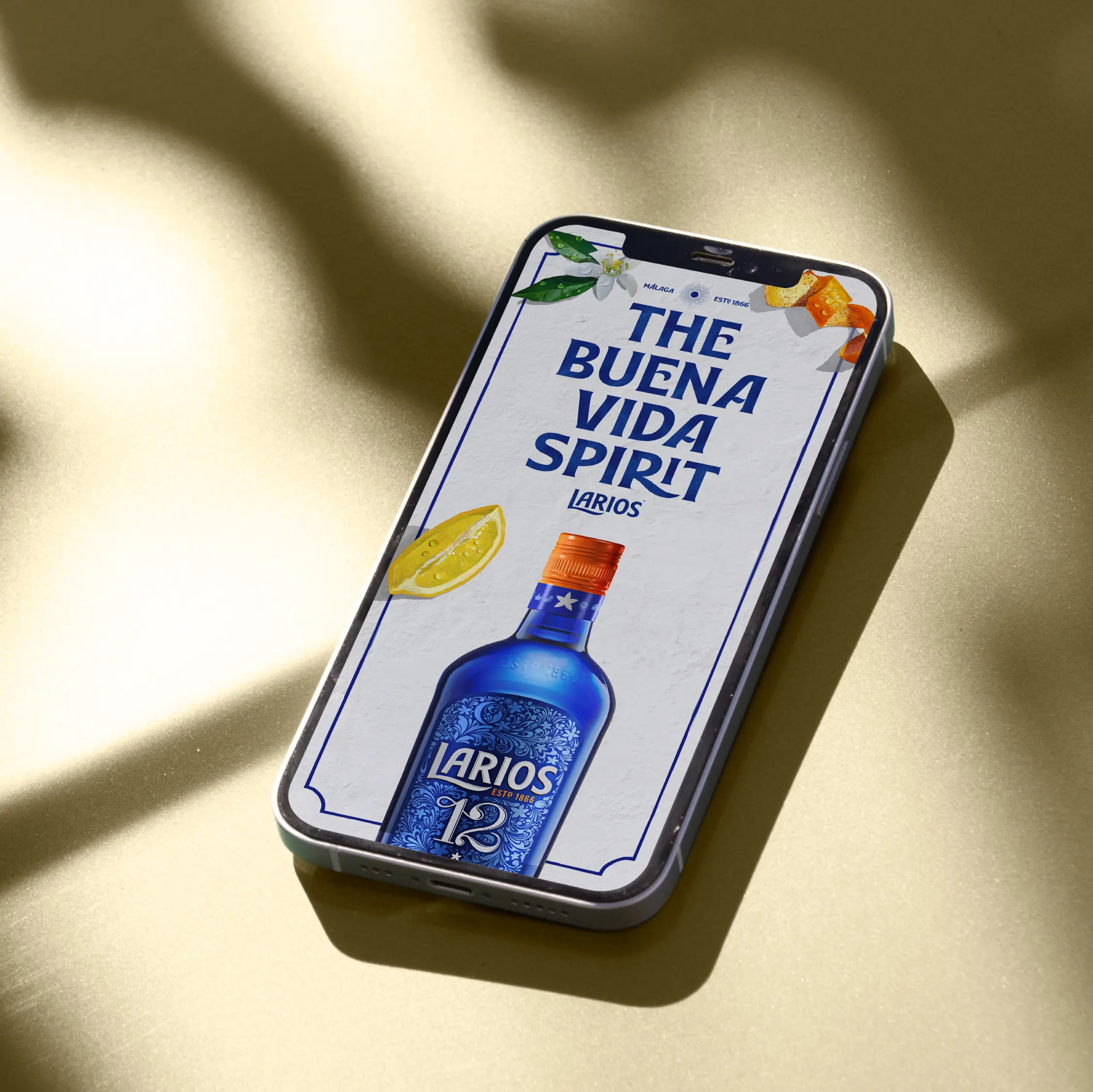
The concept of the Buena Vida and the brand's new visual universe was transferred to its website, where all the assets and language described came to life in the overall look & feel and the spirit of Larios was expressed in every message and concept.