The new identity had to be capable of conveying the organoleptic properties of this product and of reflecting the values of quality, proximity, innovation and cultural tradition associated with Spanish olive oils. We needed to achieve a balance between heritage, know-how and contemporaneity, in order to create the story with which to make this exquisite product known to the world.
A whole cuisine in a single product

-
Services
- Brand Diagnosis
- Brand Positioning
- Visual Identity Design
- Industrial Design
- Naming & Verbal Identity
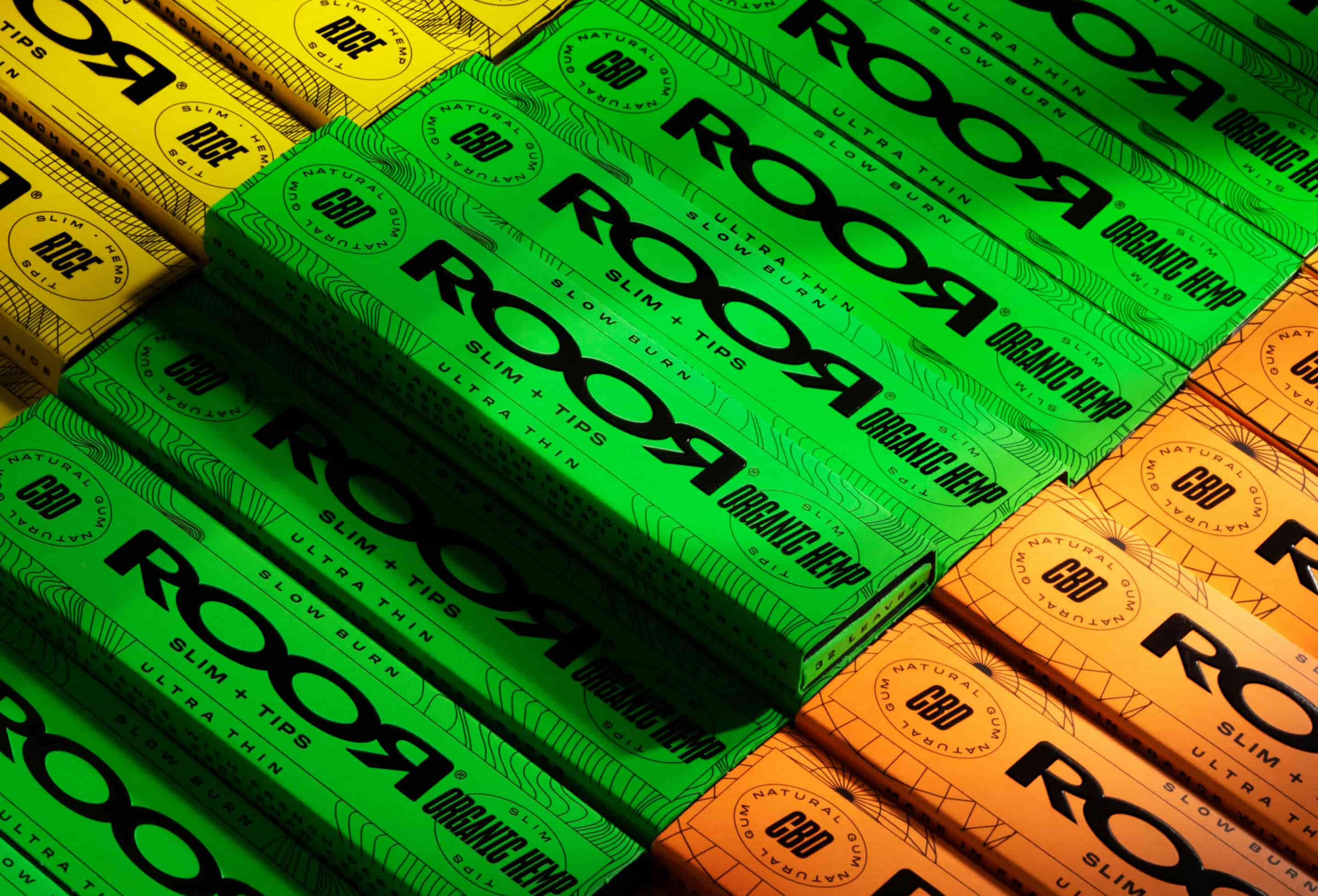
- Packaging Design
- Communication
-
Industry
- Consumer Goods
- Food and Beverage
-
Client
Aceites de Oliva de España
Aceites de Oliva de España is a non-profit interprofessional organization that acts as a prescriber of Spanish olive oil and which, in order to achieve international relevance, needed a brand that represents the essence of an entire cuisine.

Challenge
Iconizing
olive oil
The organization wanted to legitimize Spain's place as an exporter of high quality products on the international market and this would imply unique, iconic and memorable identity.


Solution
Minimum expression
to capture the jewels of our cuisine
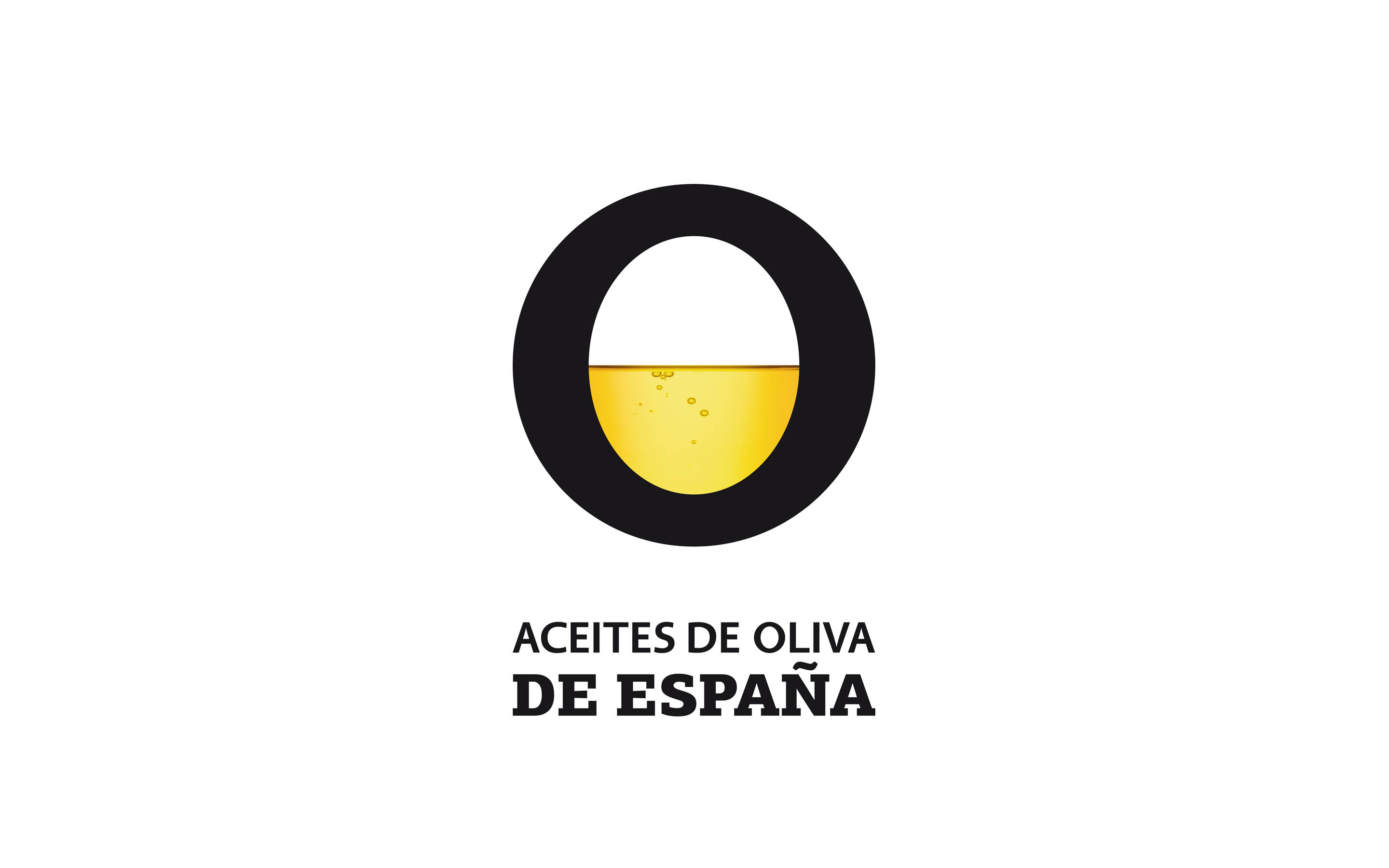
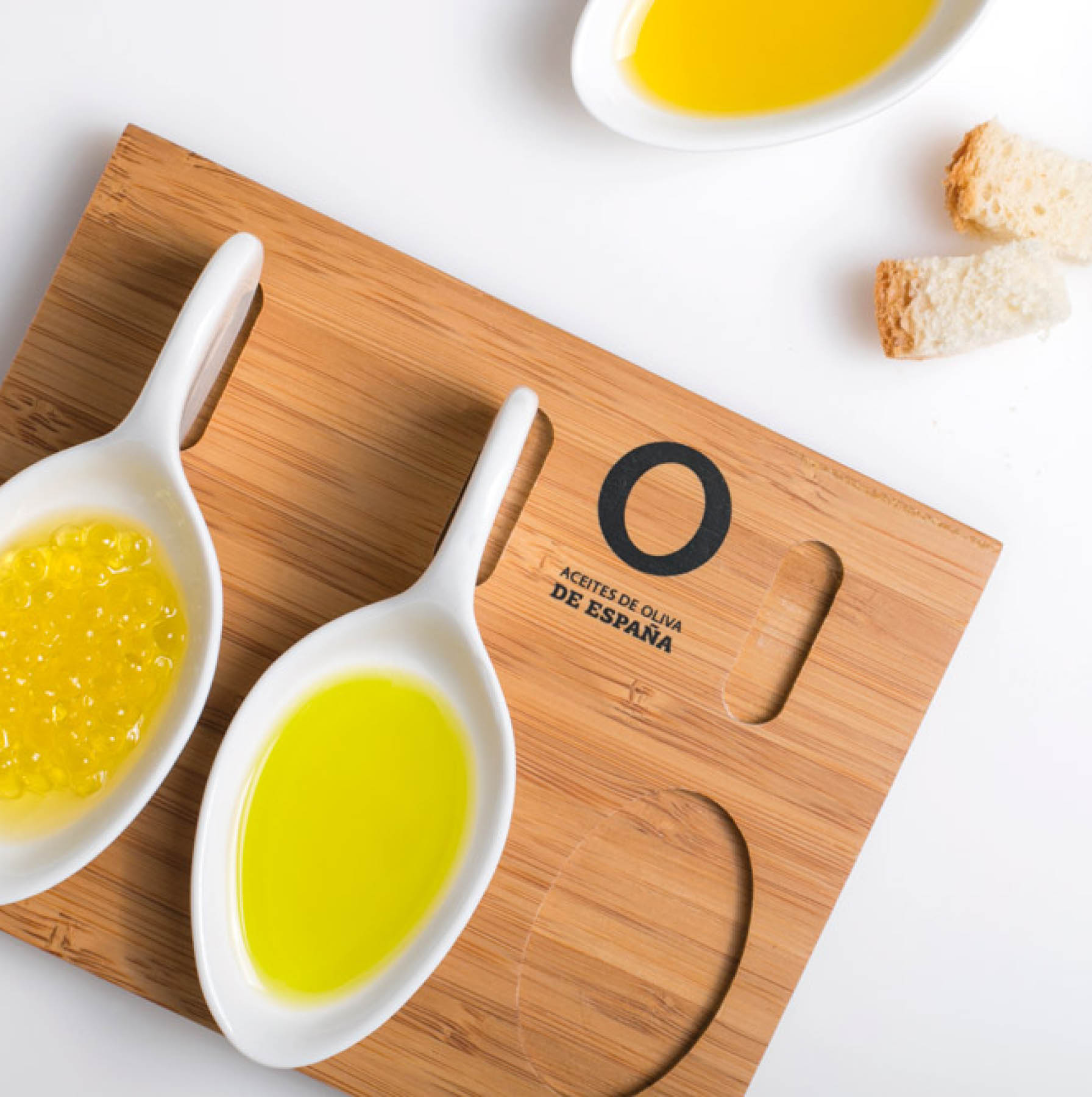
We explored the ingredient, the production and the origin... to come to the conclusion that the reason for everything could be none other than the green olive. Inspired by it, the whole identity was conceived.
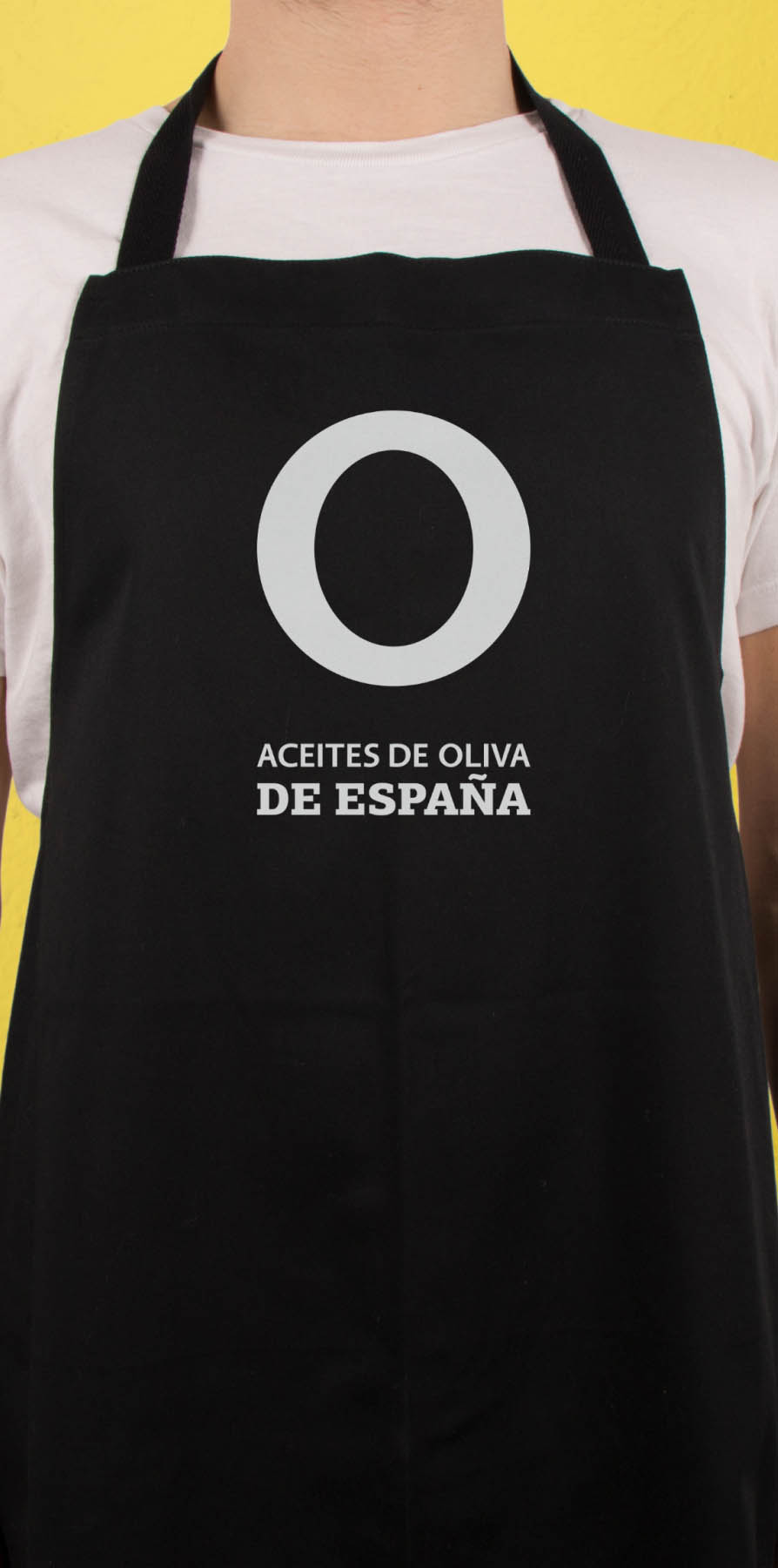
The graphic proposal was based on an O: an encapsulation of this fruit, and also the letter with which the ingredient begins in many languages.
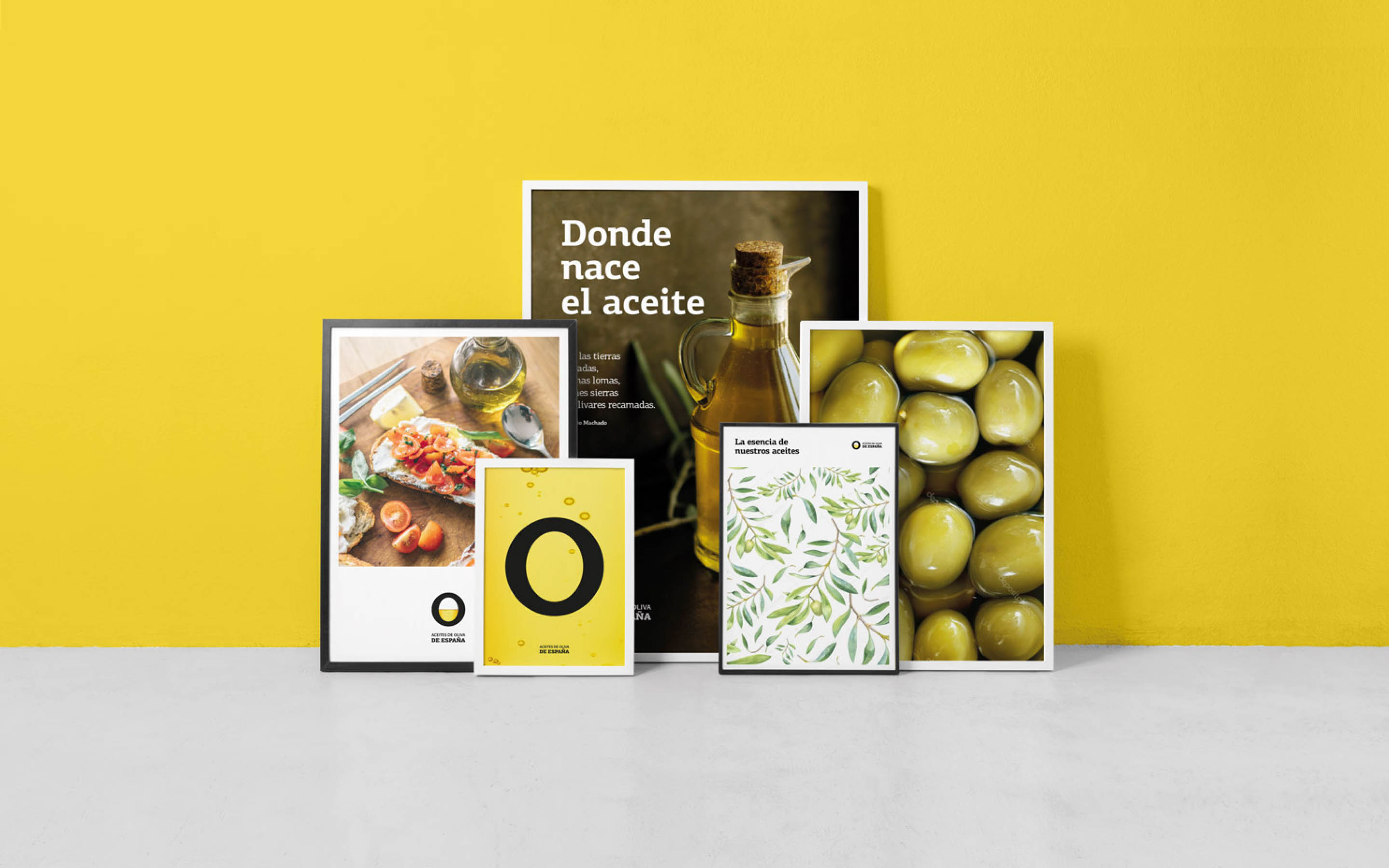
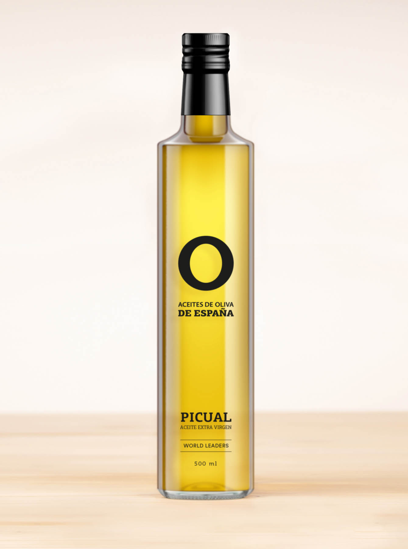
The colour yellow dominates the graphic representations of the brand, as well as being a clear allegory of the oil that expresses the organization’s warm and energetic character. The bright tones together with the solid, clean lines of the design convey the purity, elegance and strength of the product and create a signature brand imagery that is complemented in some applications by textures derived from the oil.
Minimalism
filled with
essence

During the brand creation process, a composition was defined in which the brand descriptor in different languages coexisted with the variety of each oil; in this way, the uniqueness of the product and the legitimacy of the place of origin were accentuated.

See also


Let's talk
Together, we can create something extraordinary
We will collaborate to find the right answer and bring progress to your business and to the world.