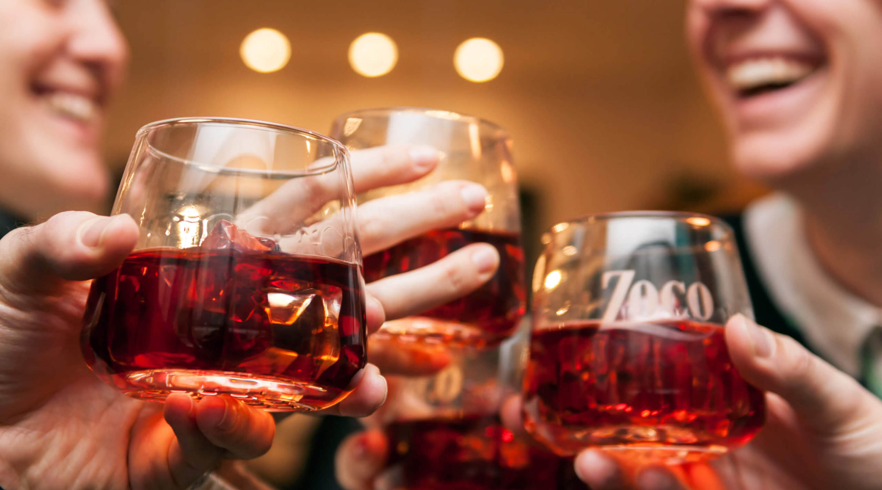
The brand wanted to reconnect with its consumers in the north and reclaim its Navarrese tradition and origin. It was essential to create a strong emotional connection between the brand and its consumer. What’s more, the brand needed to approach younger consumers and women. A new identity had to be created that represented its authenticity, naturalness and tradition from a present-day perspective, but that was also capable of showing an integral concept: moments shared around patxaran.
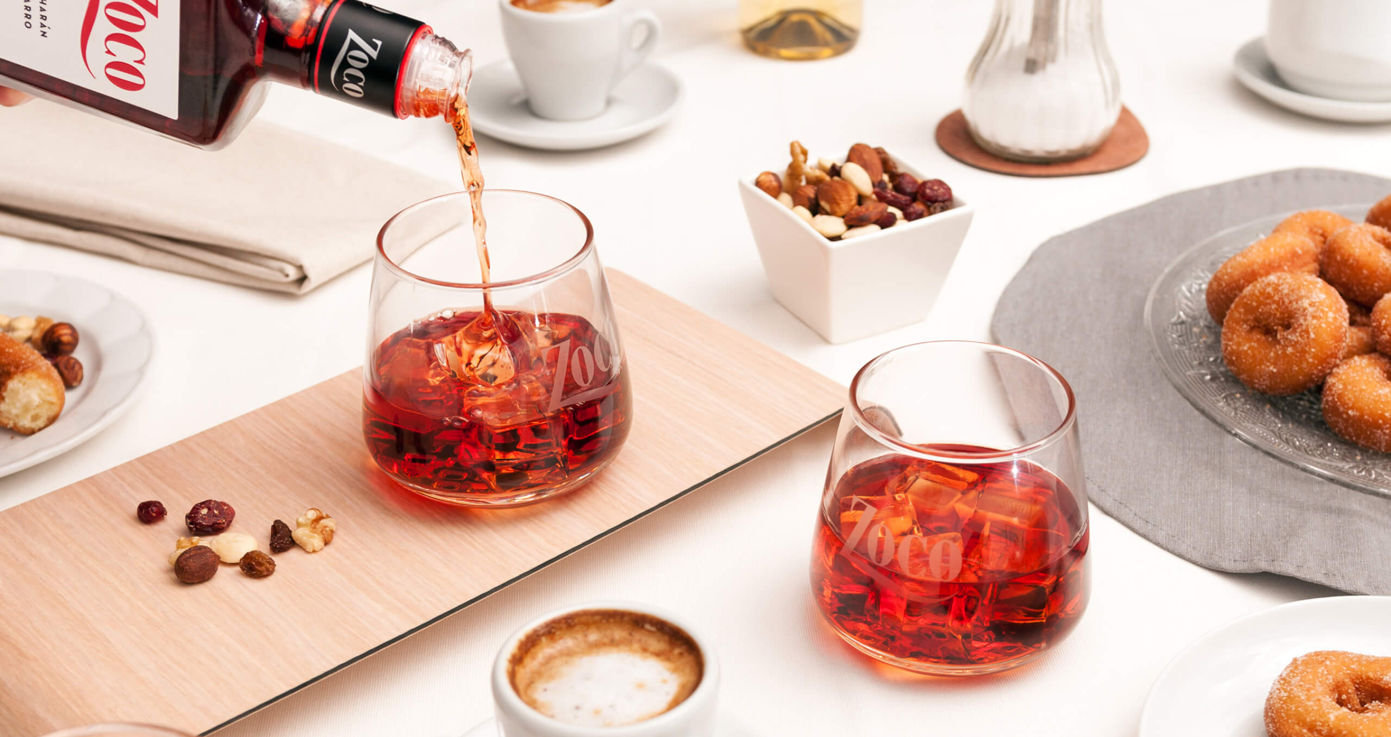
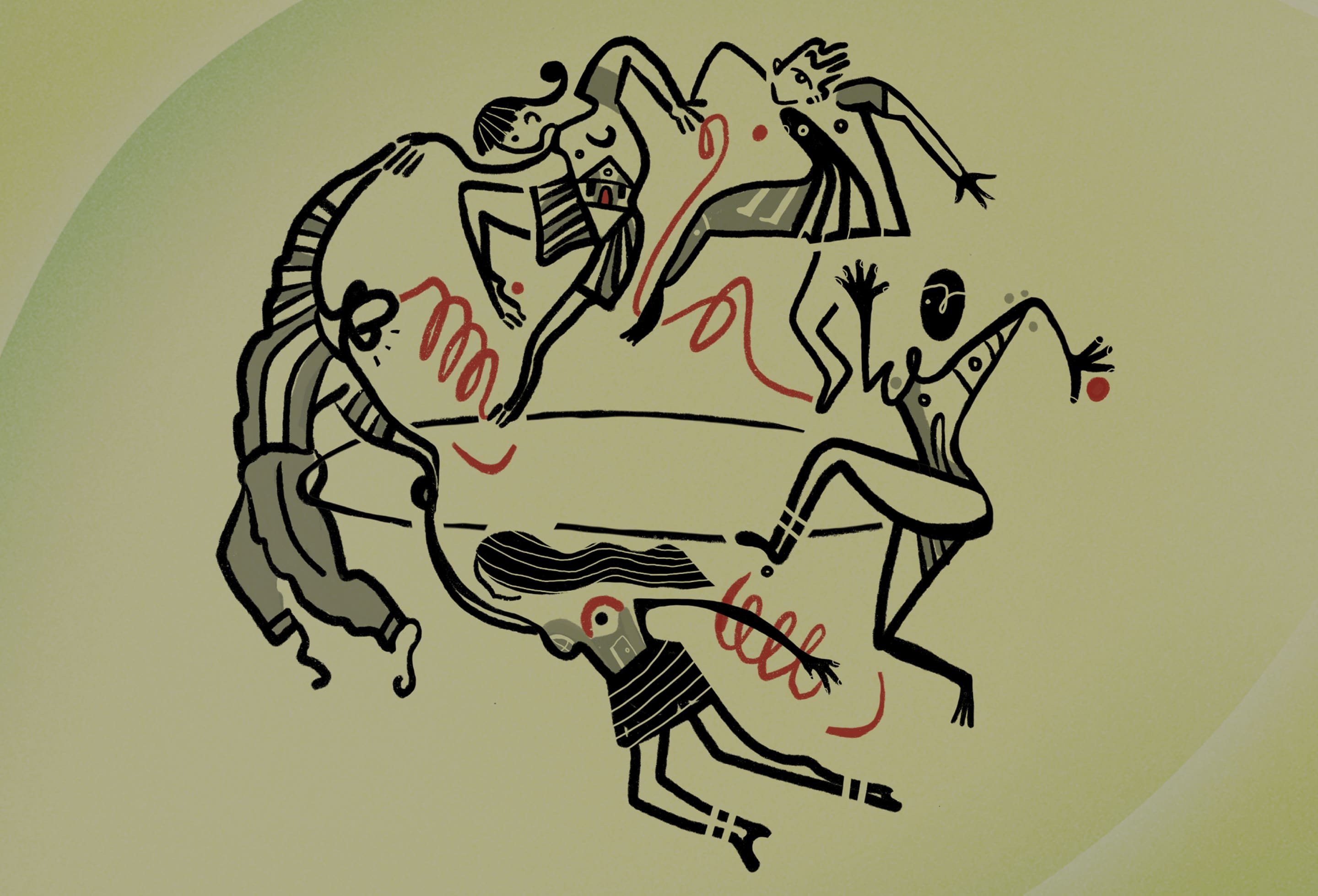
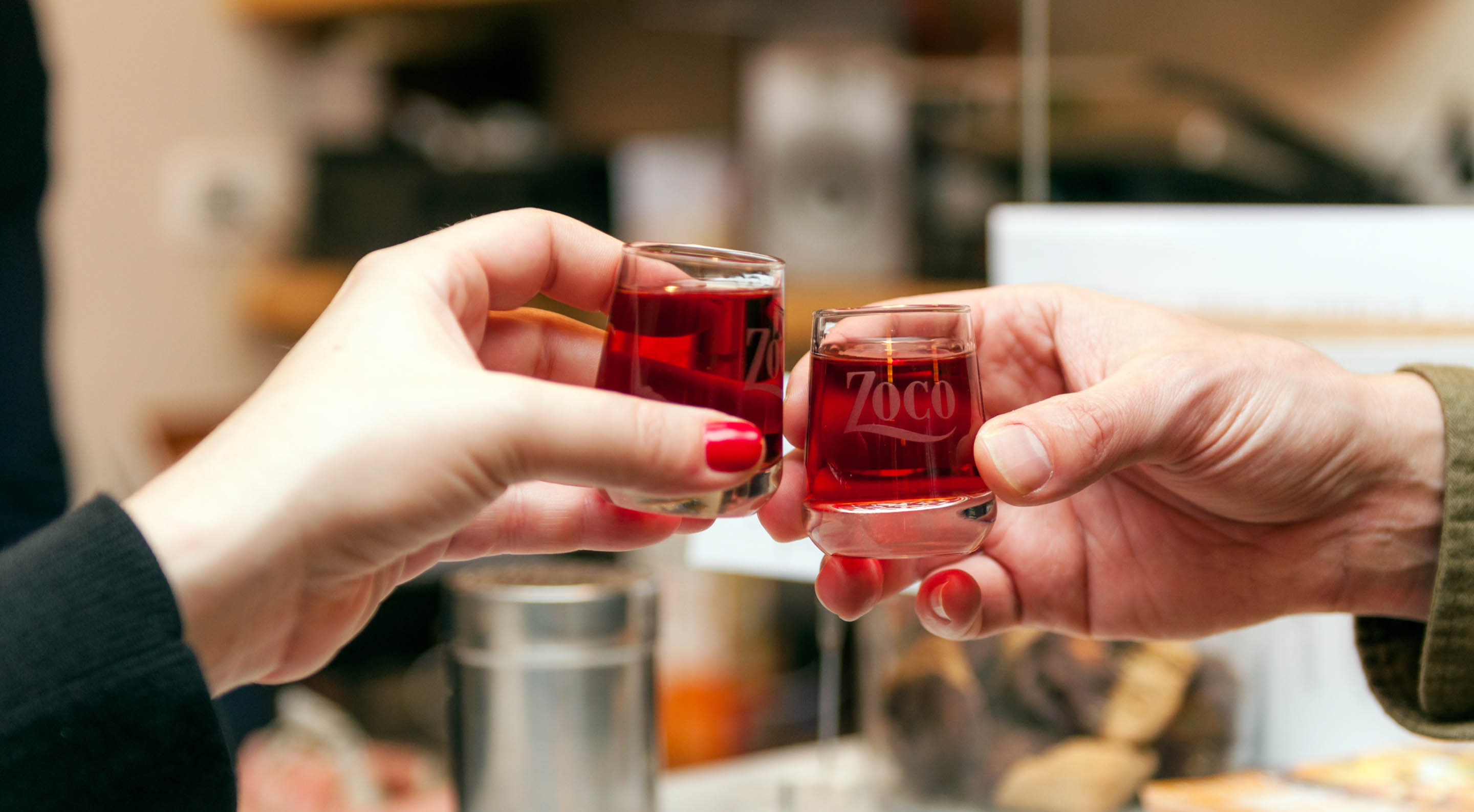
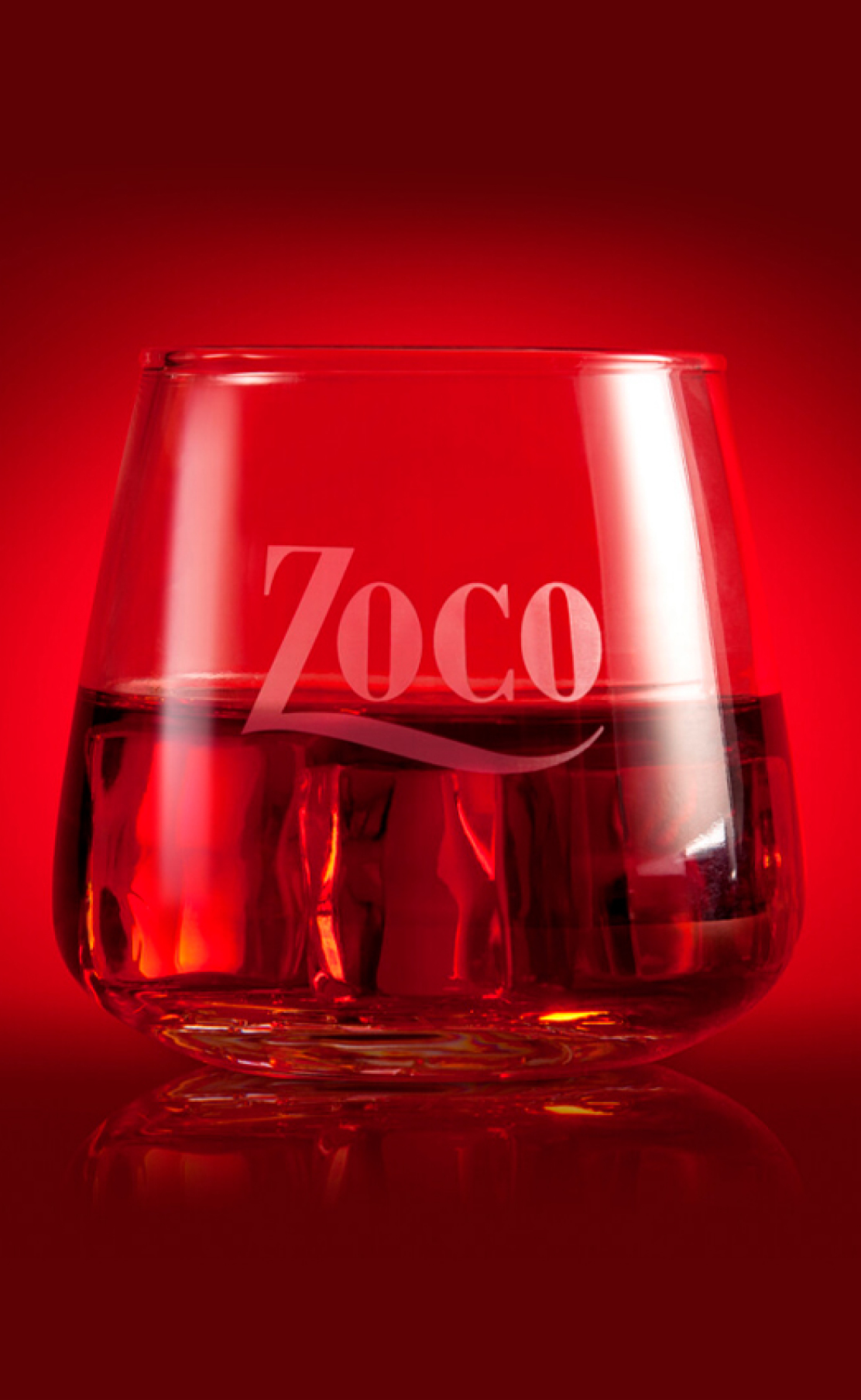
This idea inspired us to use the moment of consumption as a starting point to build the new Zoco identity. Patxaran is a social affair: when the bottle is brought to the table, it is usually time to meet to rekindle anecdotes.
The taste of memories
-
Services
- Brand Diagnosis
- Brand Positioning
- Visual Identity Design
- Industrial Design
- Packaging Design
- Communication
-
Industry
- Consumer Goods
- Food and Beverage
- Wines and Spirits
-
Client
Zoco
Zoco is a patxaran brand with more than 60 years of history. The Navarrese elixir delights the palate and is a centrepiece around which to gather to talk, laugh and build unforgettable moments.

Challenge
Reconnecting with the roots
Claiming its authenticity in its birthplace
Zoco is the highest rated brand in its category in blind tastings. However, in 2016, it had to face an important challenge: despite being the best in terms of quality, it was not well perceived among patxaran consumers, especially in Navarra, its birthplace and the place where this drink is most consumed.


Solution
Conversations
to savour

Under the concept "What really unites us", the Brand Essence conjured its new image. A brand positioning that distills the best stories, of moments shared, of future tales, and of a taste that always awakens memories.
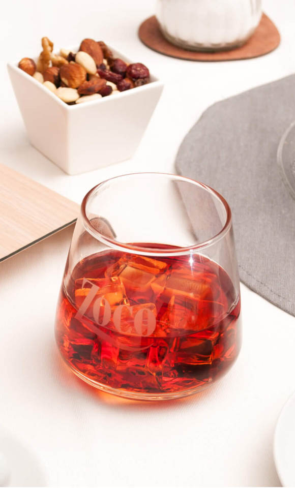
At the same time, the new identity was perfectly aligned with another Zoco's objective: to take moments of drinking pleasure beyond the table-cloth. And so, we continue appealing to a traditional form of consumption that is passed from generation to generation, while celebrating a new way of drinking this liqueur to infuse special experiences.

Moments worth
remembering
are painted
Retaining
the original
essence
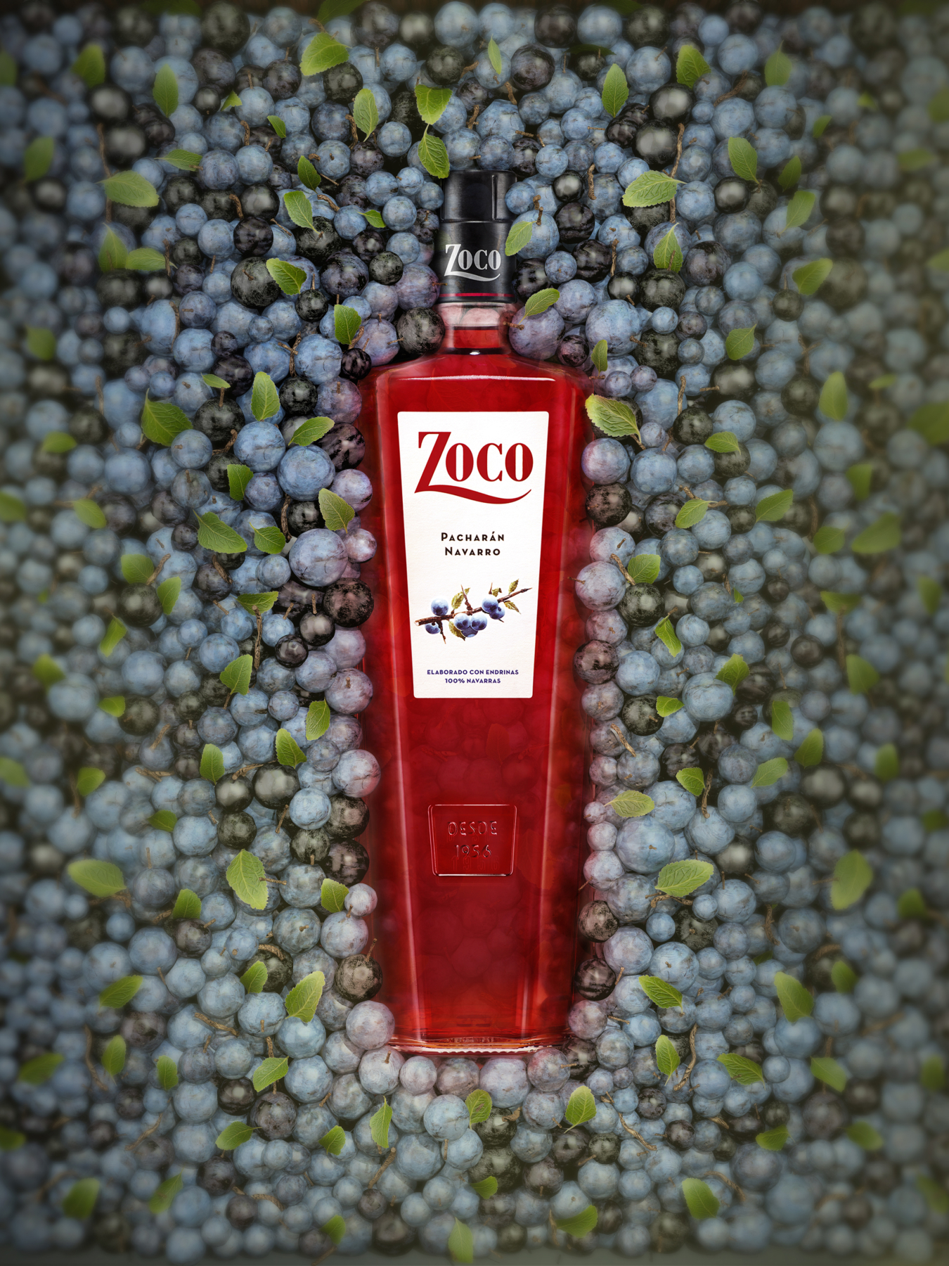
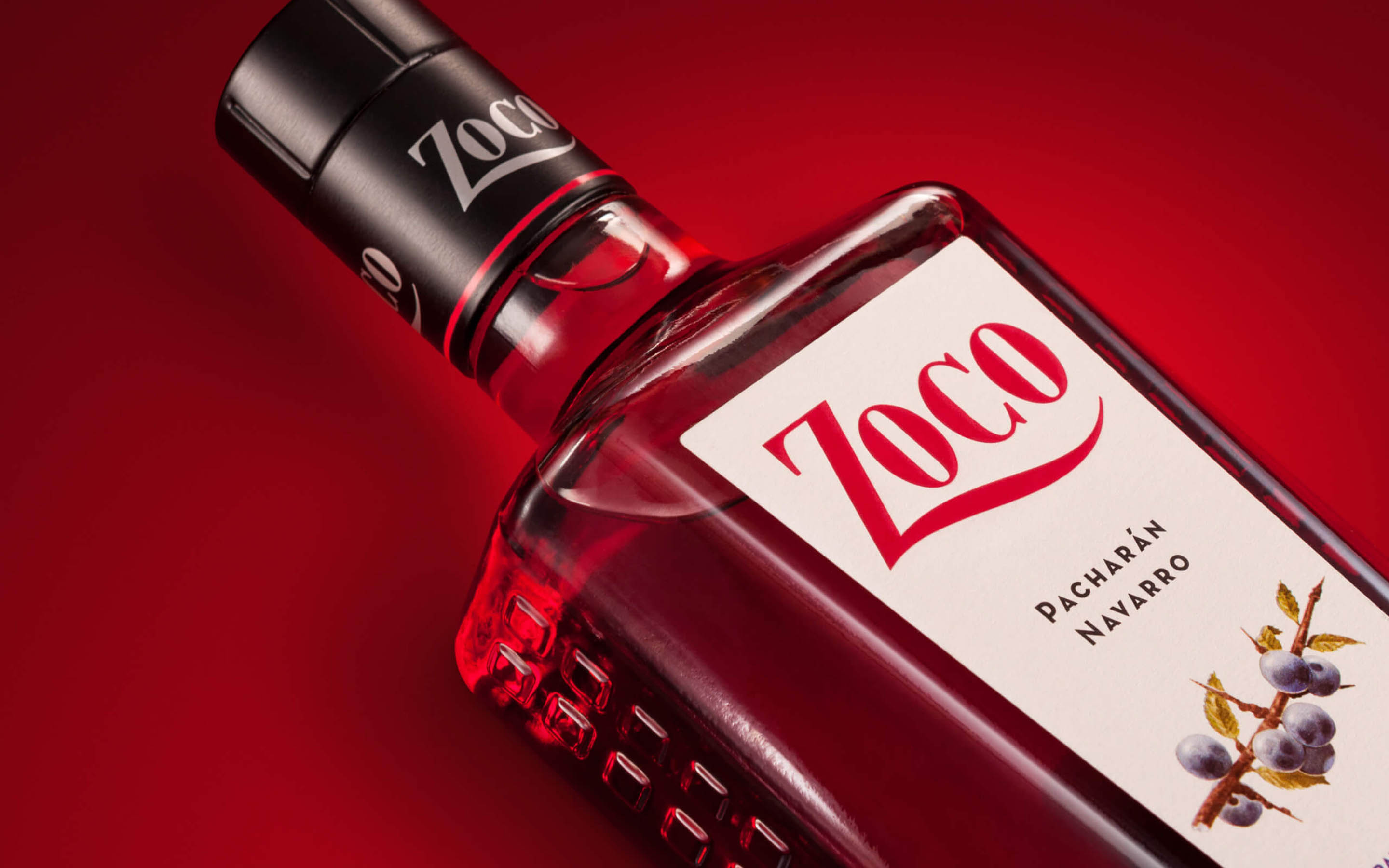
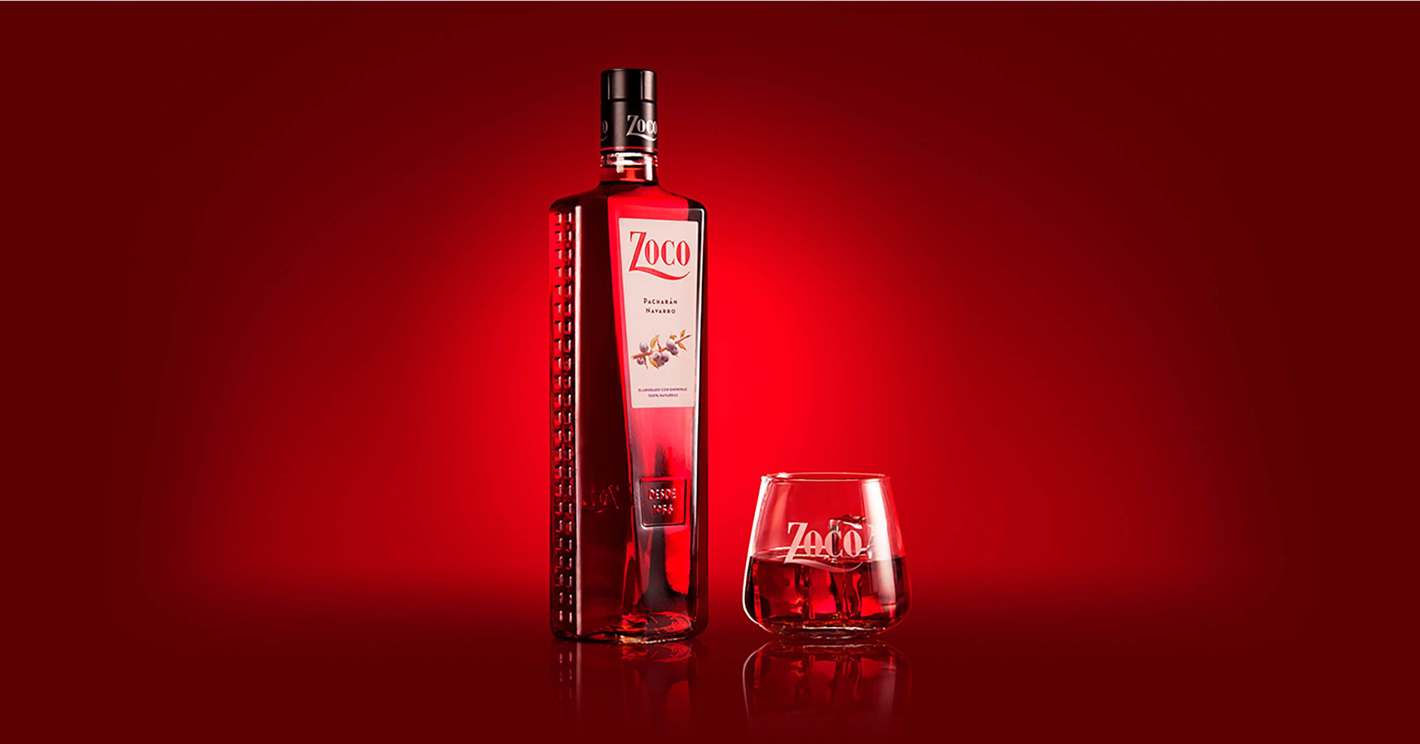
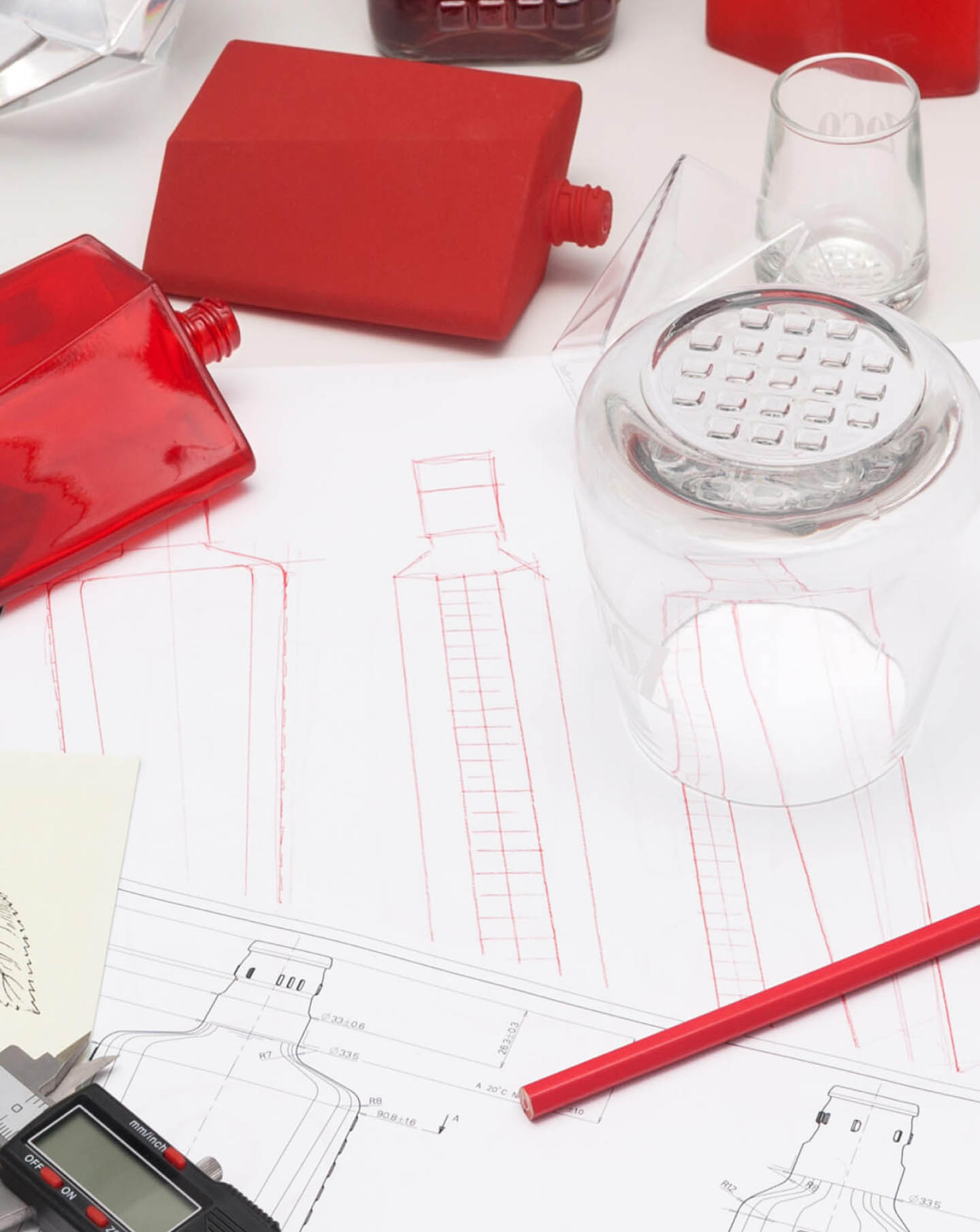
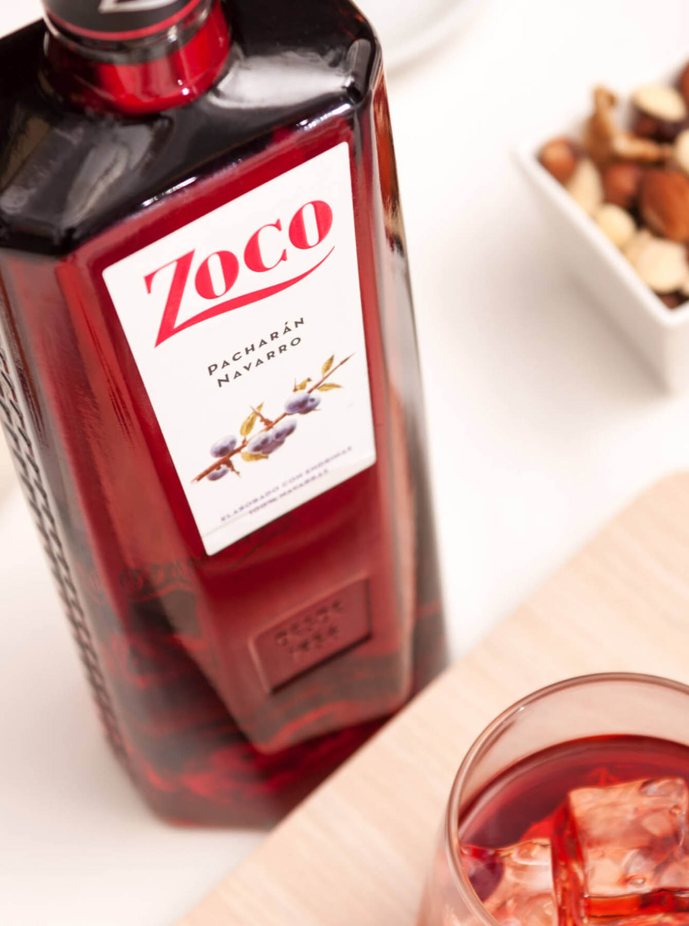
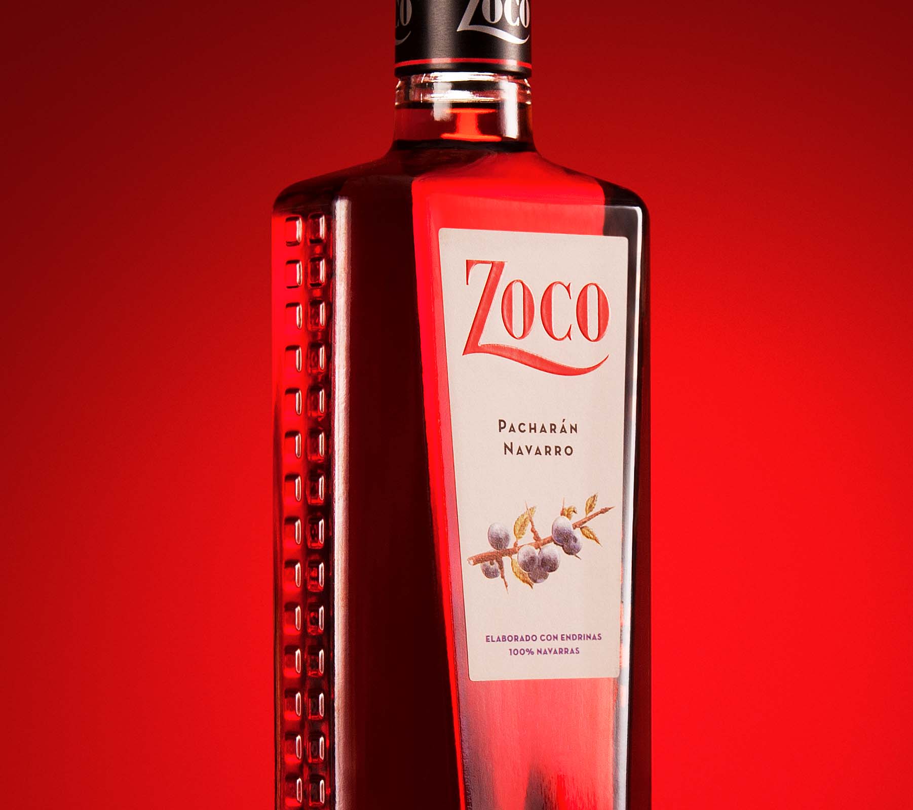
The starting block to build the brand’s new image was its emblematic bottle: an icon of the brand that appeals to tradition and origin.
We opted to evolve the design of the bottle while maintaining its recognition, but with more refined and contemporary lines.
-
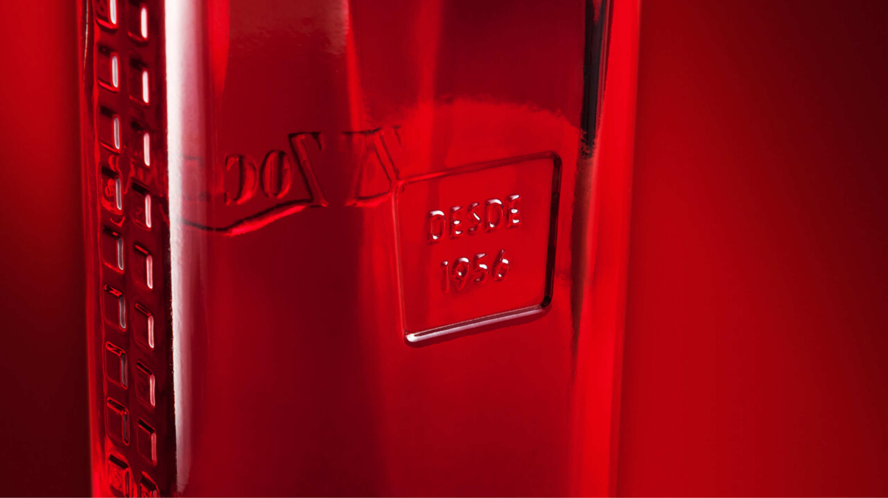
The distinctive transparency of the bottle was preserved, in contrast to the etched glass of other proposals on the market.
-

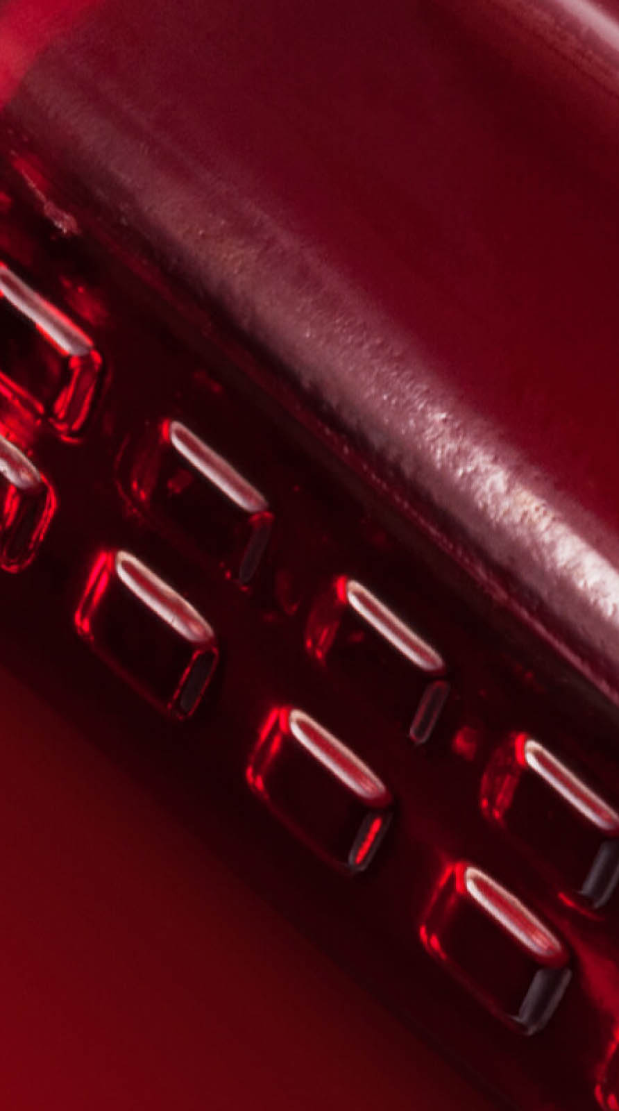
At the same time, certain differentiating elements were maintained, such as the textured relief on the sides.
-

The aim was to create a totem that, when placed on the table, would mark the beginning of past anecdotes and those yet to come.
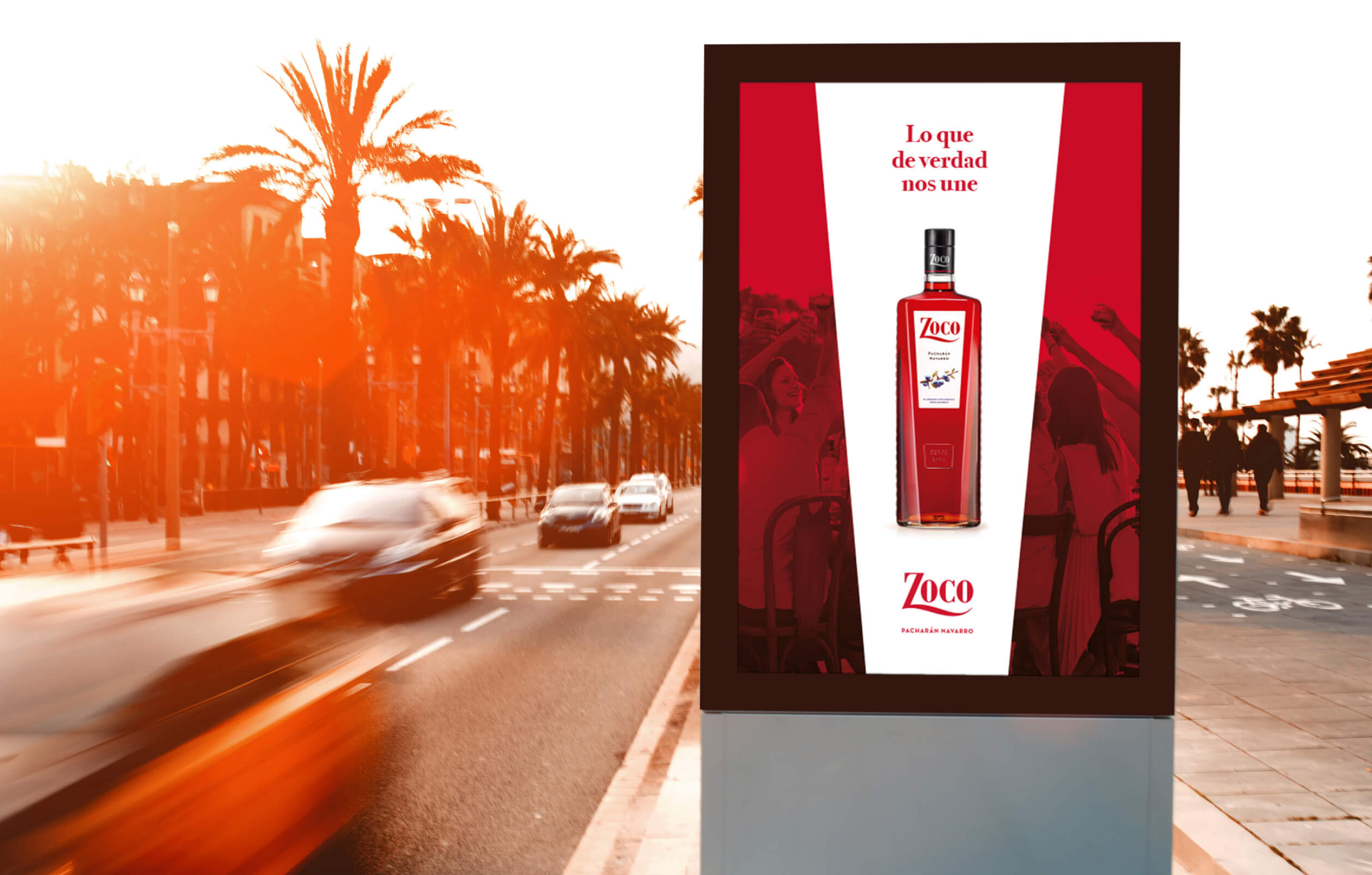

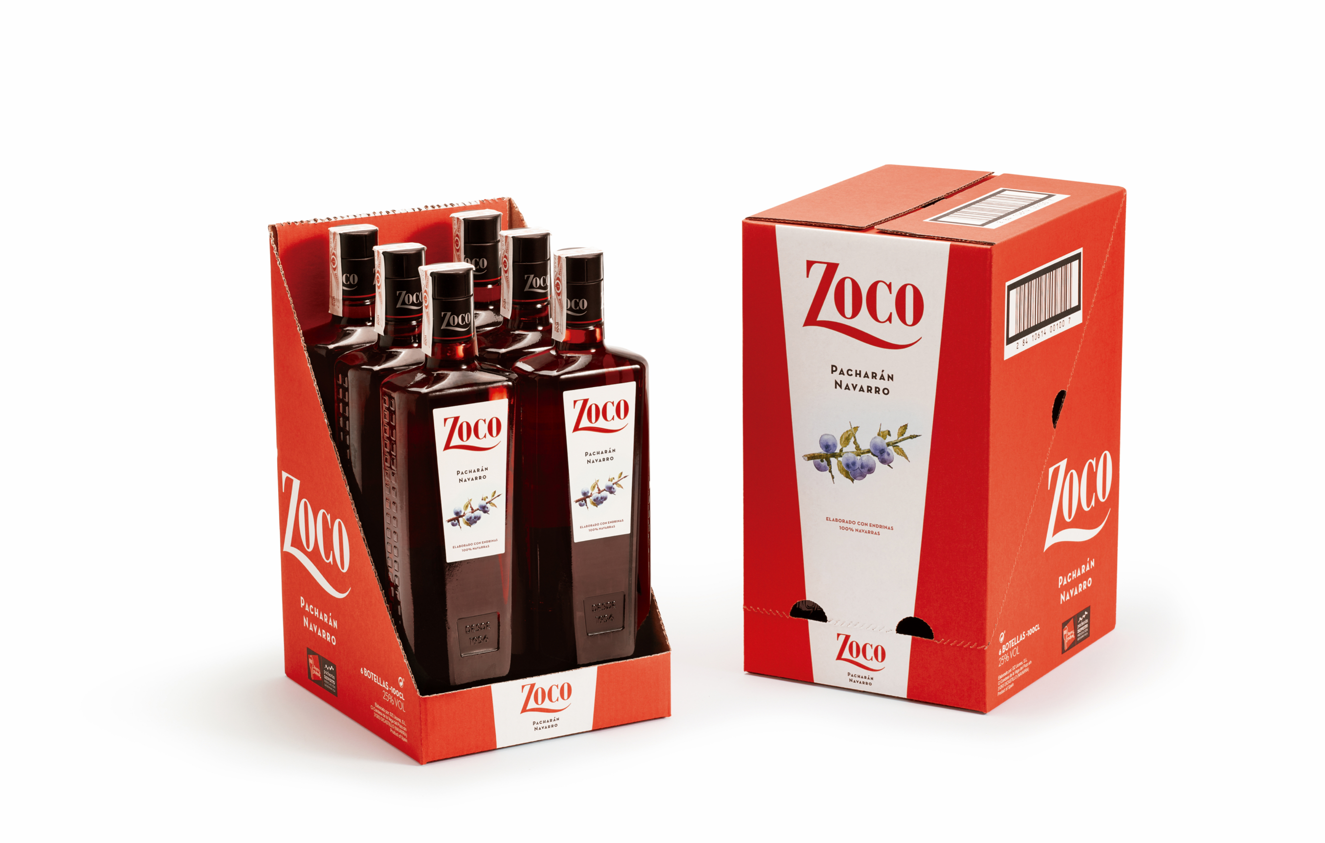
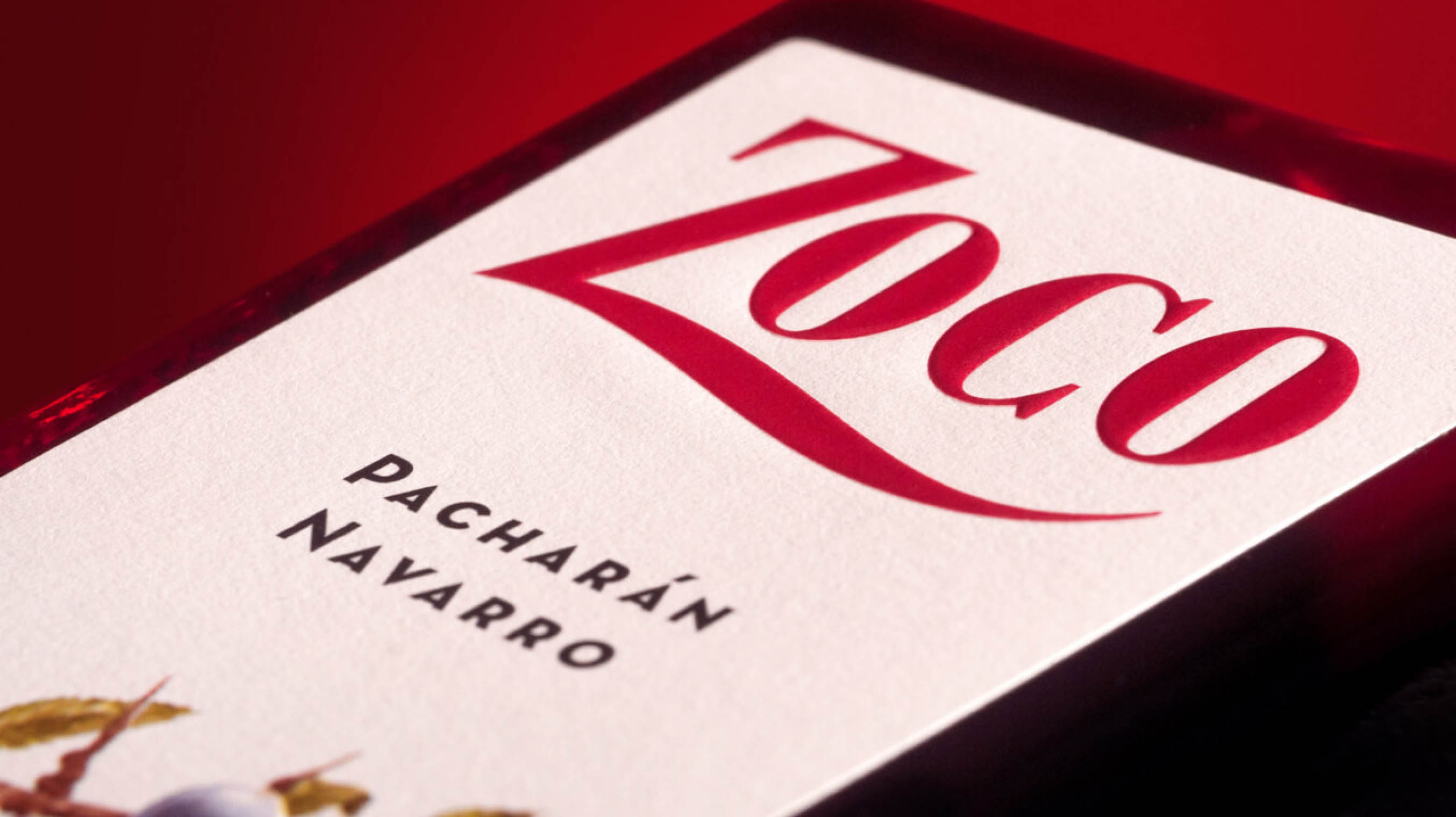
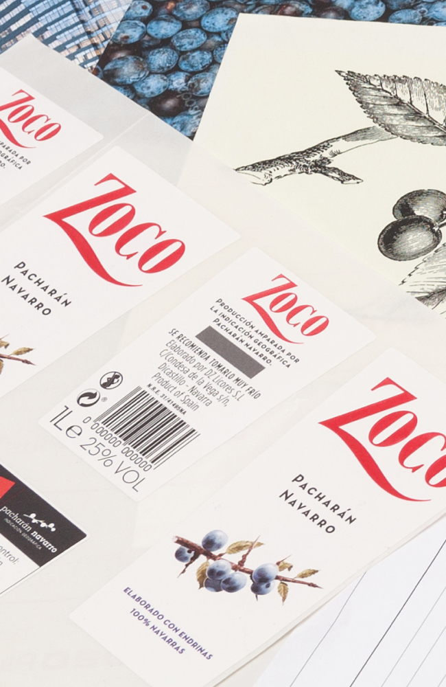
The pack's octagonal design was complemented by a cleaner and more sophisticated label that spotlights the sloe, delivering naturalness and modernity. The diagonal edges of the bottle facing, together with the intense red colour of the visible product, have become two brand assets of the new Zoco that have invaded and inspired the design of the brand's remaining touchpoints and its communication.
