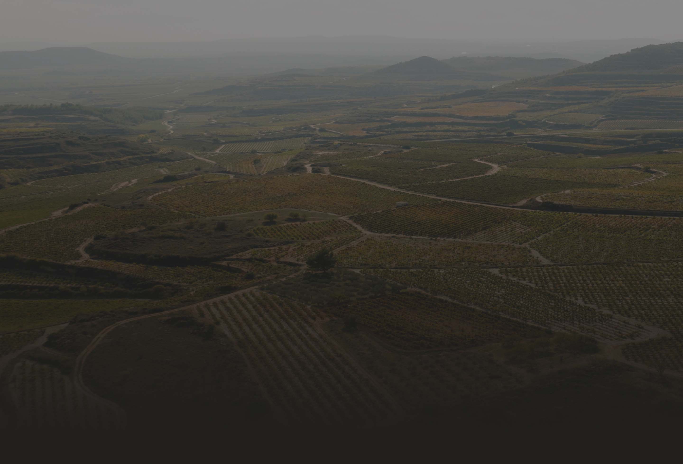
A digital revolution for agriculture
-
Services
- Brand Diagnosis
- Brand Purpose & Beliefs
- Brand Positioning
- Naming & Verbal Identity
- Visual Identity Design
- UX/UI Design
- Editorial Design
- Communication
-
Industry
- Software and Technology
- Consulting and Professional Services
-
Client
MatHolding
We defined the strategy and visual identity of Vegga, a brand created by MatHolding and Sistemes Electrònics Progrés. This digital platform for "Smart Farming" was born to revolutionize agriculture in an efficient and sustainable way.
Challenge
Bringing technology
to a traditional sector
Our challenge was to create a contemporary identity capable of representing precision agriculture: highlighting the innovation, technology and intelligence of a digital platform, as well as its essence, origins and agronomic DNA.

Solution
Combining innovation
with agricultural
tradition

We defined a strategy that reinforced Vegga's agricultural and innovative values and highlighted the expertise and vision of a leader in agrotechnology, giving it a flexible, techy, smart, empathetic and democratic personality.
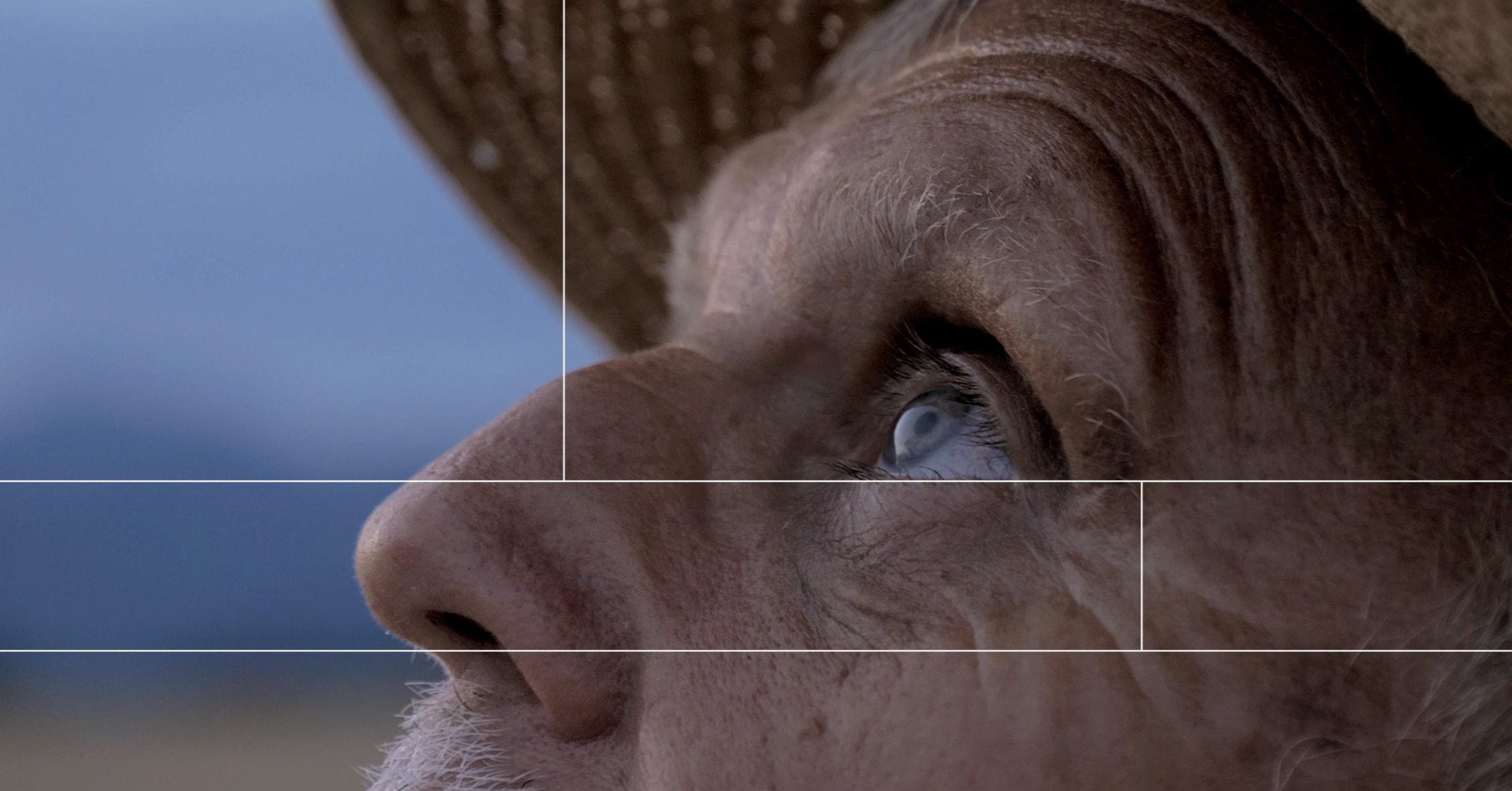
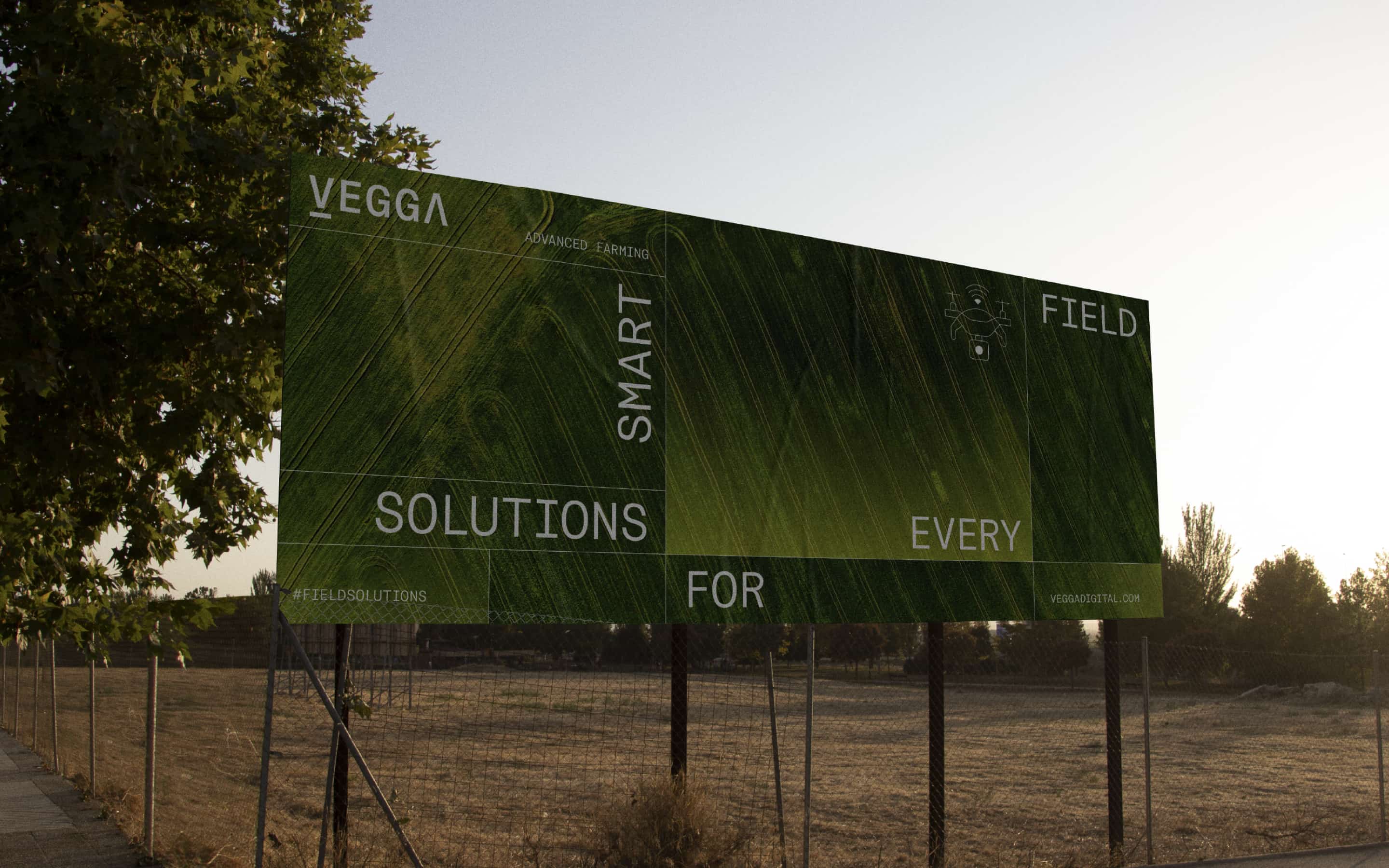
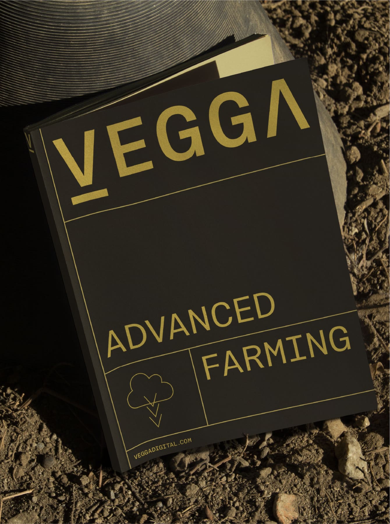
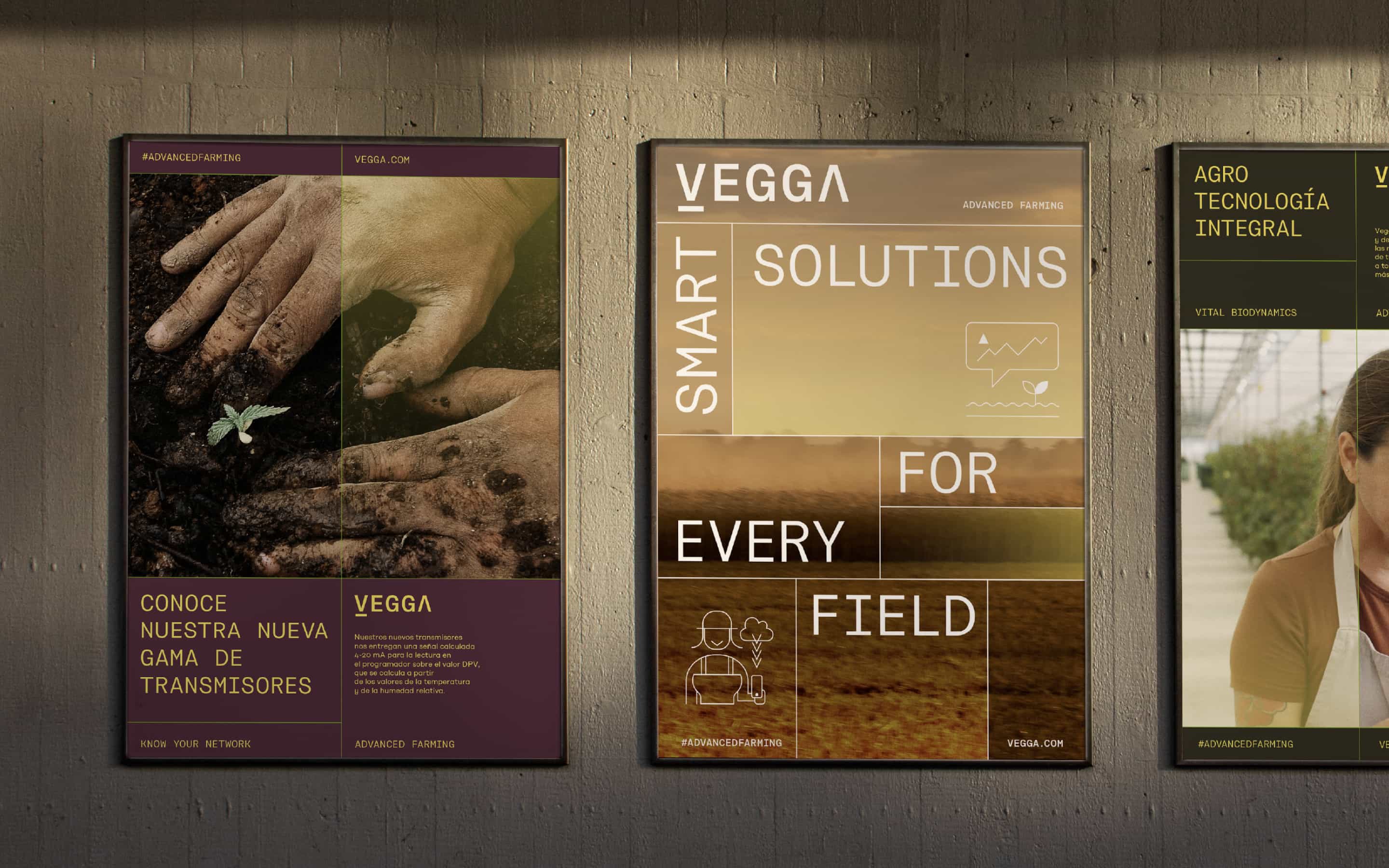
To showcase its efficiency, intelligence and precision, we created the claim "Advanced farming", which puts the farmer at the center and demonstrates how offering 360° solutions can take agriculture to the next level.


Advanced farming,
a claim that puts
the farmer and innovation
at the center


A modern
identity linked to
the rural world

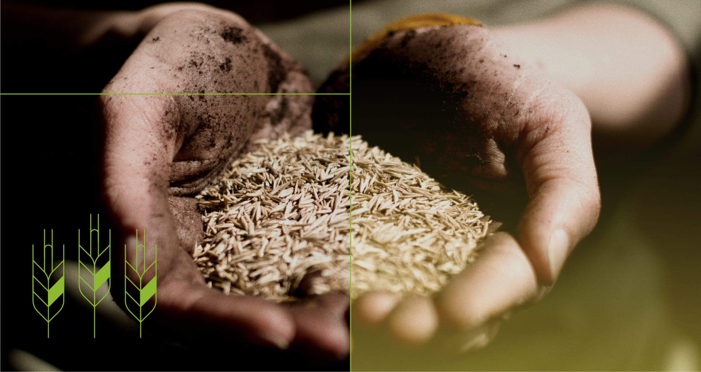
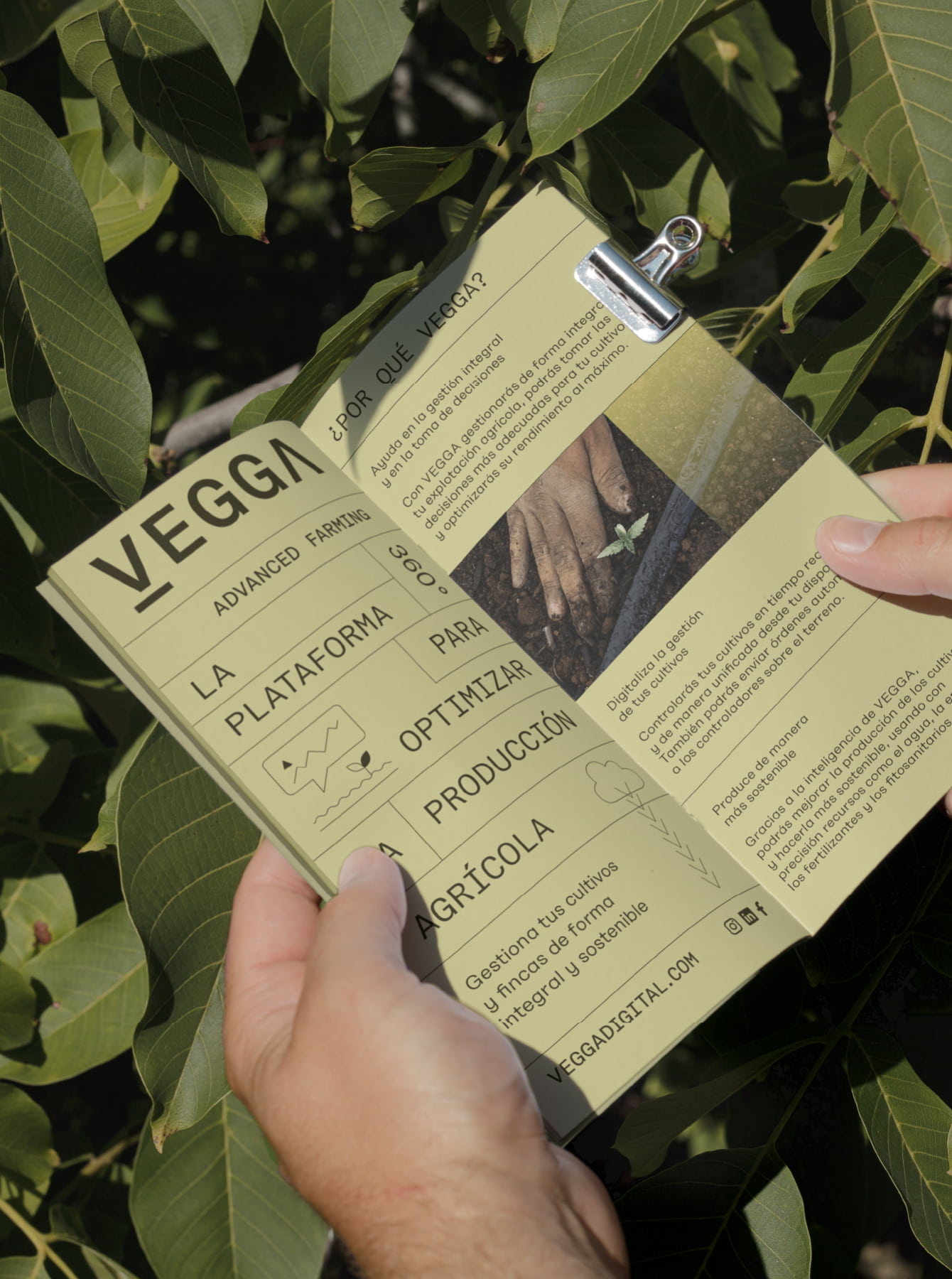
To make a modern and innovative identity, but also one that would be accessible, recognizable and representative of the agricultural world, we sought a concept closely linked to the field.
We designed a logo that symbolized the growth of plants, building from the V of Vegga, an arrow that points to the earth, and in turn grows upwards, and that is combined with a typography that has technological features, making it perfect for digital media, and reflecting both its rural and cutting-edge components.
Plot-inspired
grid system
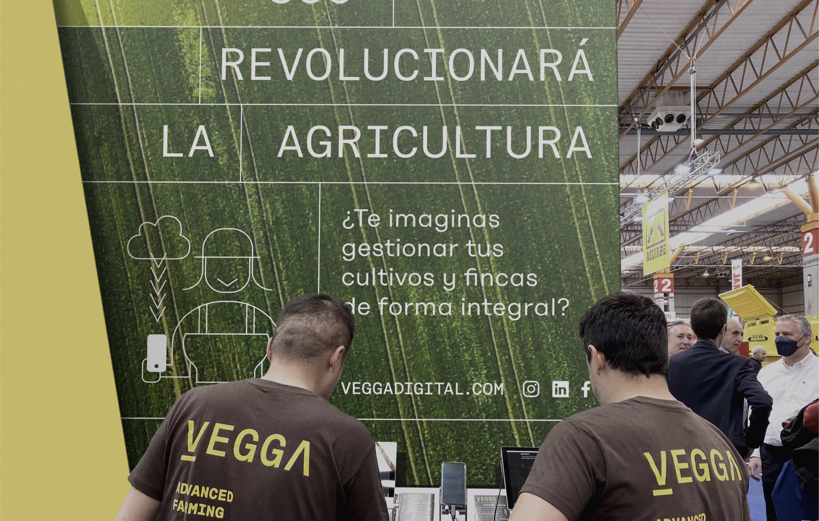
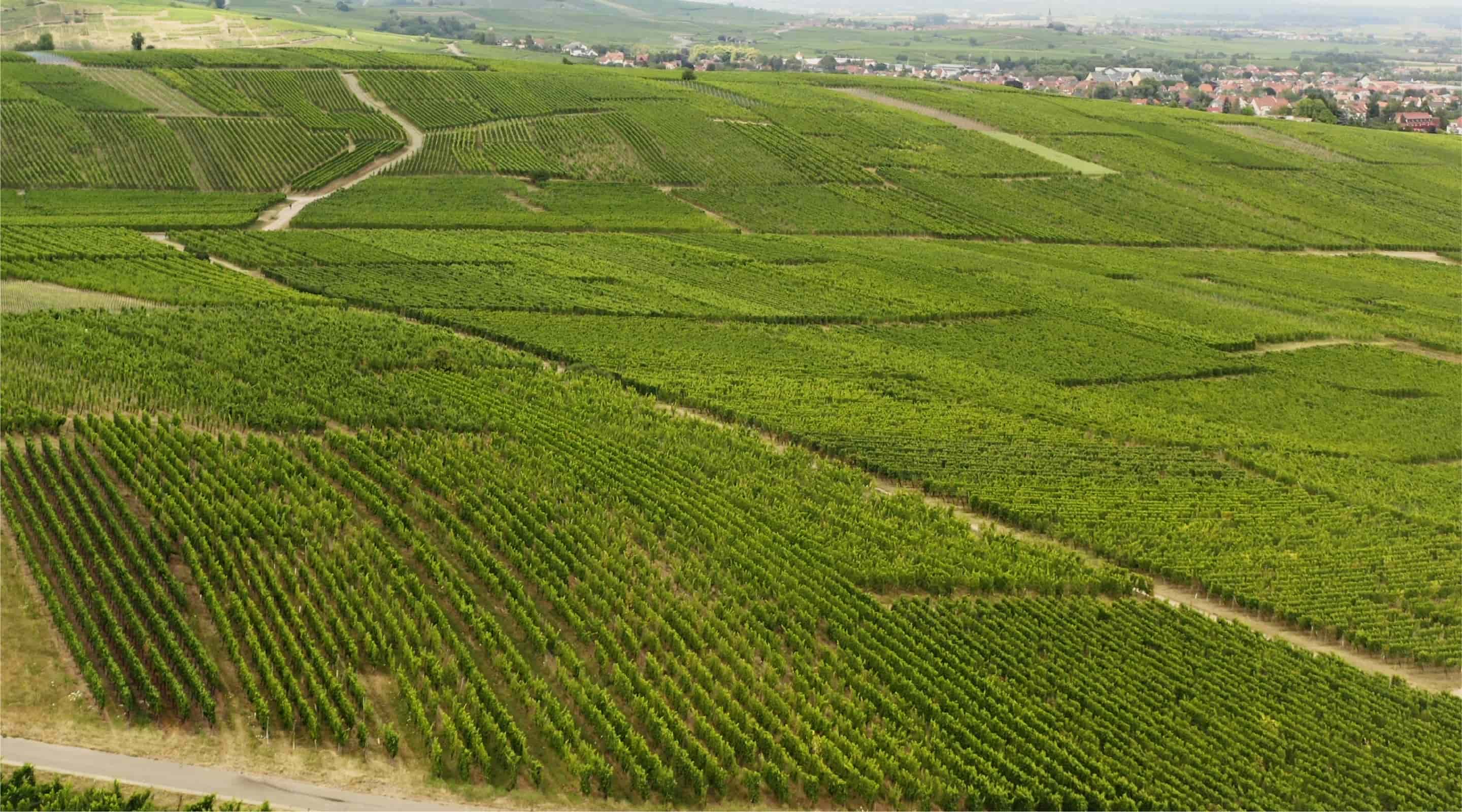
Vegga's language is based on the grid maps that divide plots of land. We created a variable grid system that evokes the countryside, while revealing how each solution adapts to each type of farm.
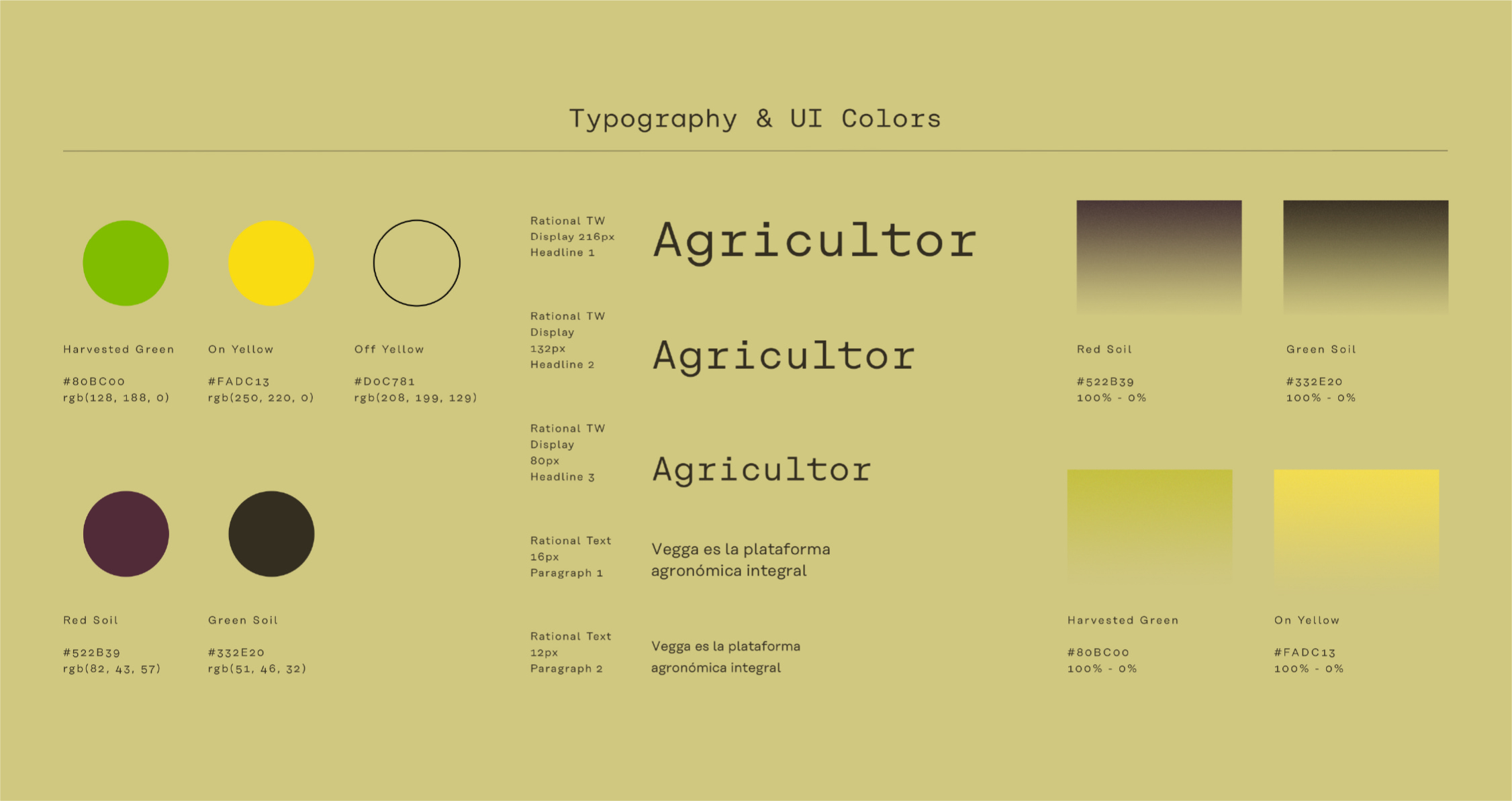
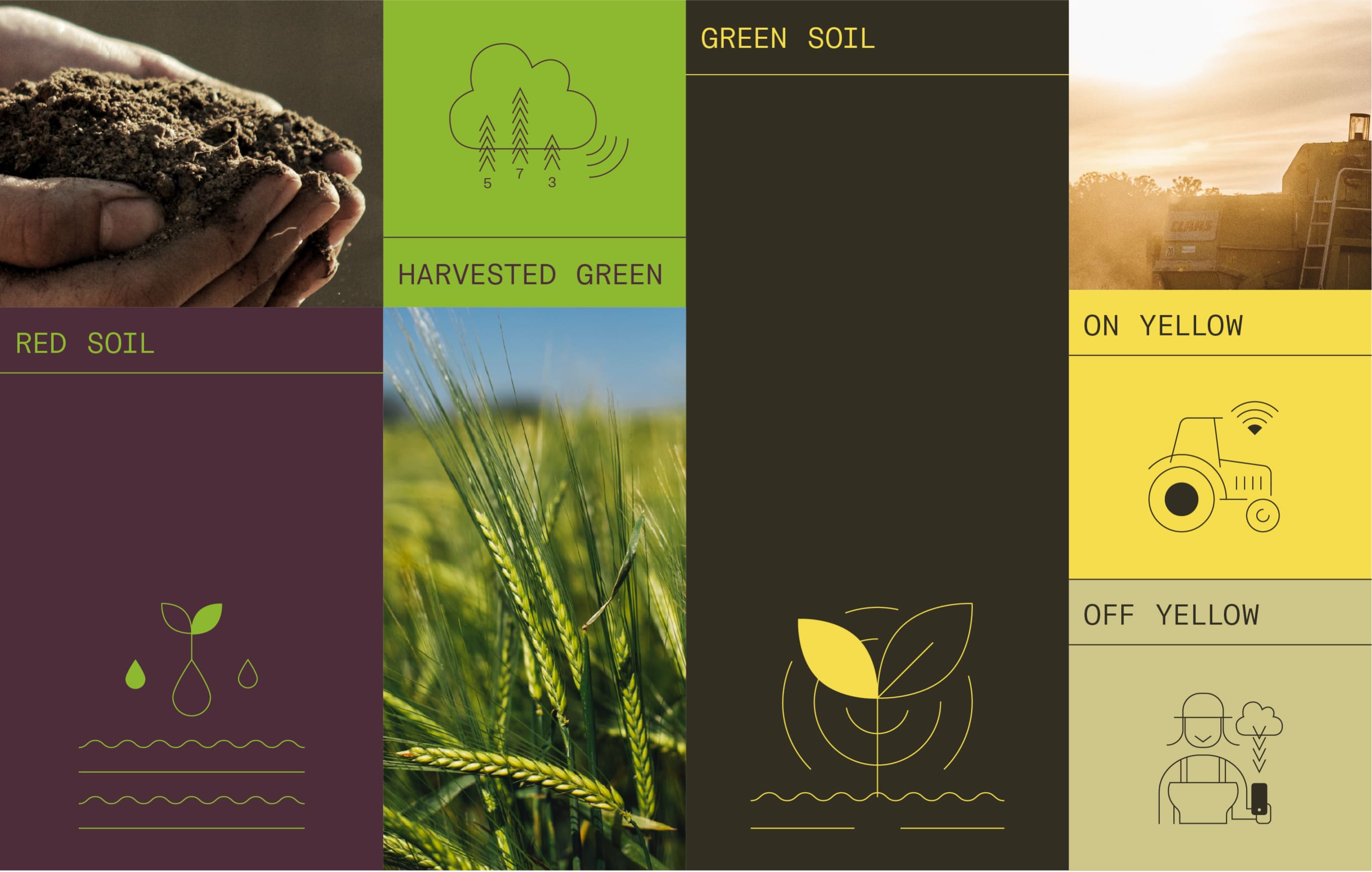
Using the Rational TW Display typography, which transmits technology and digitalization in a friendly style, and representing the land with earthy and yellow colors contrasted with a luminous green, we devised a modern and innovative identity anchored to the agricultural world.
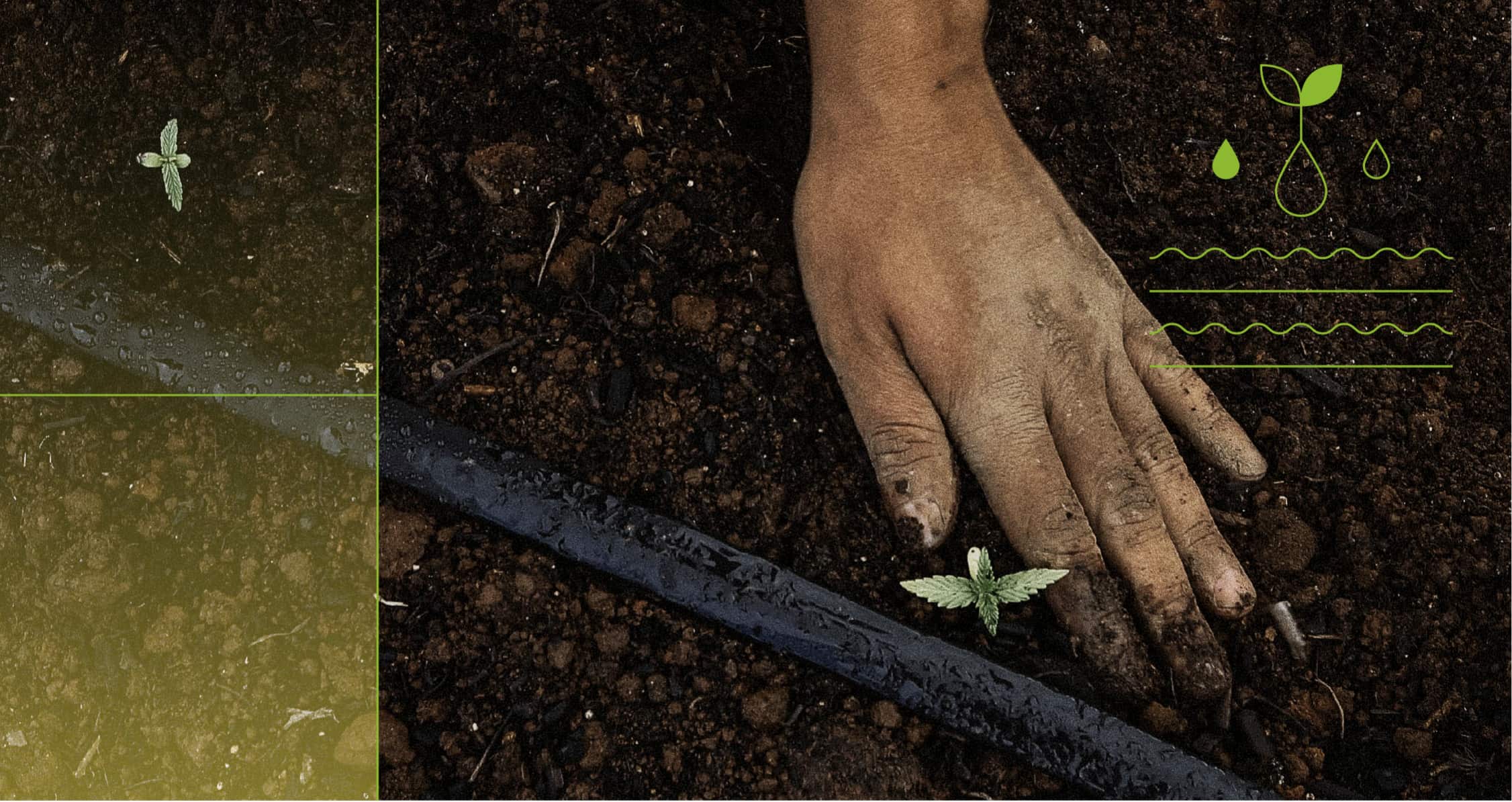
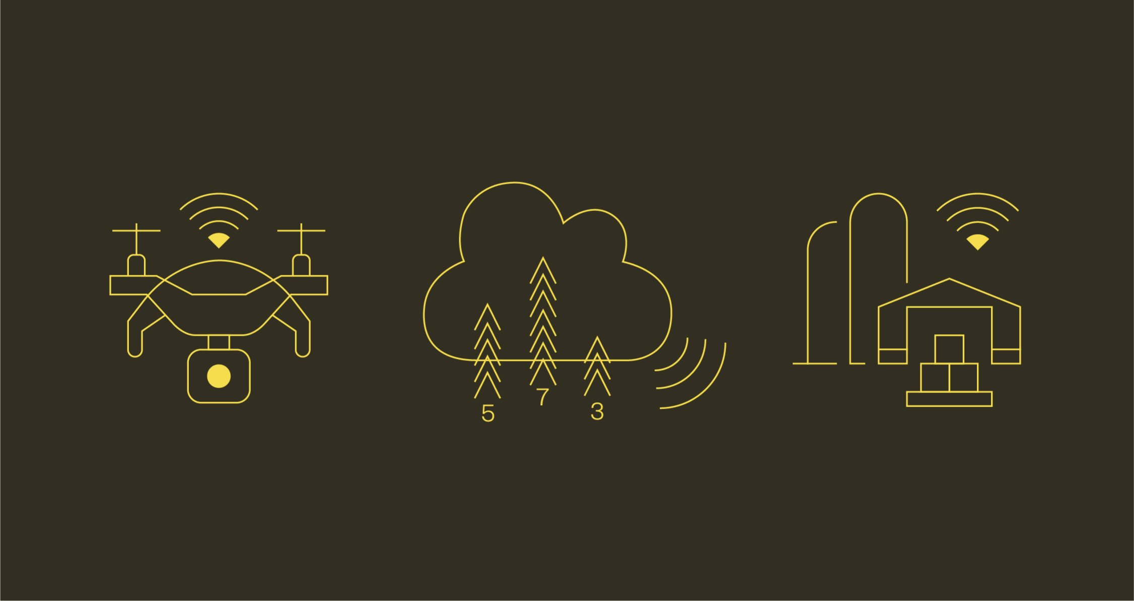
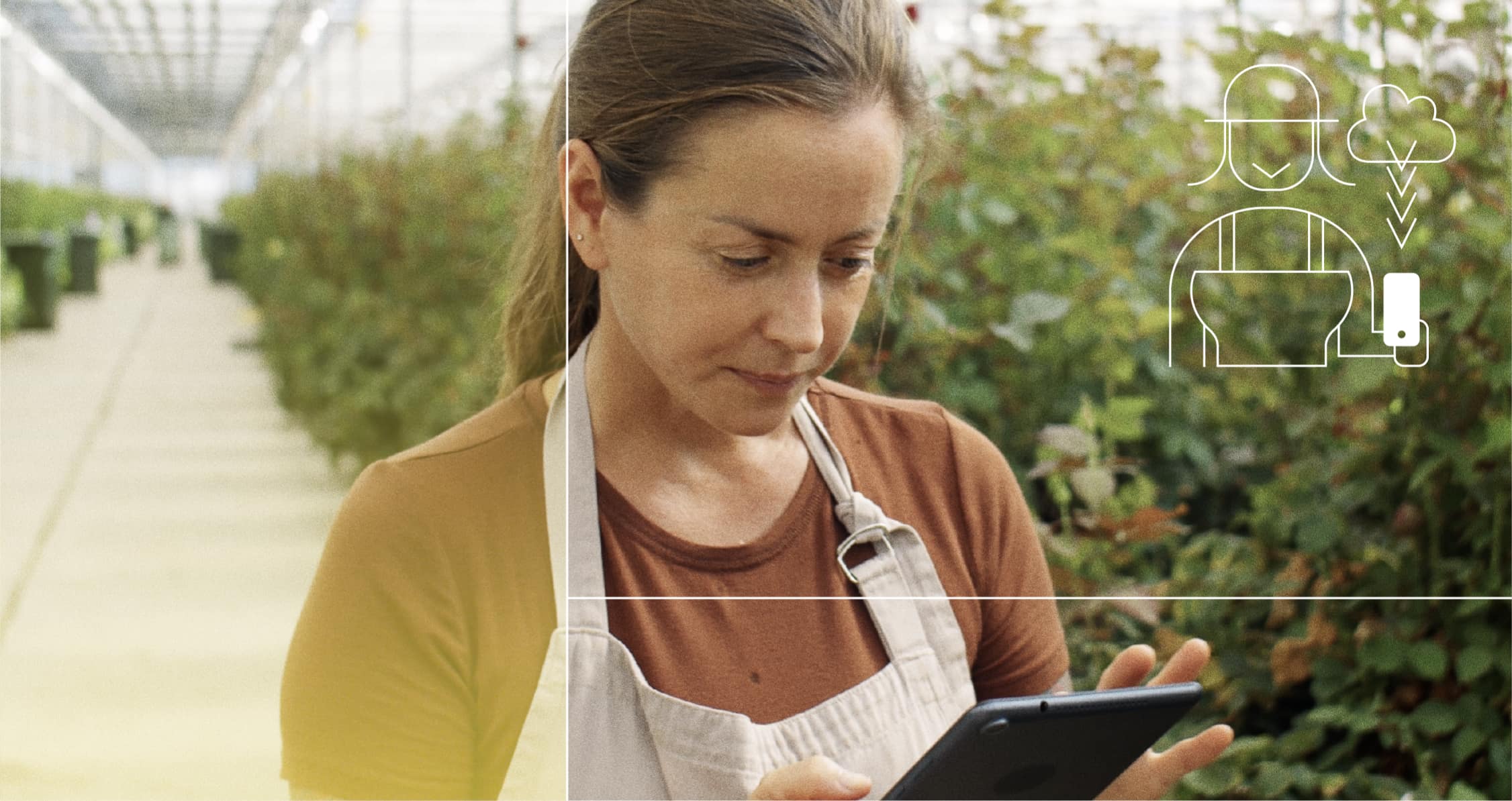
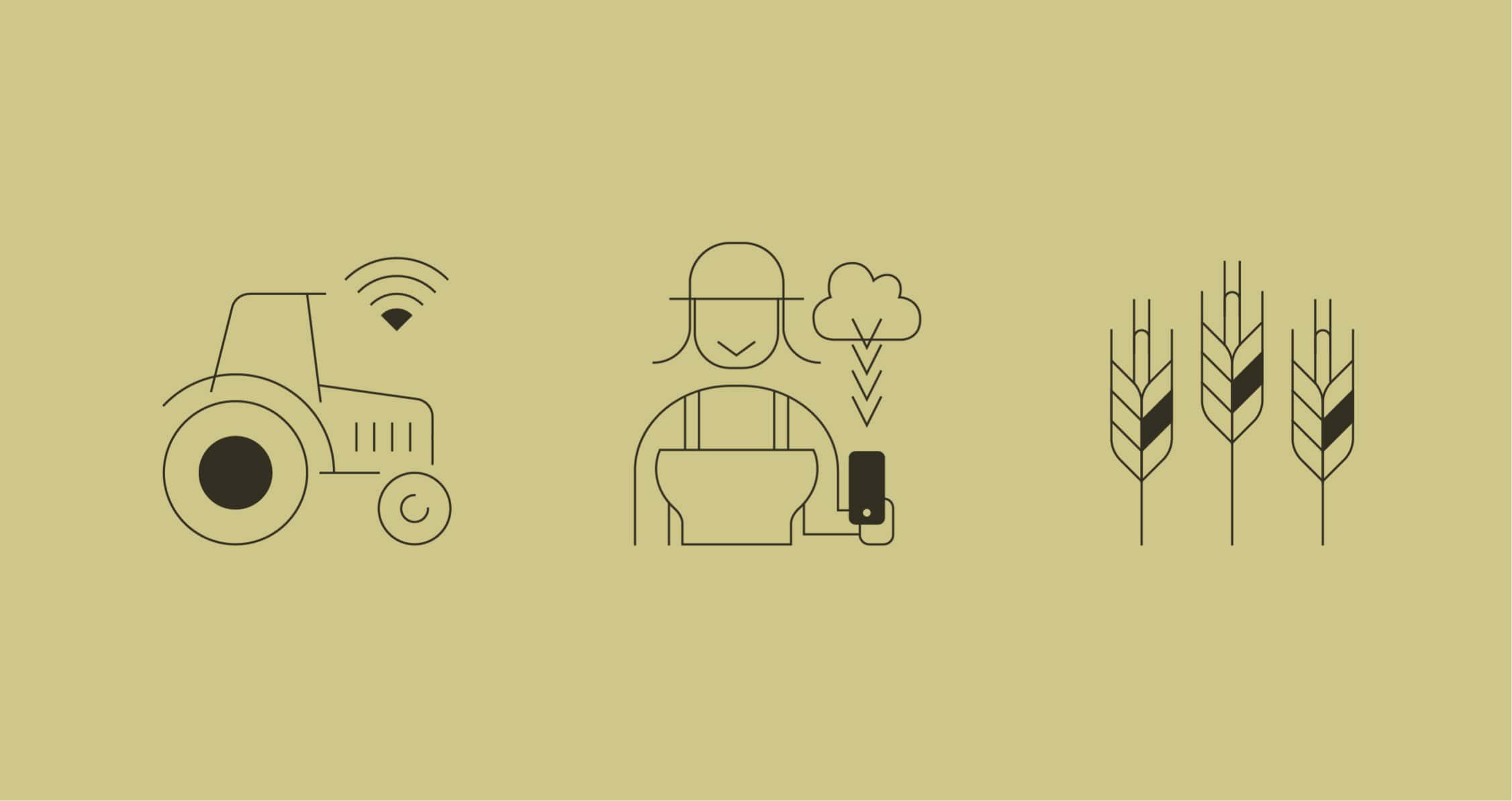
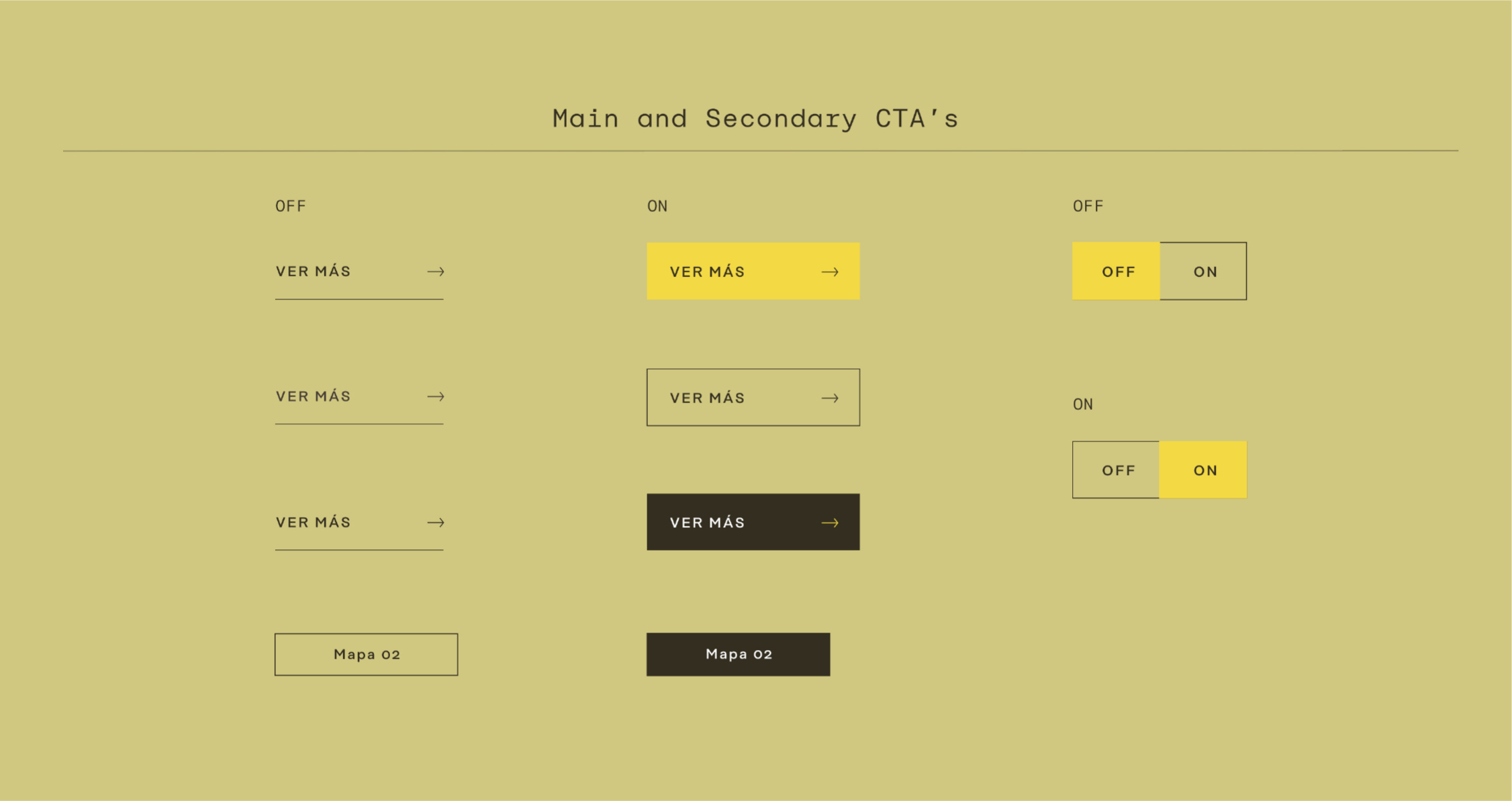
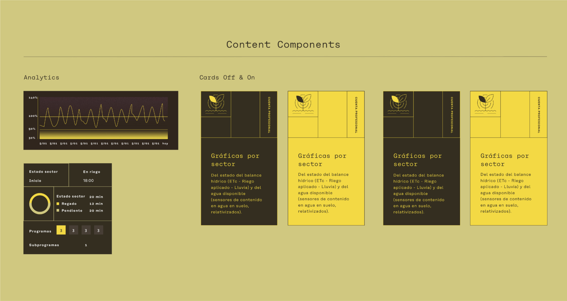
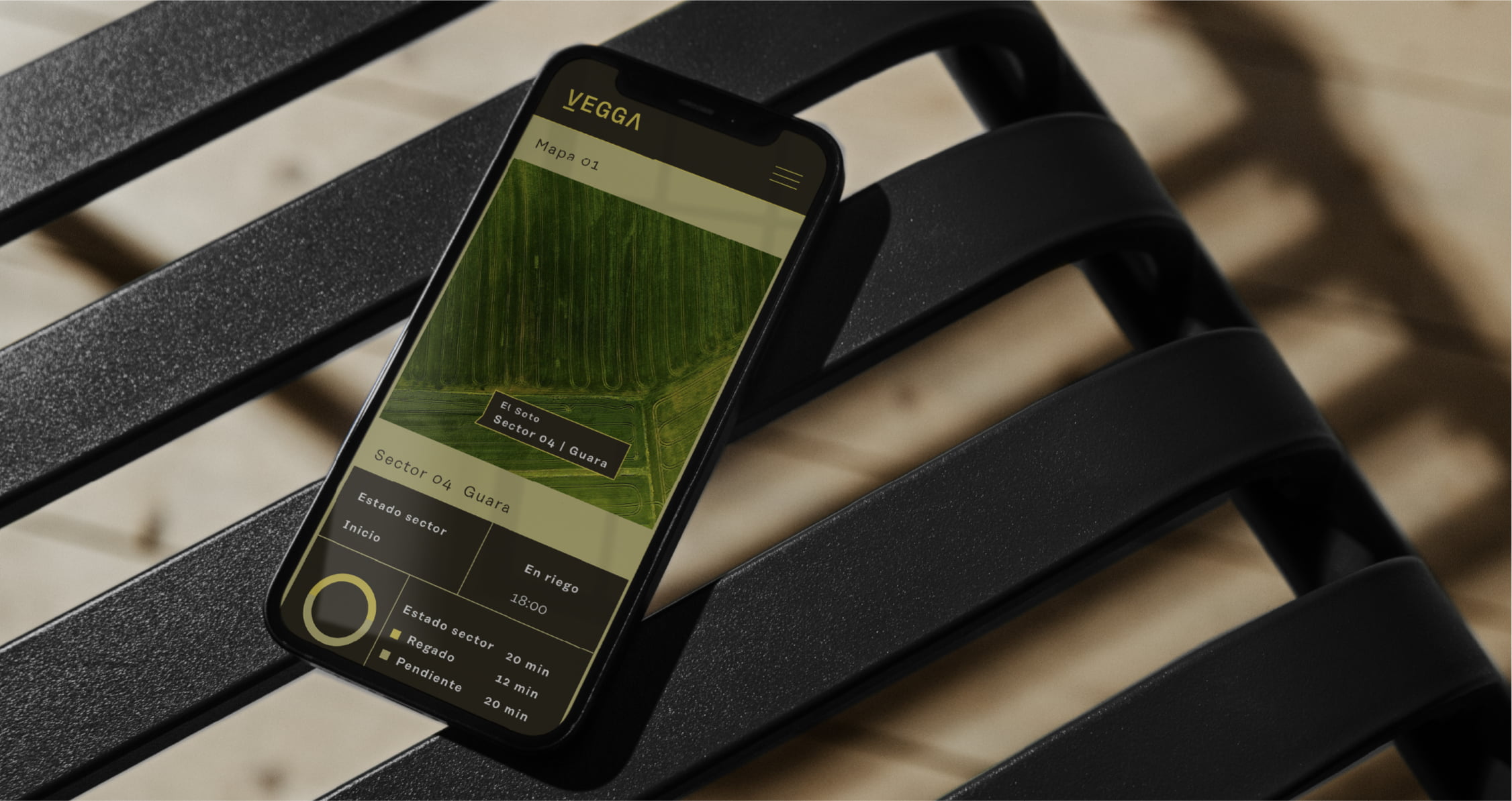
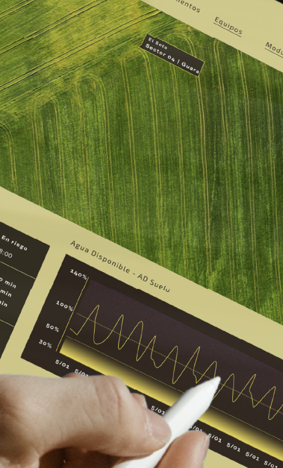
The UI Kits of the web and the internal management application respond to the defined strategy and design, with a language and illustrations that convey modernity, technology and innovation, but in an accessible and intuitive way for all farmers.
