We embarked on an exciting project that had one of the core elements that distinguish the work we do at Morillas: a valuable and transformative purpose. We had to find a brave and accessible way to present HOPE Hydration to the world, bringing this new hydration model closer to the users.
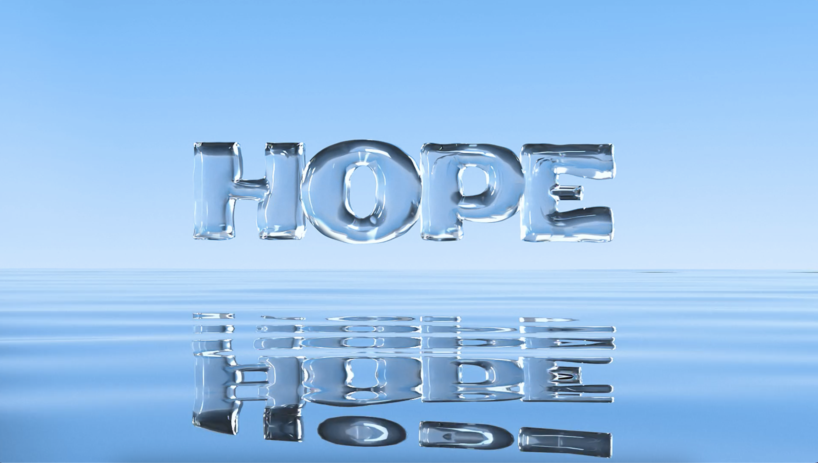
Upgrade to water 3.0

-
Services
- Brand Purpose & Beliefs
- Brand Positioning
- Brand Narrative
- Visual Identity Design
- Communication
- Naming & Verbal Identity
- UX/UI Design
-
Industry
- Food and Beverage
- Energy and Utilities
-
Client
Hope Hydrate
HOPE Hydration is a start-up born within the Tech for Change movement, which seeks to develop innovative technologies capable of transforming the world into a more responsible and sustainable place. HOPE Hydration was born from the desire to make drinking water accessible to everyone and to reduce the environmental impact of plastic bottles.

Challenge
Accessible, sustainable
hydration
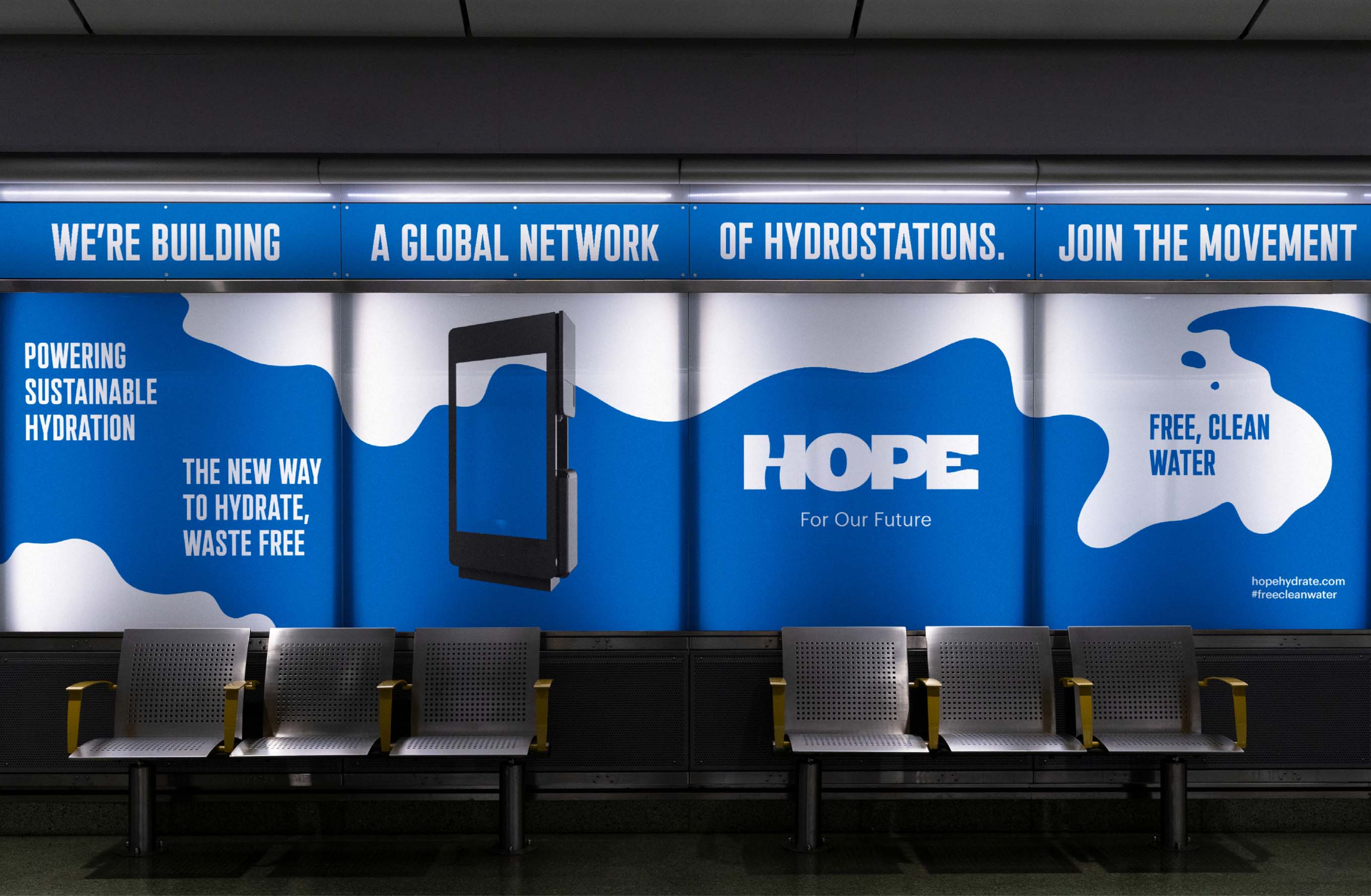
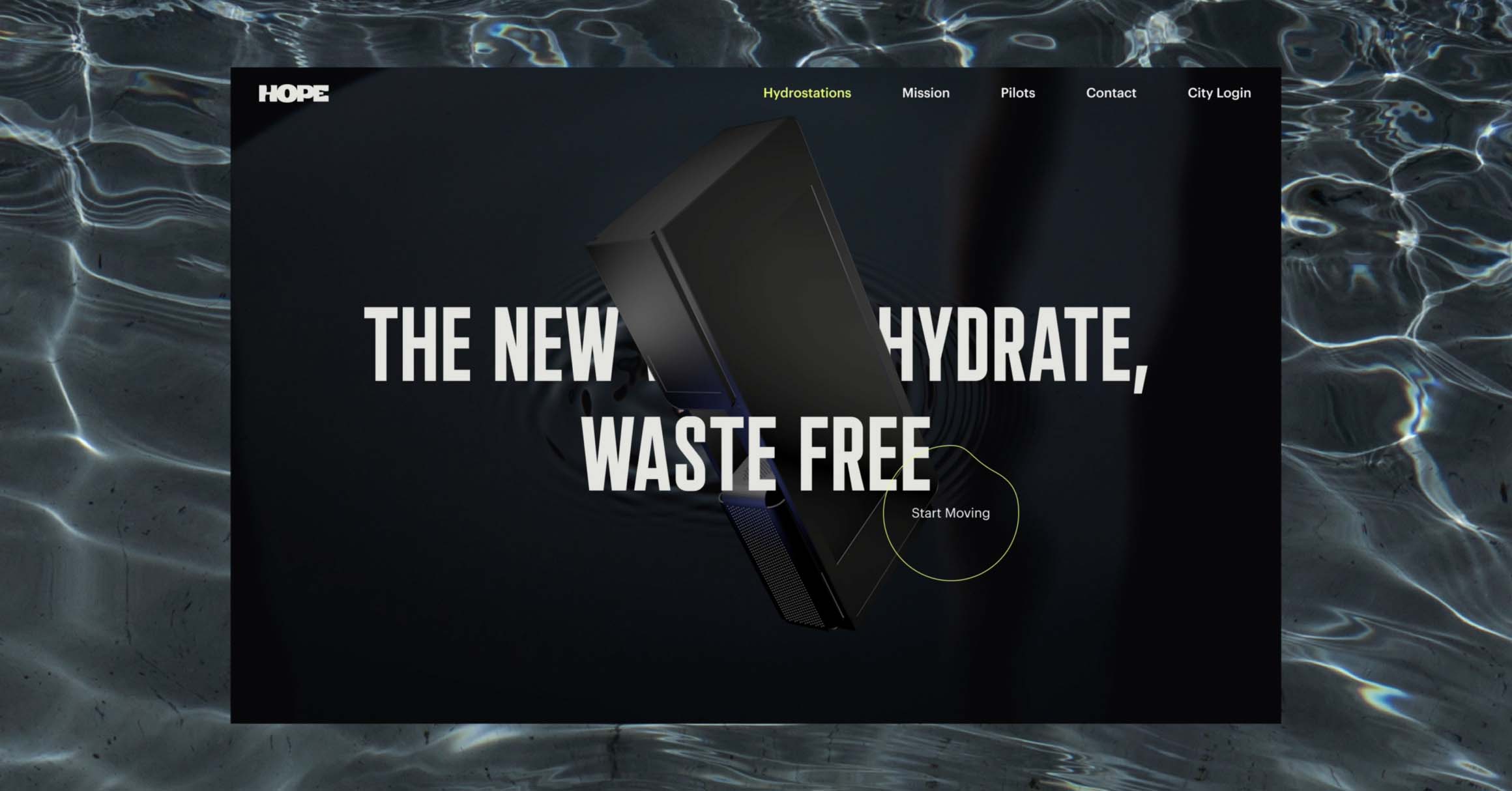
HOPE Hydration presented us with the challenge of creating a brand that will represent a new form of hydration based on a network of water stations located in major cities that are redefining the way we relate to water.
Solution
Water
3.0
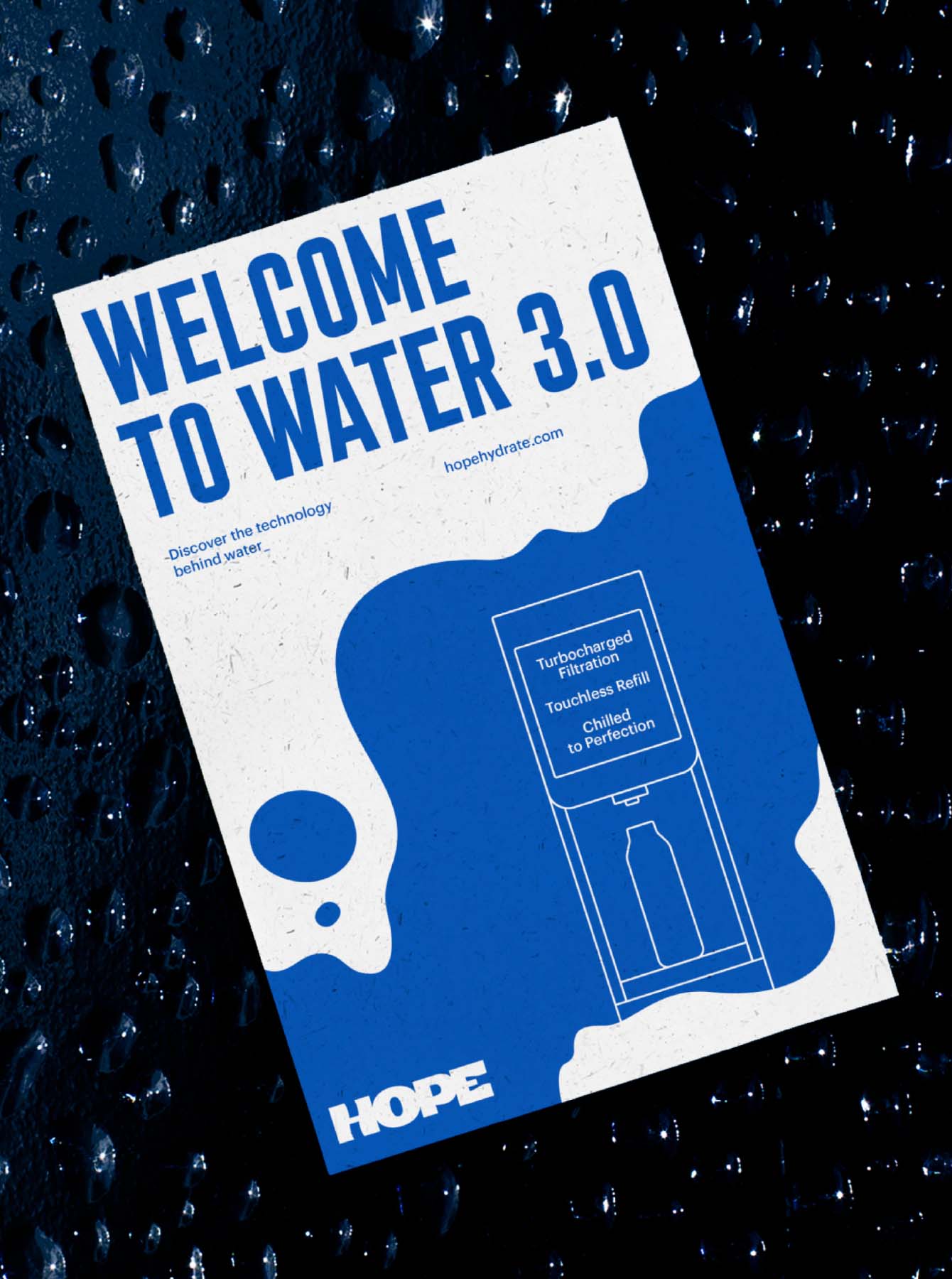
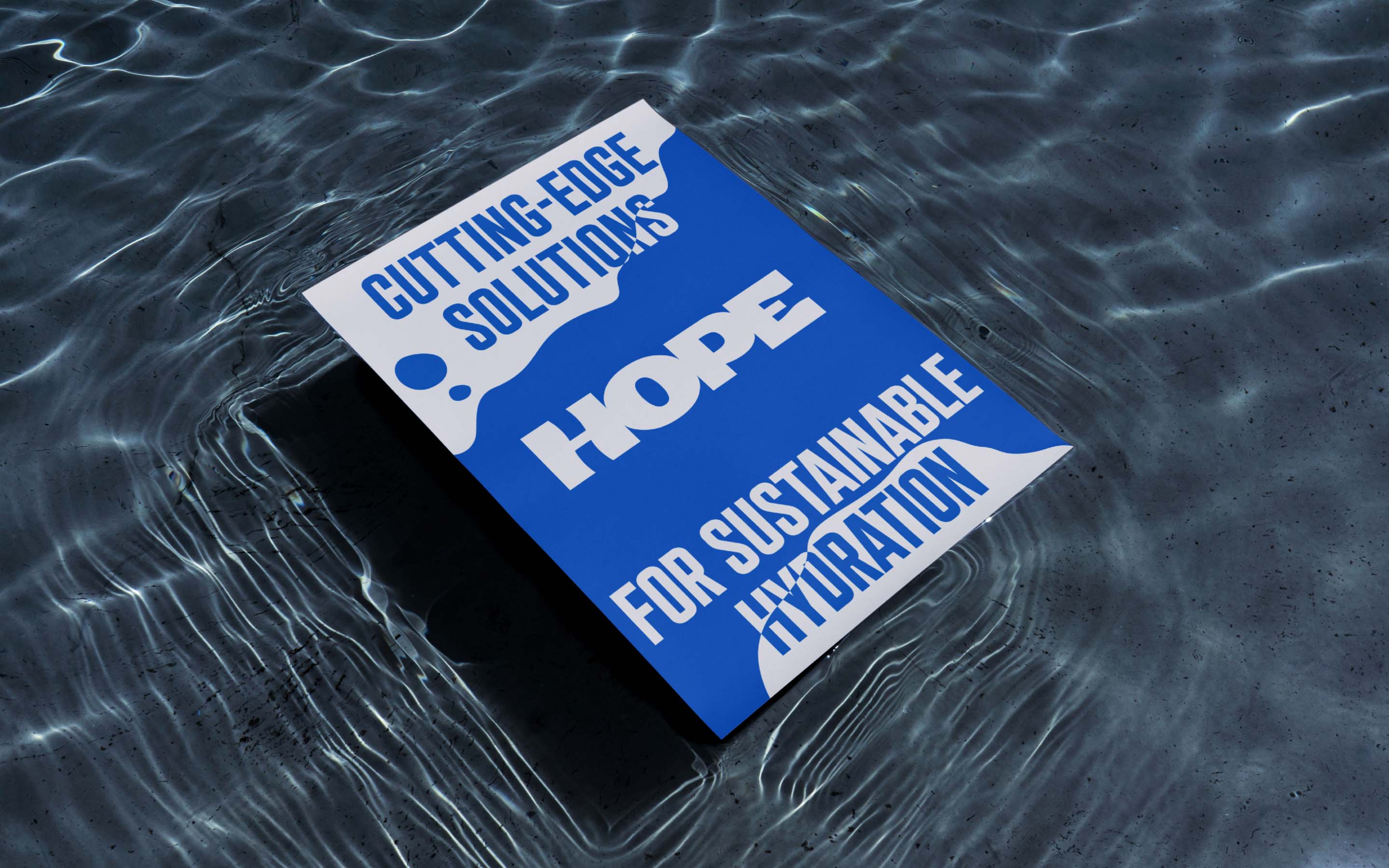
The challenge began with defining of the brand's purpose and positioning, which sprang from the commitment of its founders but had to be grounded and adapted to different audiences. The brand needed to express technology and modernity at the same time as closeness and sustainability. By doing so, it could fully represent the company's ambitious vision: to create a new form of hydration that eliminates disposable bottles and makes water accessible to everyone. (more)
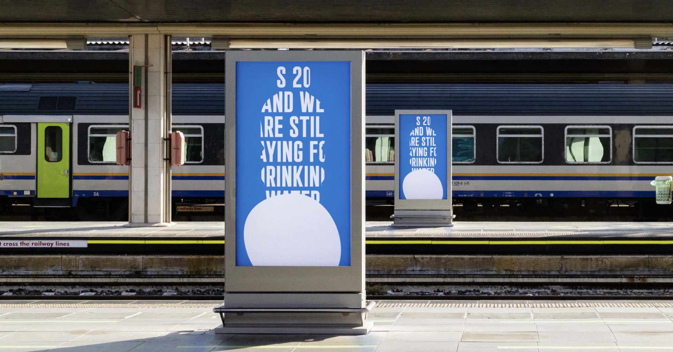
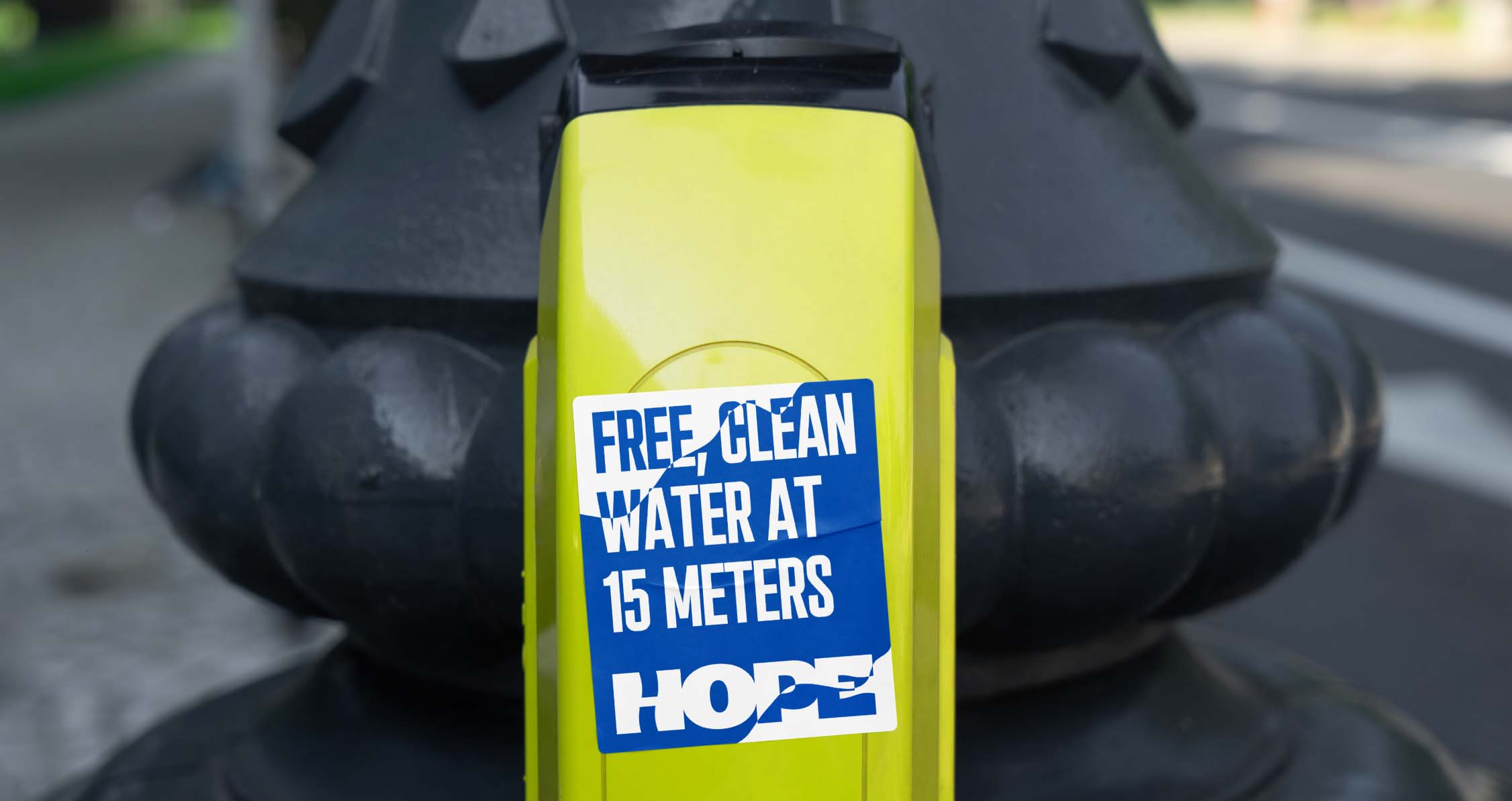
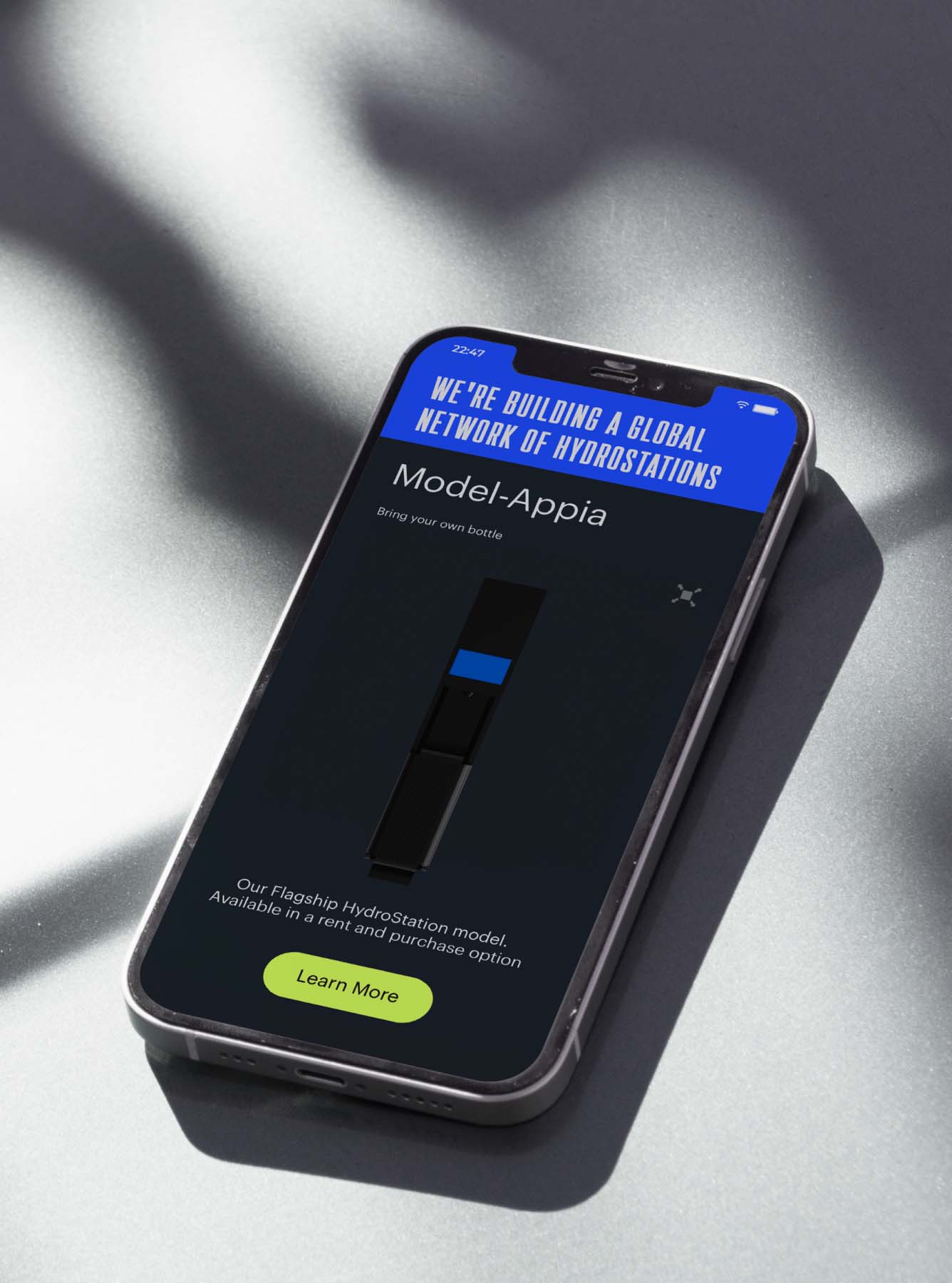
HOPE Hydration's network of hydration stations spread across US cities inviting citizens to refill their reusable bottles and also placed drinking water stations in underserved areas of the city, making it accessible to those most in need.
Solution
Connected
through
water
Connected by water
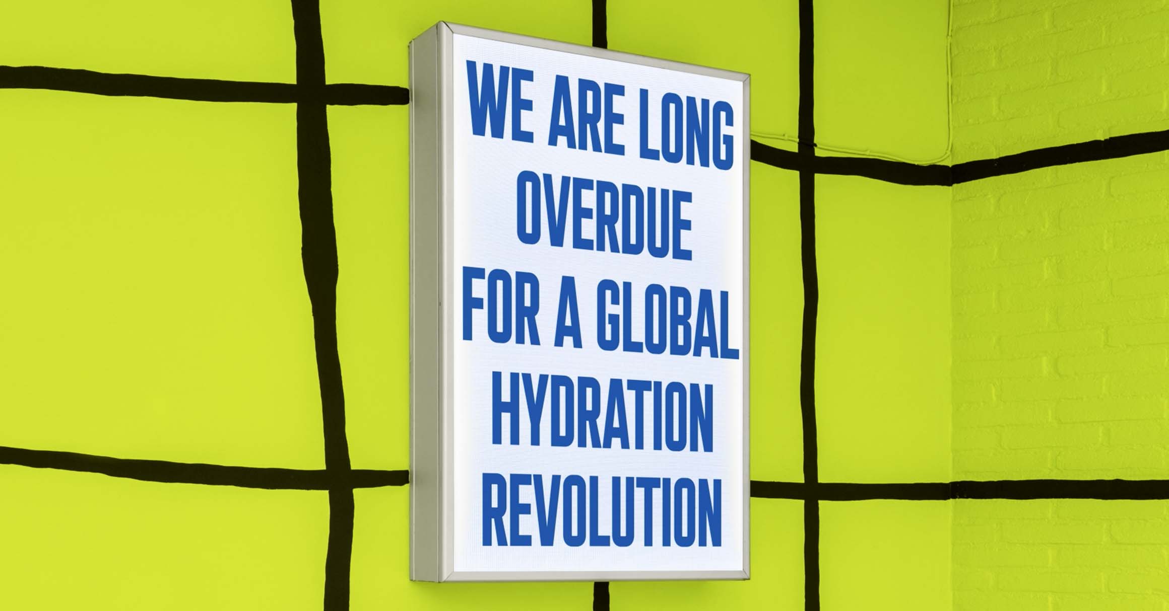
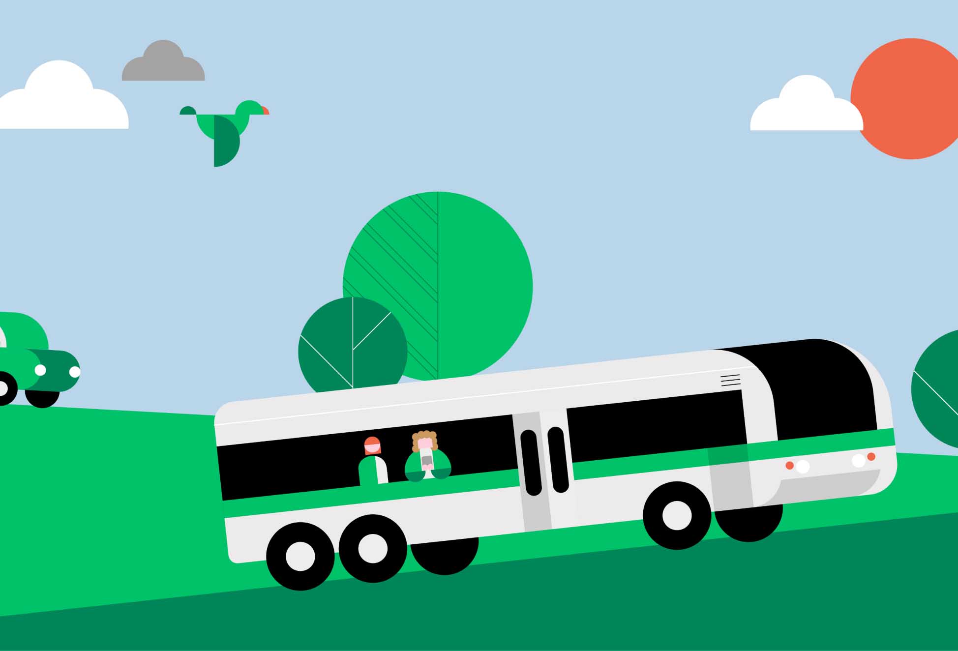
The brand therefore needed to be attractive and approachable for different types of audiences, expressing optimism, modernity and technology, without being distant or exclusive.
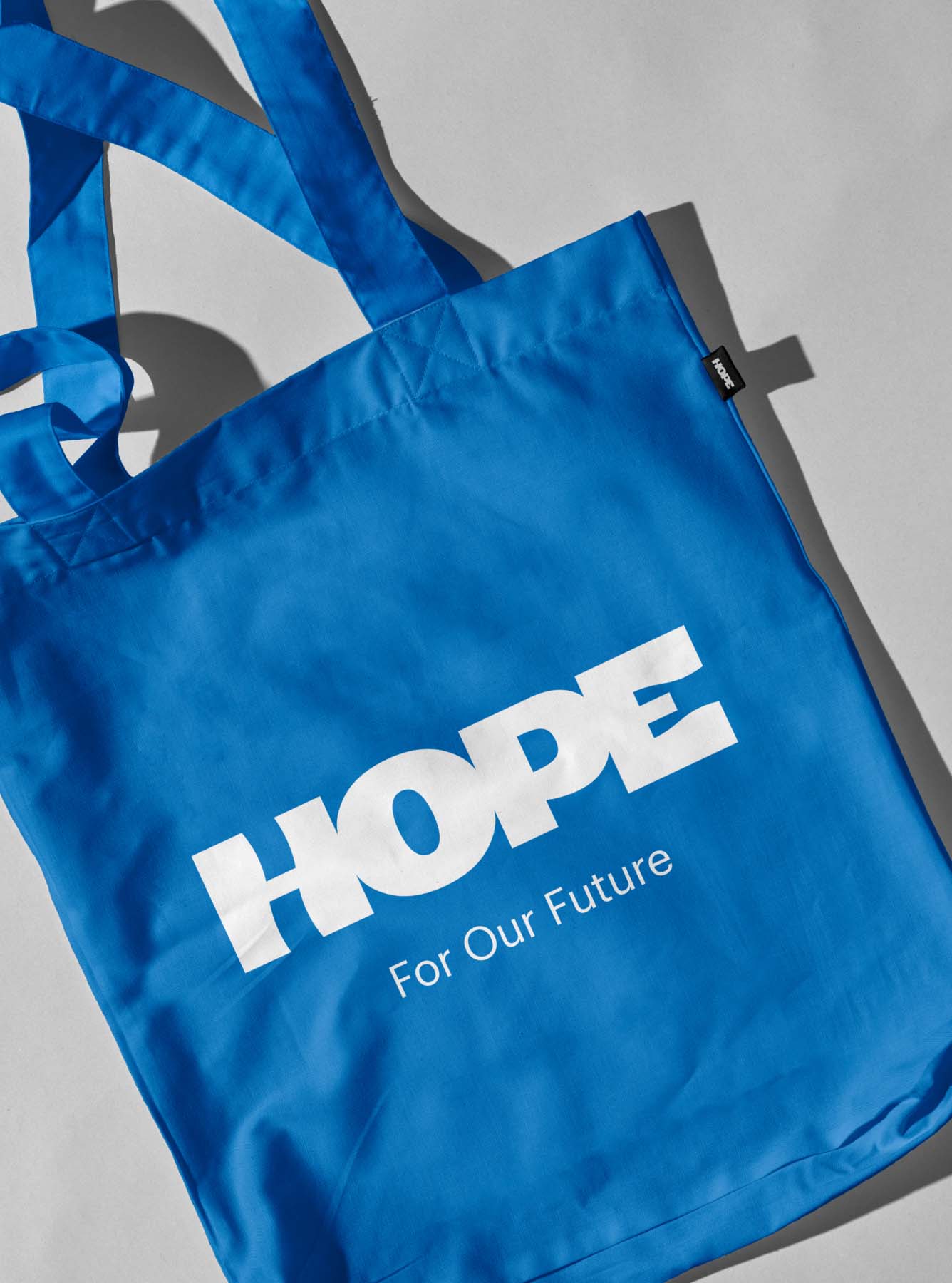
In order to achieve this goal, we created a fluid, organic visual identity and generated a series of messages that would resonate with potential users, introducing the brand while raising awareness of the importance of everyone having access to clean water.

BRAND LENGUAGE
The symbol
of a movement
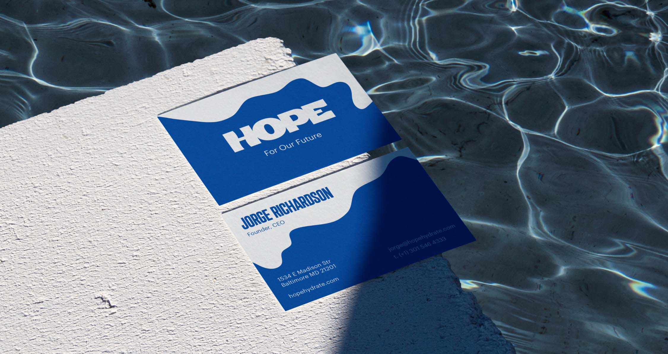
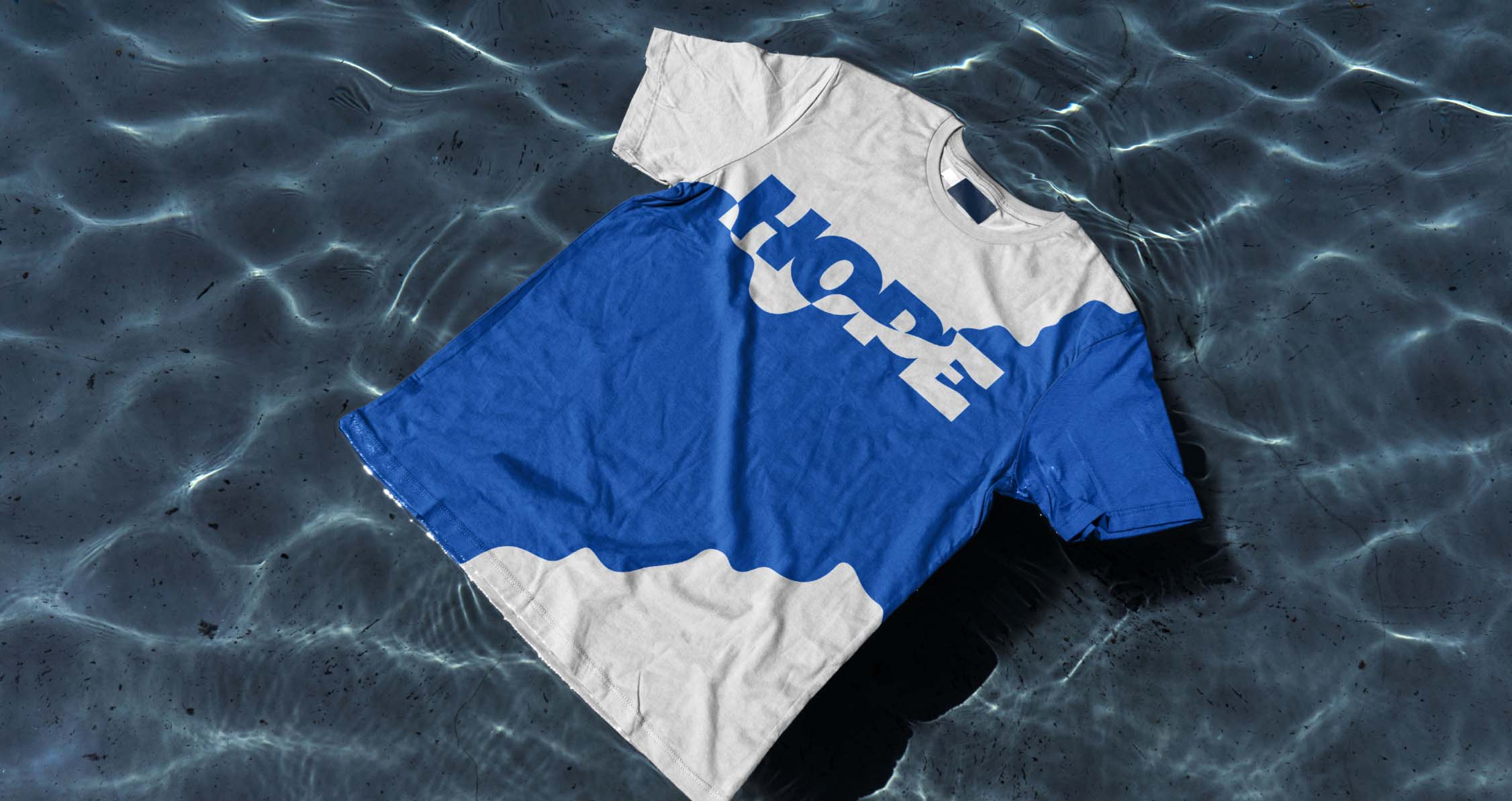
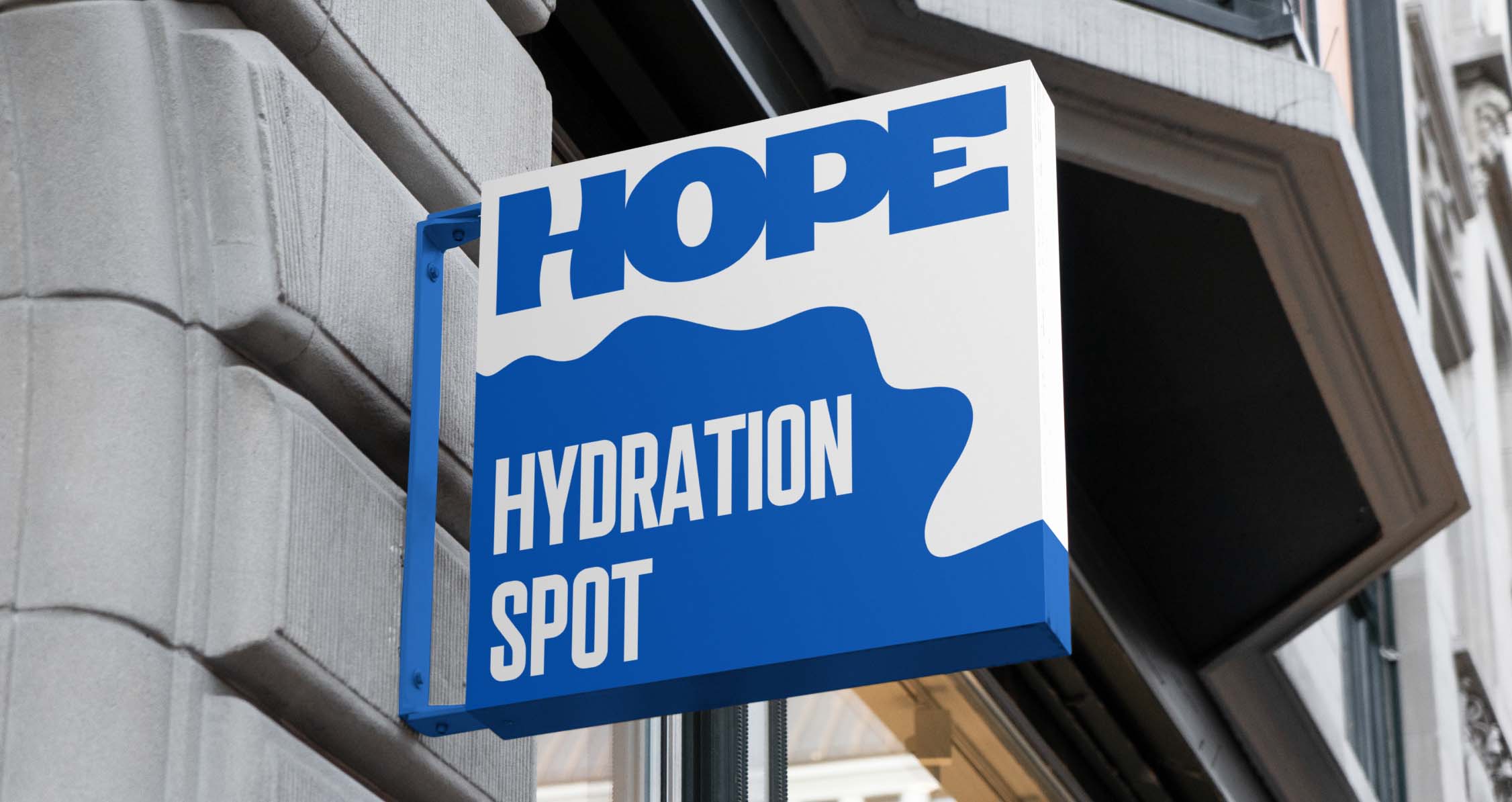
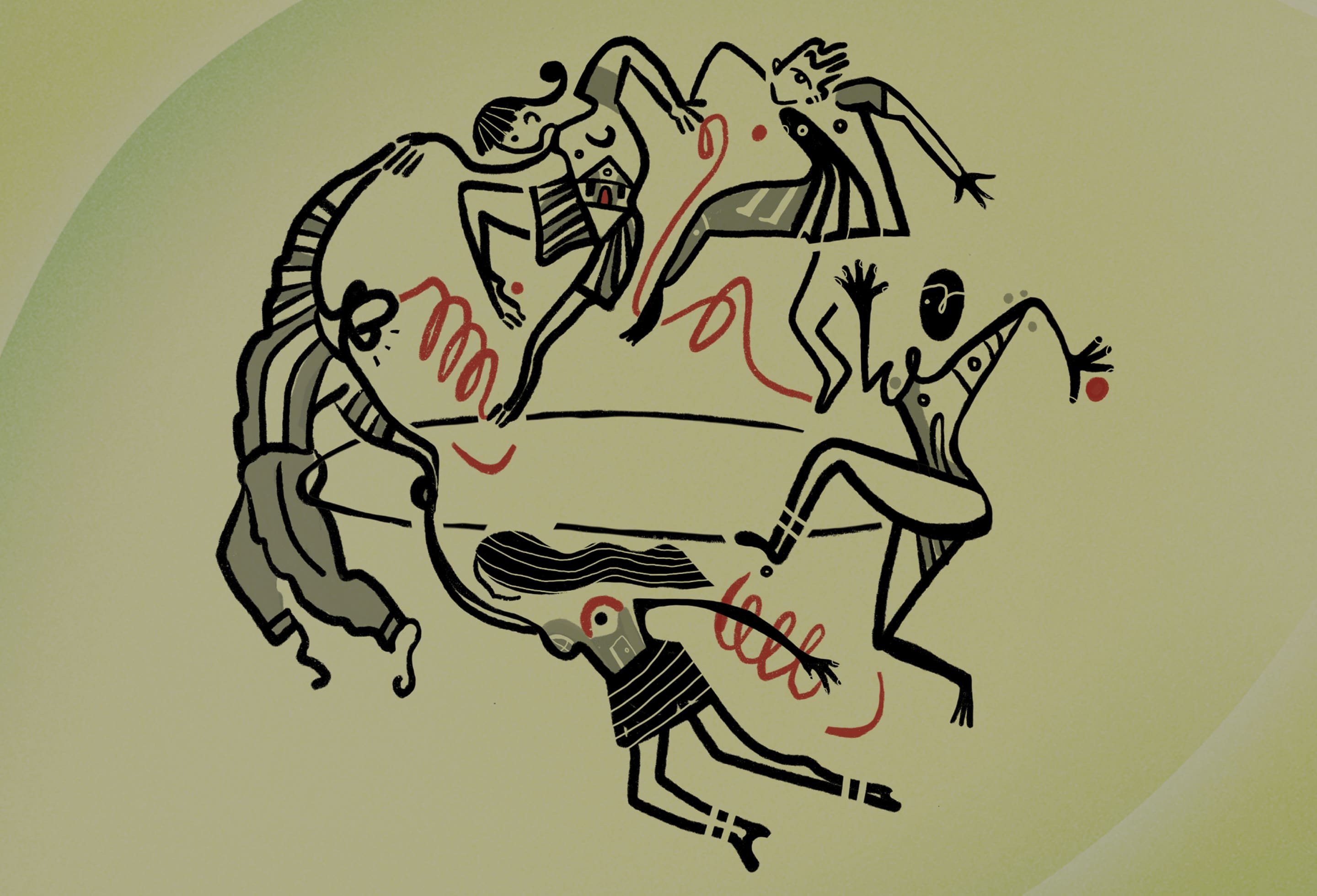
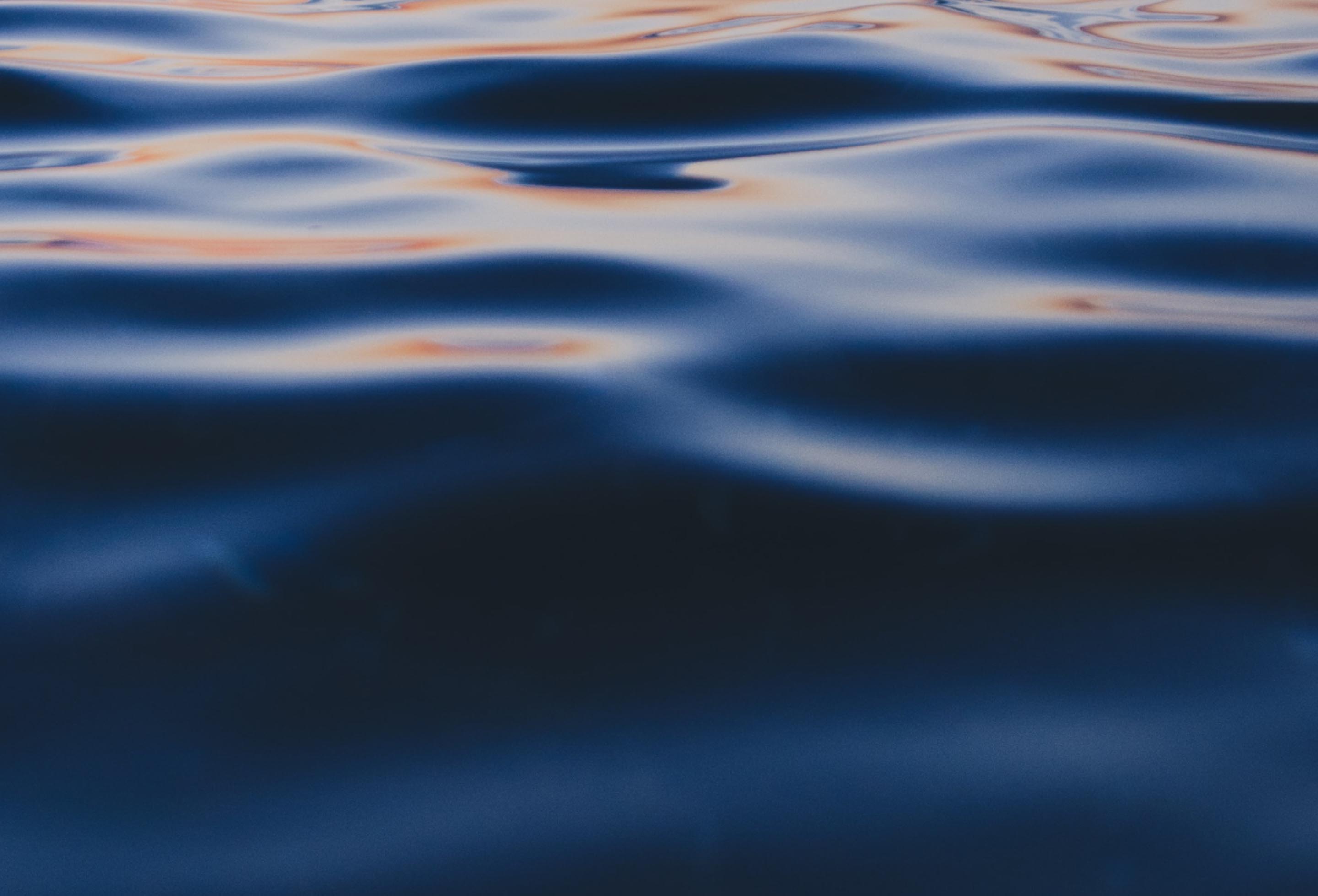
The identity of HOPE Hydration is full of curving shapes, flowing like water, expanding untamed wherever there is space, and adapting to the environment, expressing the transformational power and adaptability of water.

Water
for
everyone
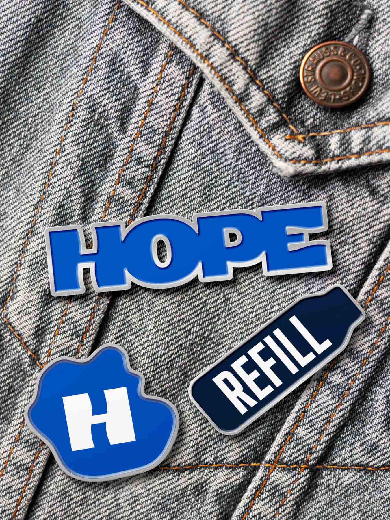
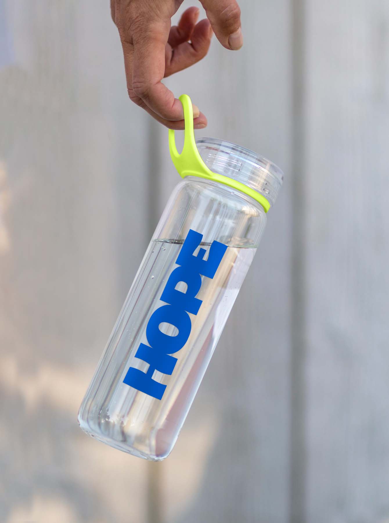
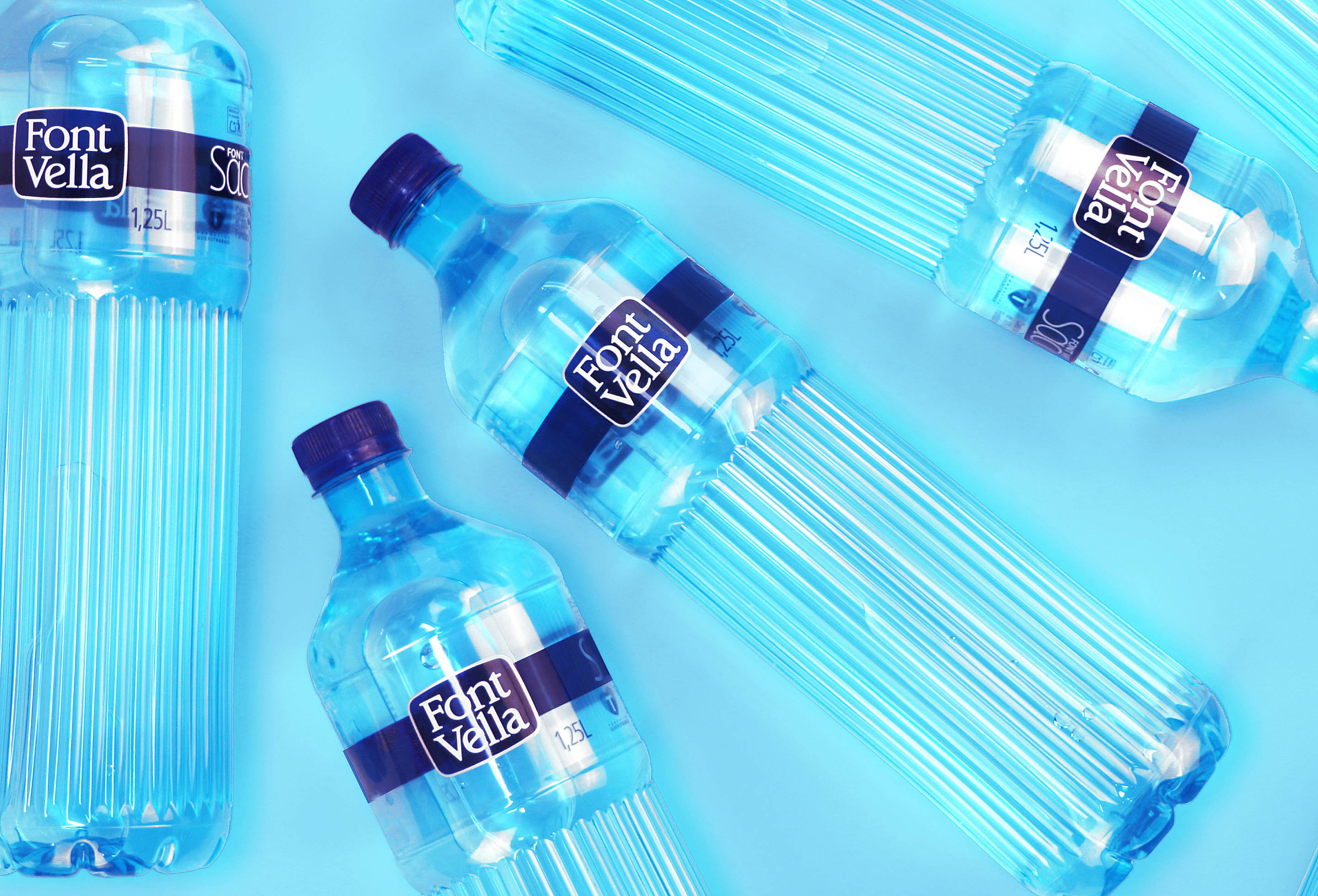
Blue now becomes the colour of hope and fills all brand elements, moving away from excessively technological tones. Yellow becomes the complementary colour that contrasts with blue and highlights the communication messages developed for the brand.
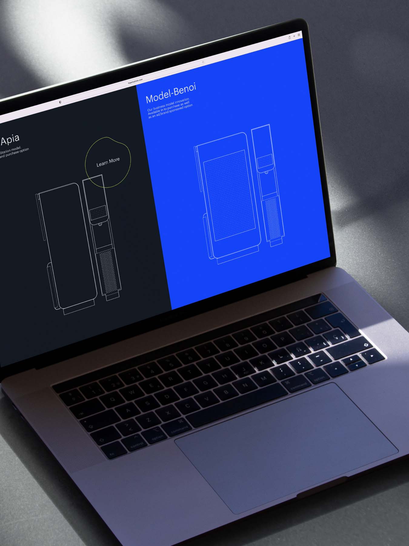
The visual identity also needed to blend in with the design of the stations and be versatile enough to adapt to future brand launches in new markets beyond the United States.
See also


Let's talk
Together, we can create something extraordinary
We will collaborate to find the right answer and bring progress to your business and to the world.