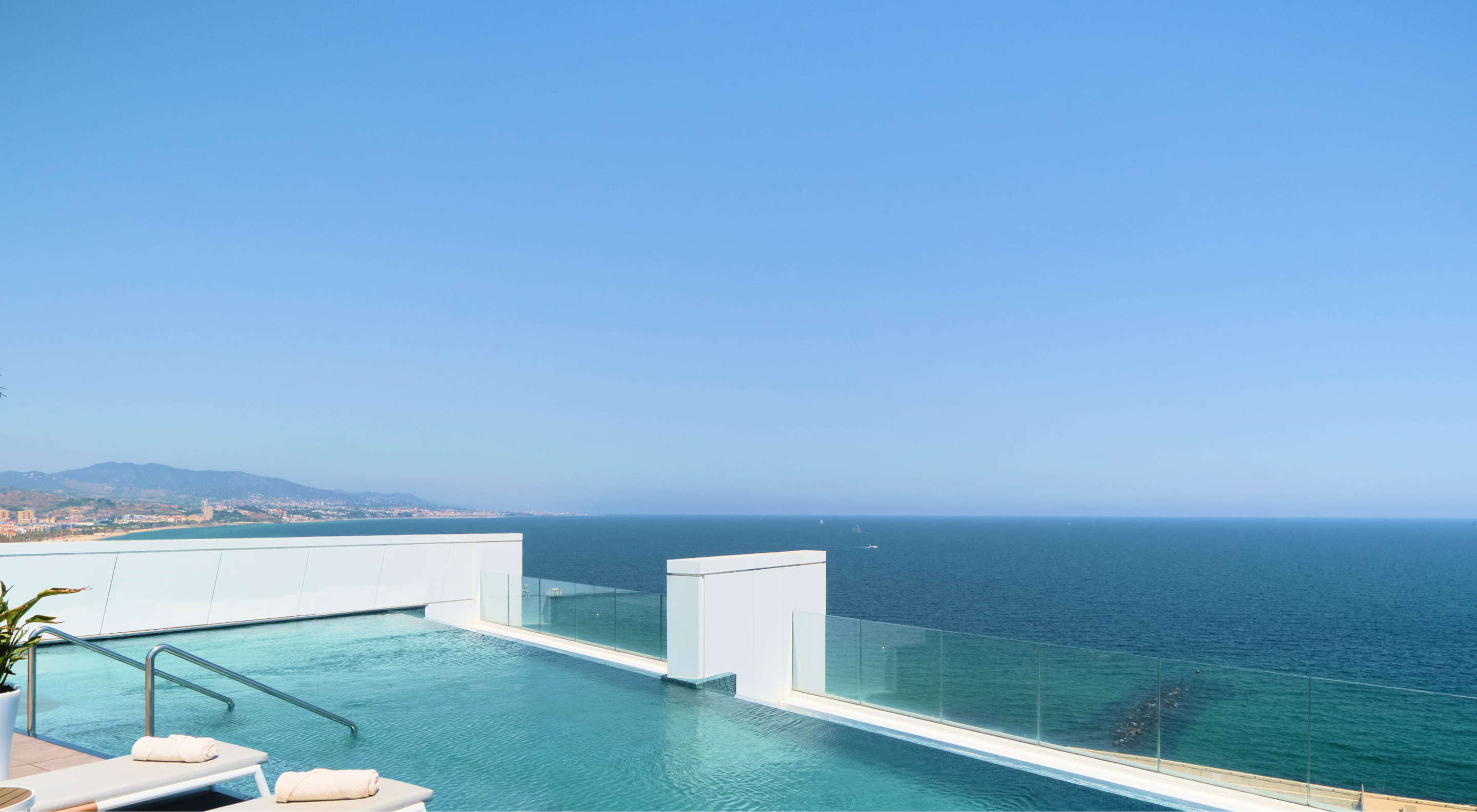
A window to the sea
-
Services
- Brand Diagnosis
- Brand Positioning
- Brand Narrative
- Brand Ecosystem
- Visual Identity Design
- UX/UI Design
- Editorial Design
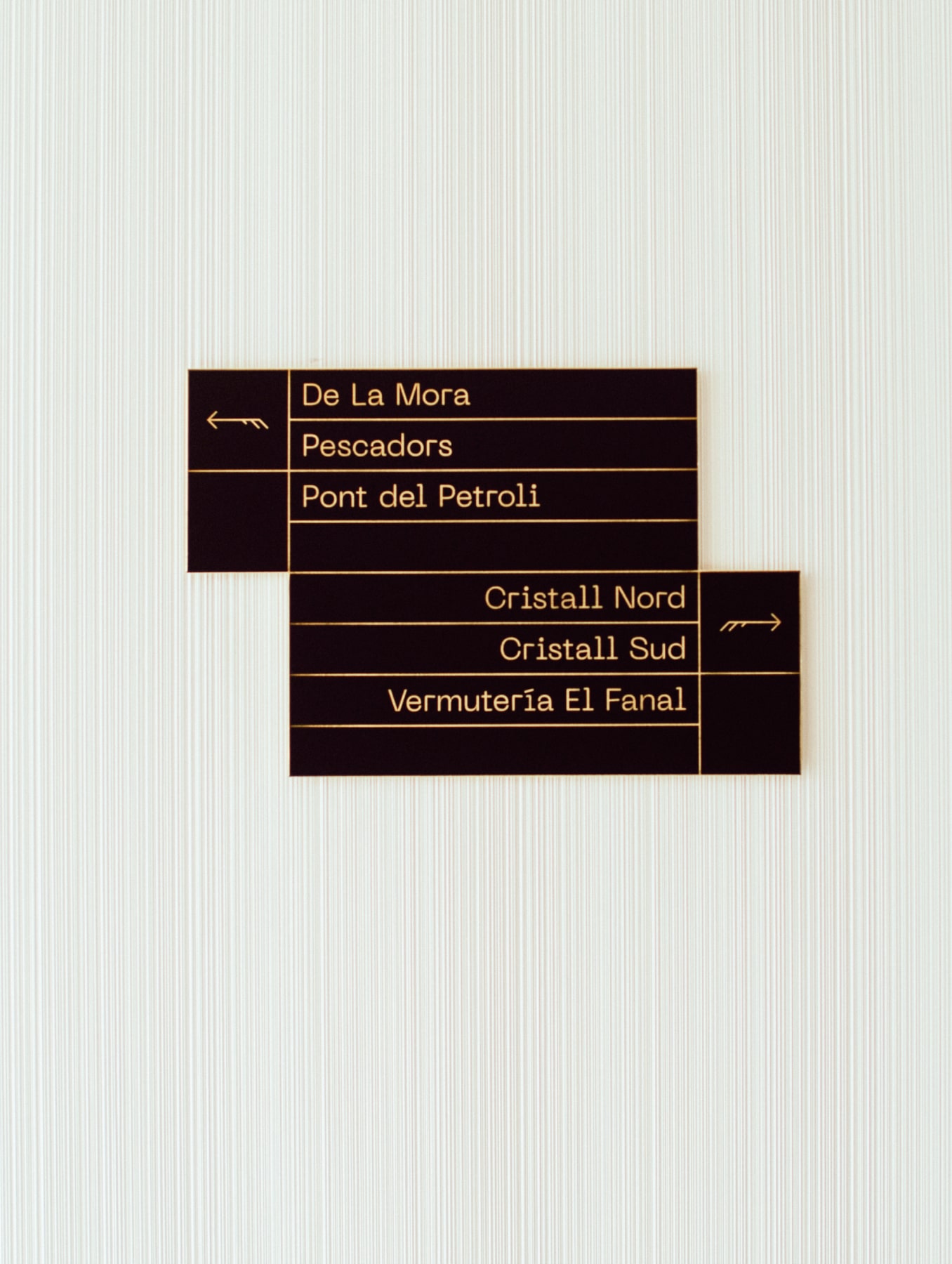
- Signage Design
- Naming & Verbal Identity
-
Industry
- Hospitality and Restaurants
-
Client
Sallés Hotels
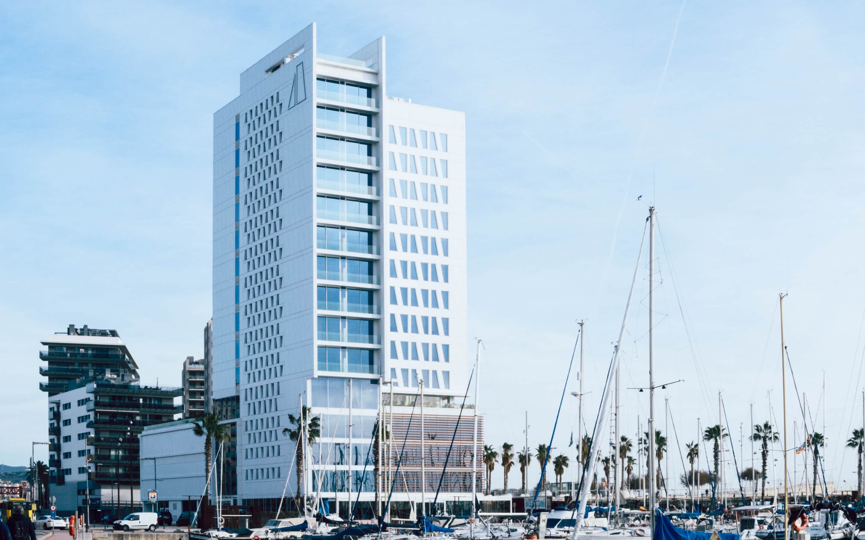
We developed the identity and outlets of the Hotel Marina Badalona, a new Sallés Group hotel with a privileged location and direct connection to Barcelona, which offers luxurious stays, and high-quality gastronomy and wellbeing.
challenge
Creating a unique experience
for a flagship hotel
We had the opportunity to create the strategy and identity of the Marina Badalona Hotel, a new Collection Hotel bySallés Group. Our aim was to design a meaningful experience of the caliber of the company’s other flagship hotels.

Solution
A heaven with the best
of the metropolis and
of the Mediterranean

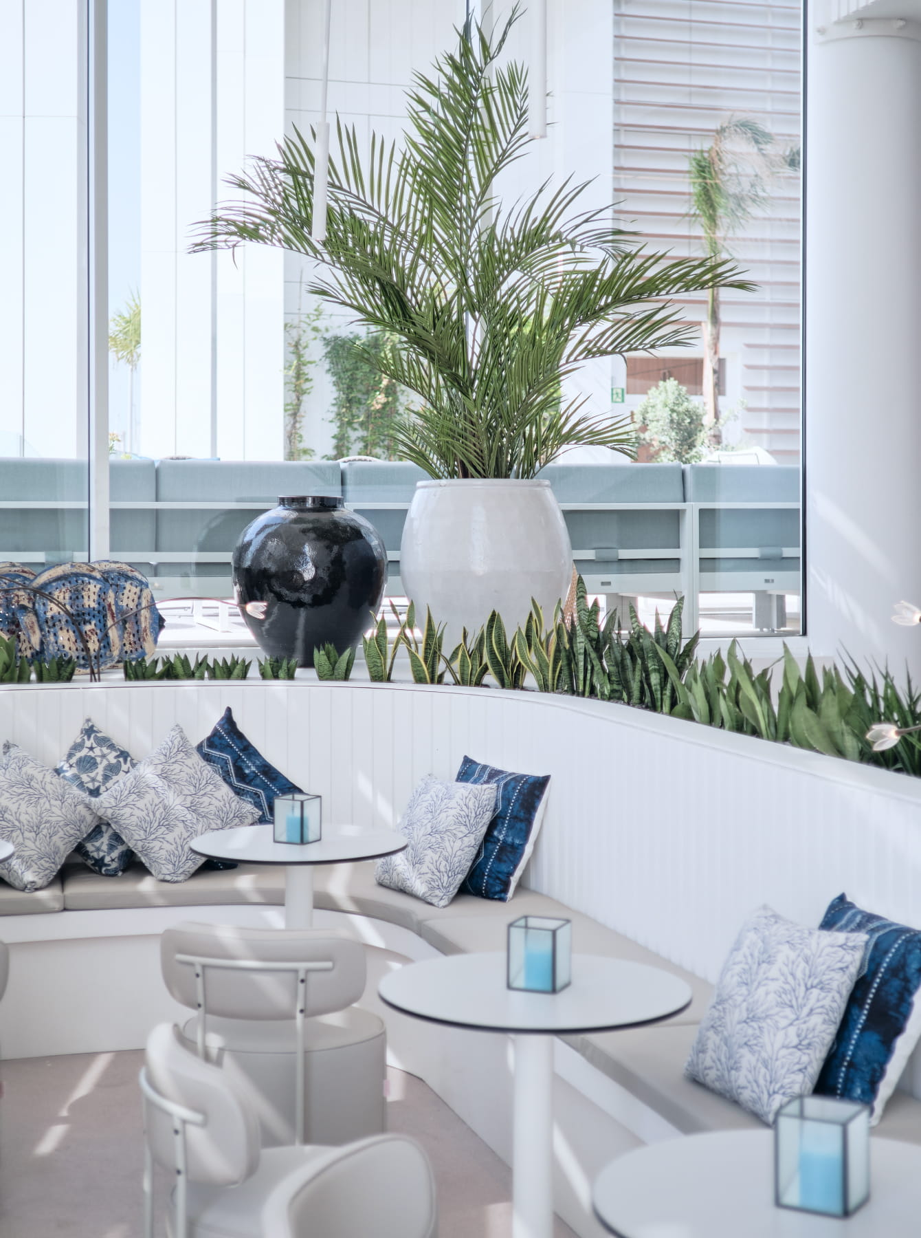
We fused sea and city to create an unconventional Mediterranean experience. This concept was key in designing a brand universe, positioning and signature assets that would enhance this high-end experience.
To create an unforgettable experience, the entire brand universe drew inspiration from the Mediterranean, from the identity to the physical space, the signage, and the digital experience.

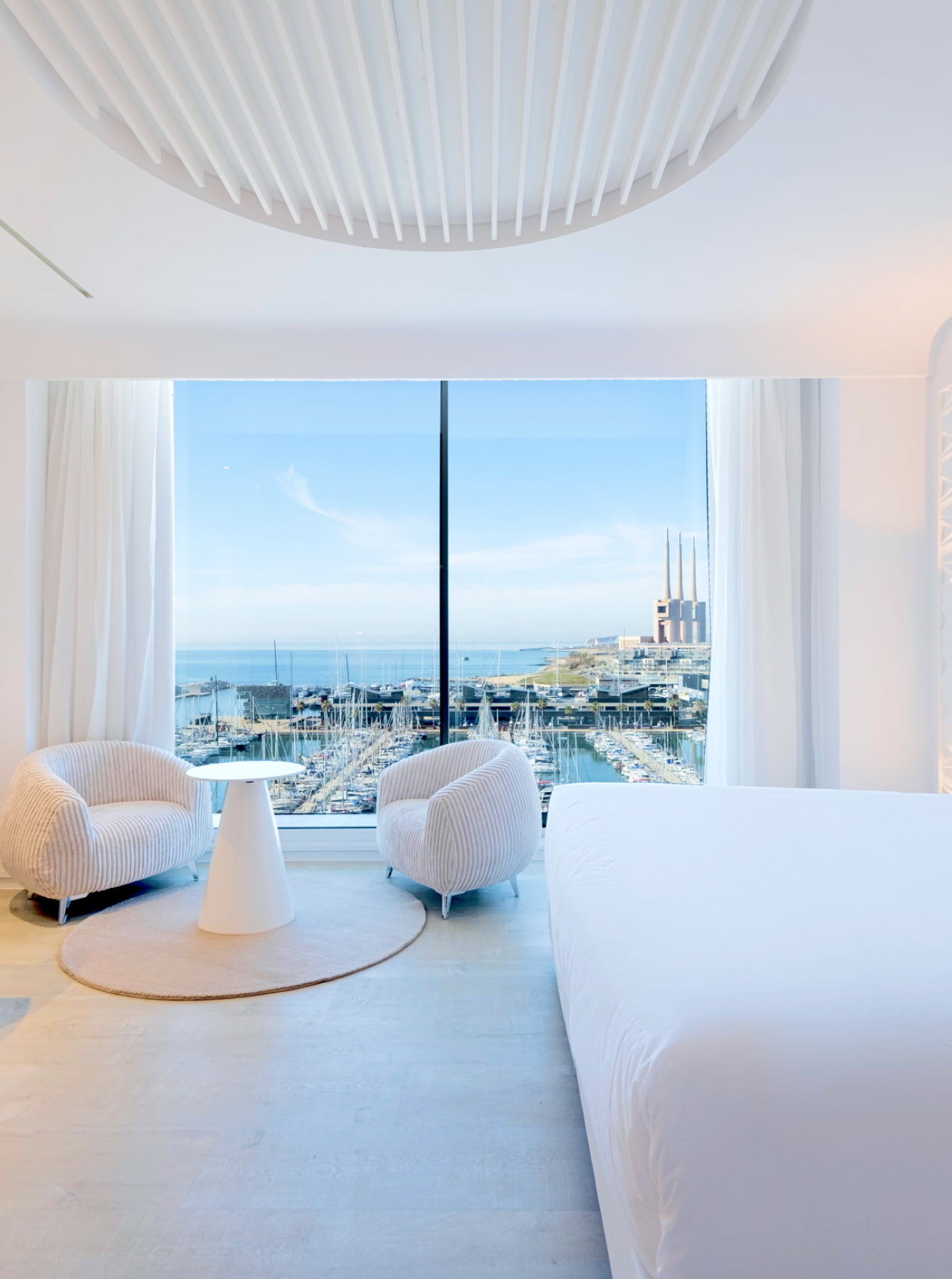
A window
to the Barcelona
coastline
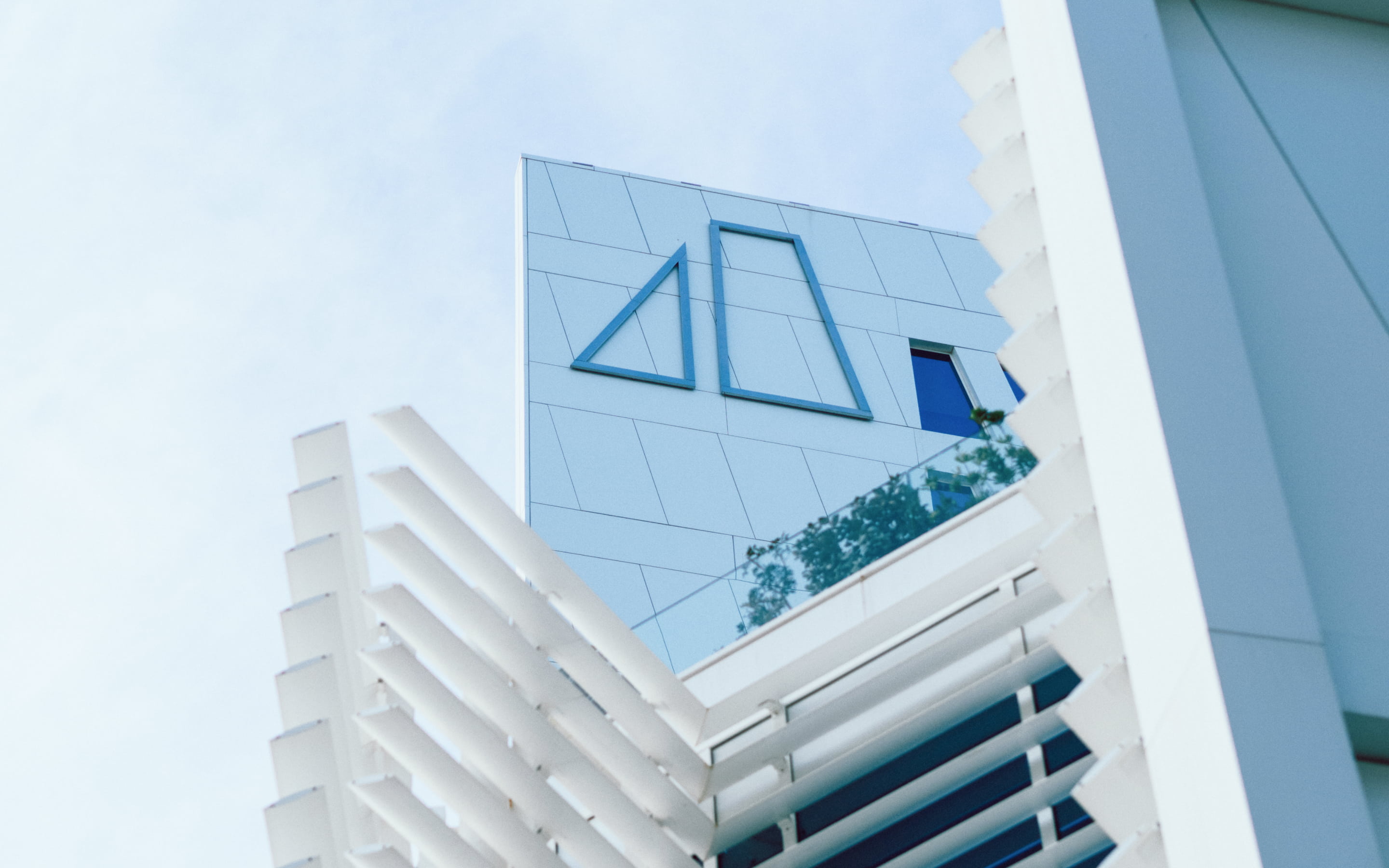
Inspired by its privileged location, we created window to the port, a concept that represents the nautical heart of Badalona and highlights the connection with the coastline of Barcelona, defining the tagline: ‘Barcelona Coast’.

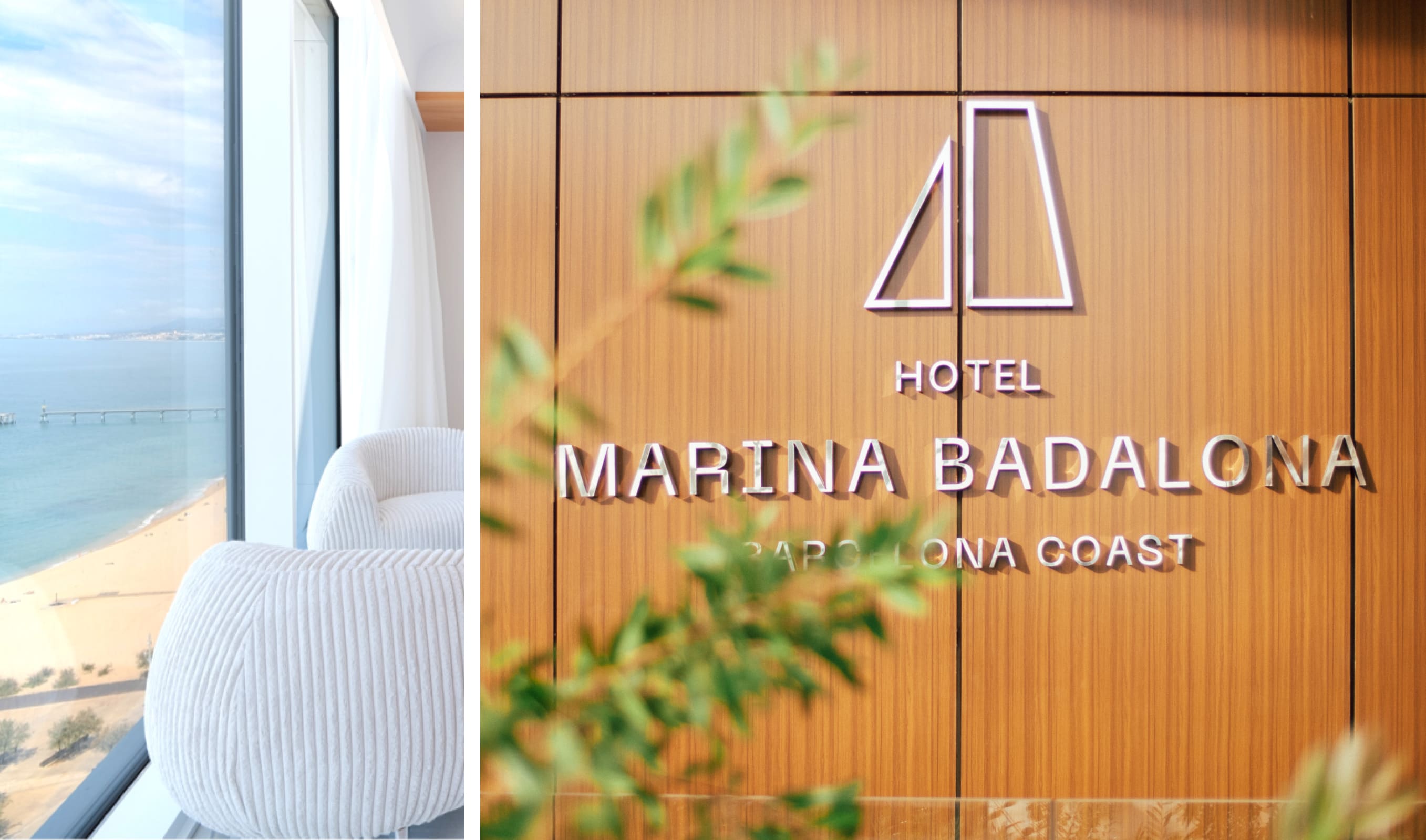
Sail, sea, and sky
as the anchor of
the visual identity

To invigorate the brand’s visual identity, in addition grounding it in the concept of the window to the sea, we also took inspiration from a highly characteristic element of the port: The sail, from which we generated the entire visual language.
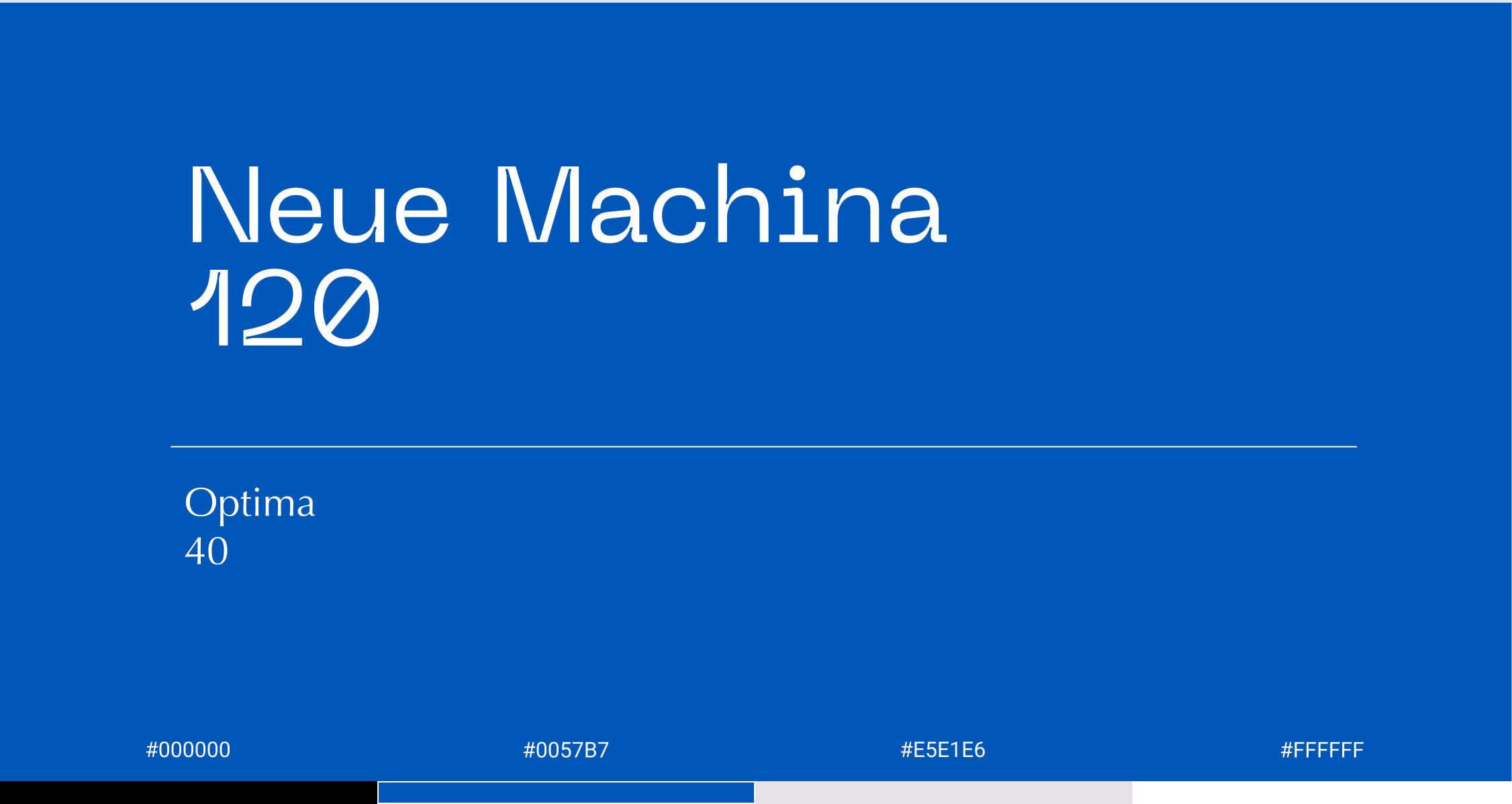
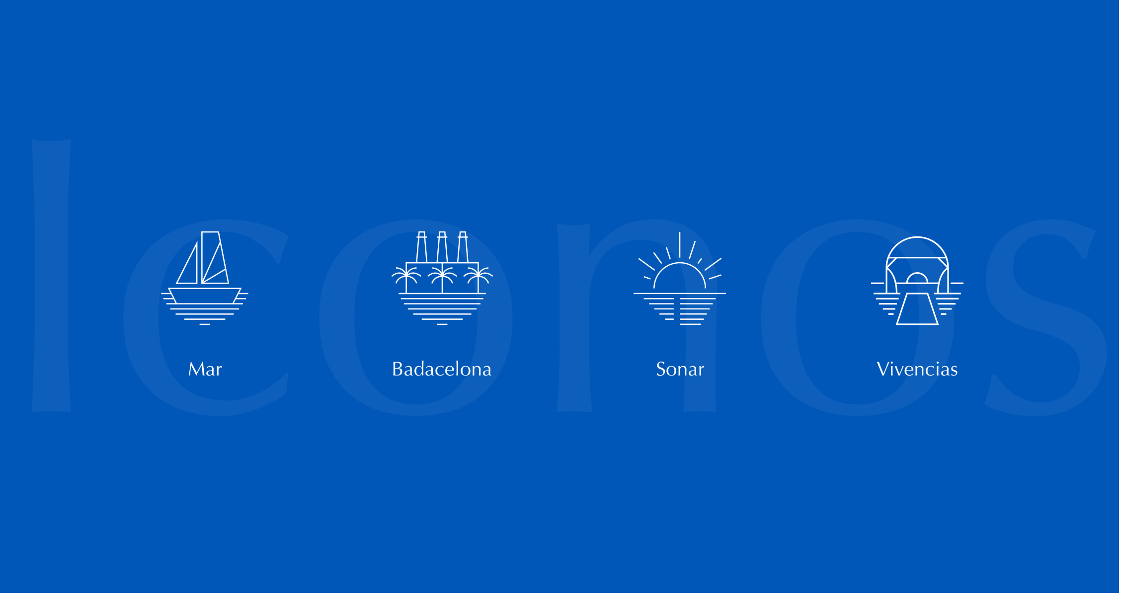
The visual universe and the graphic language of the brand was based on the combination of the geometry of the winds with maritime images and the use of navy blue and sky blue to represent the contrast between the sea and skyline, star elements in the experience. A matching typography filled with geometric shapes was chosen to coexist with the window trims.

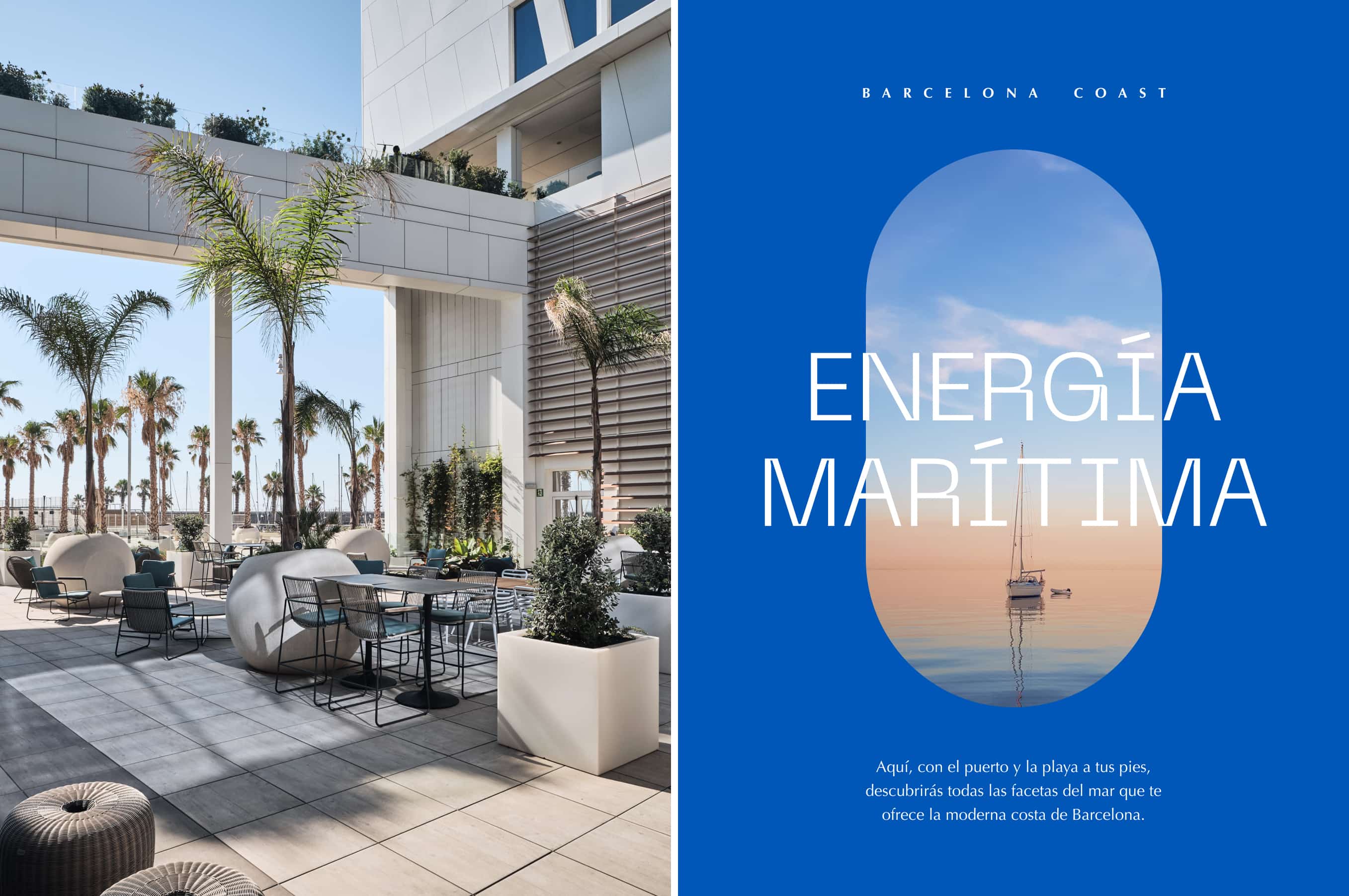
DIGITAL EXPERIENCE
Adigital
gateway
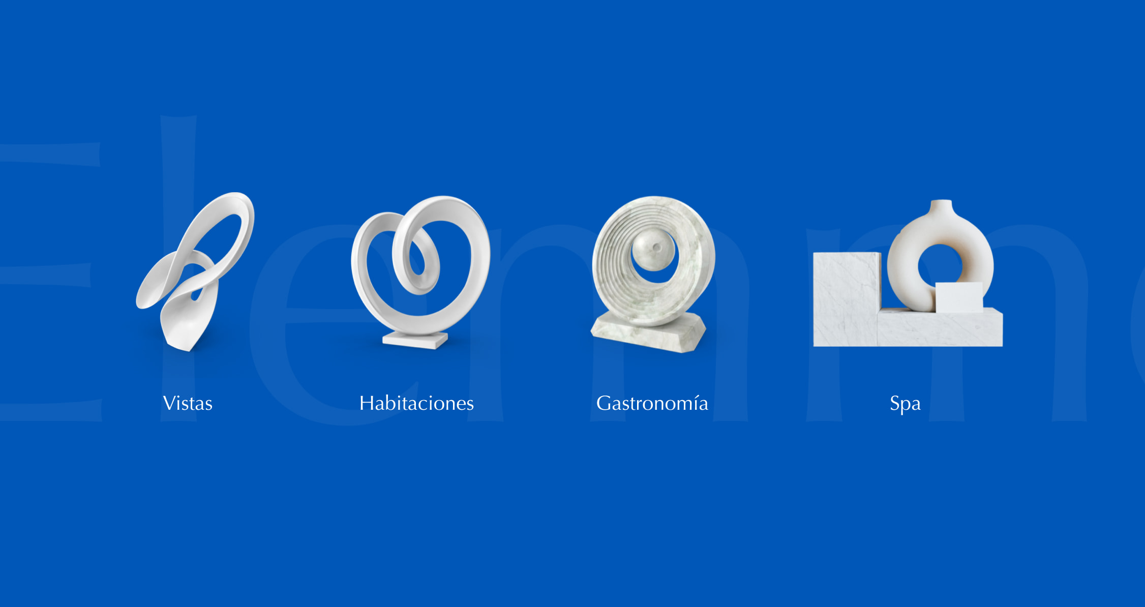
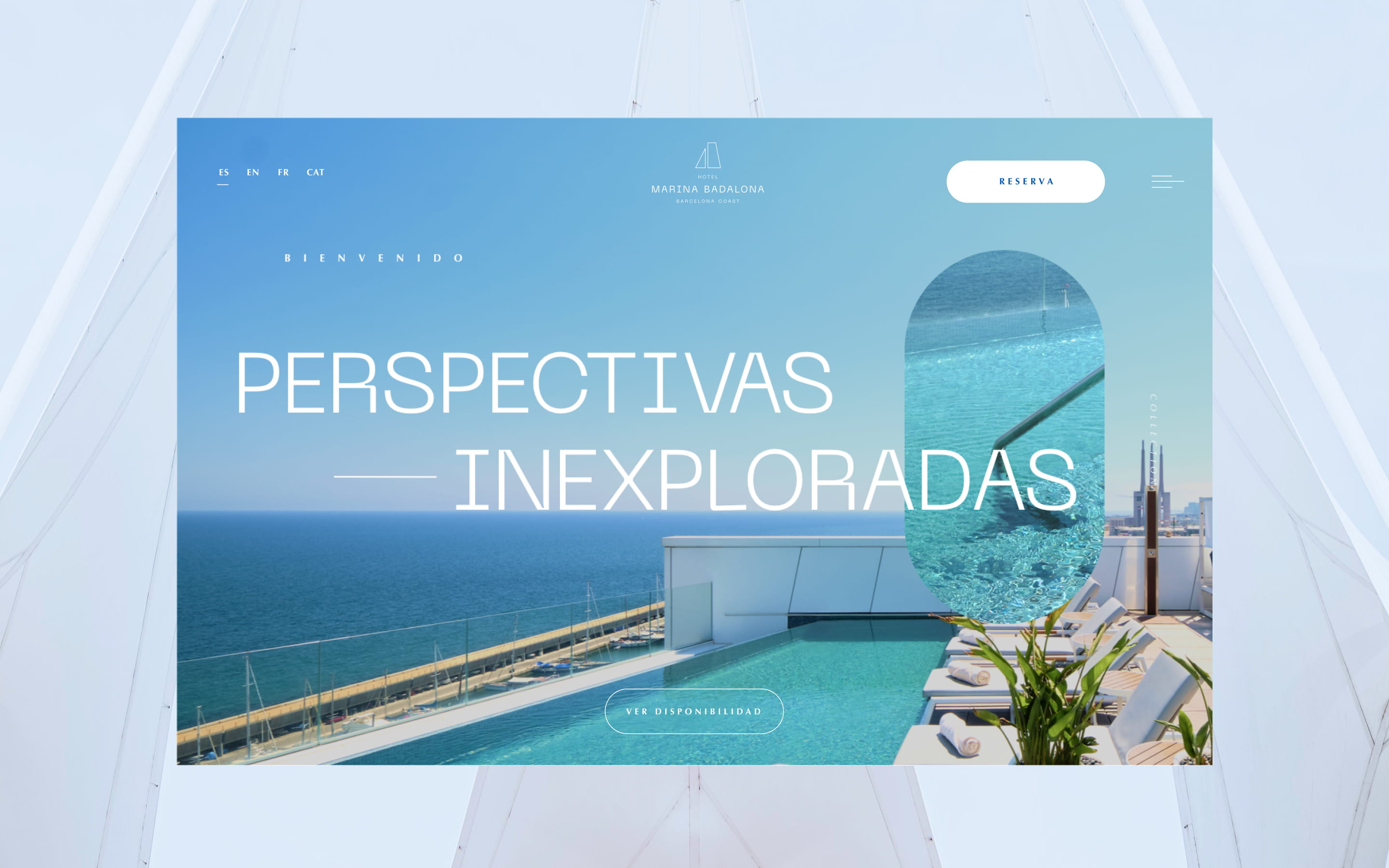
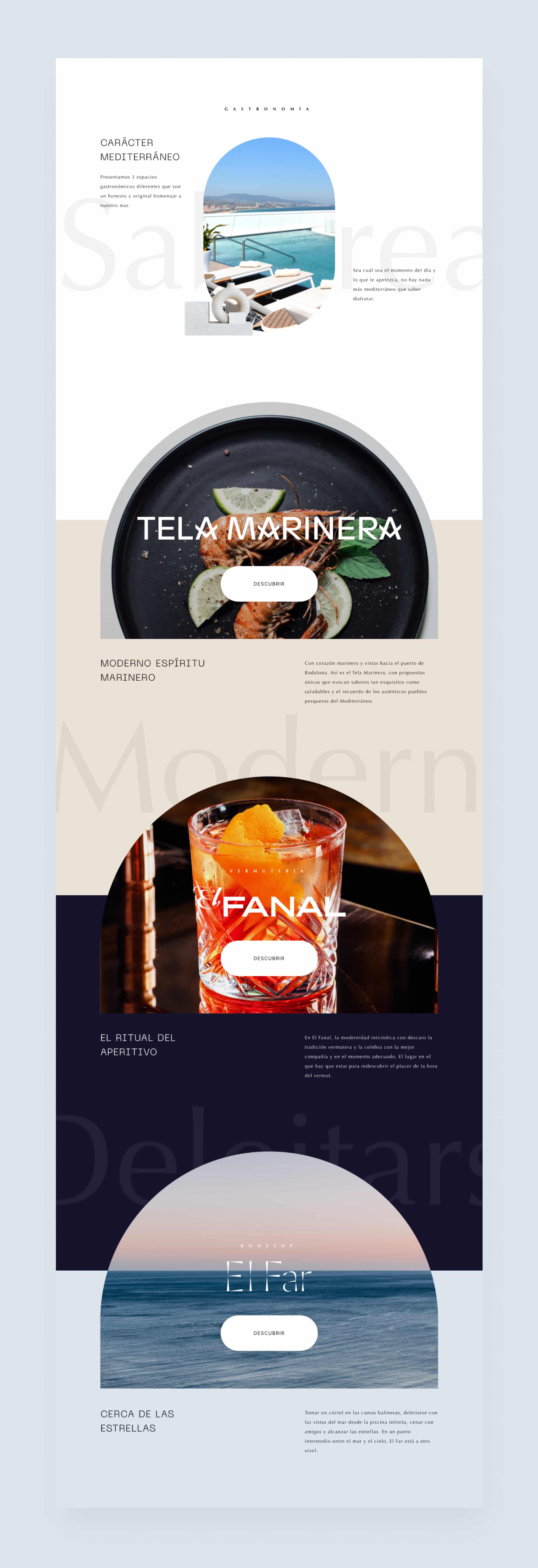
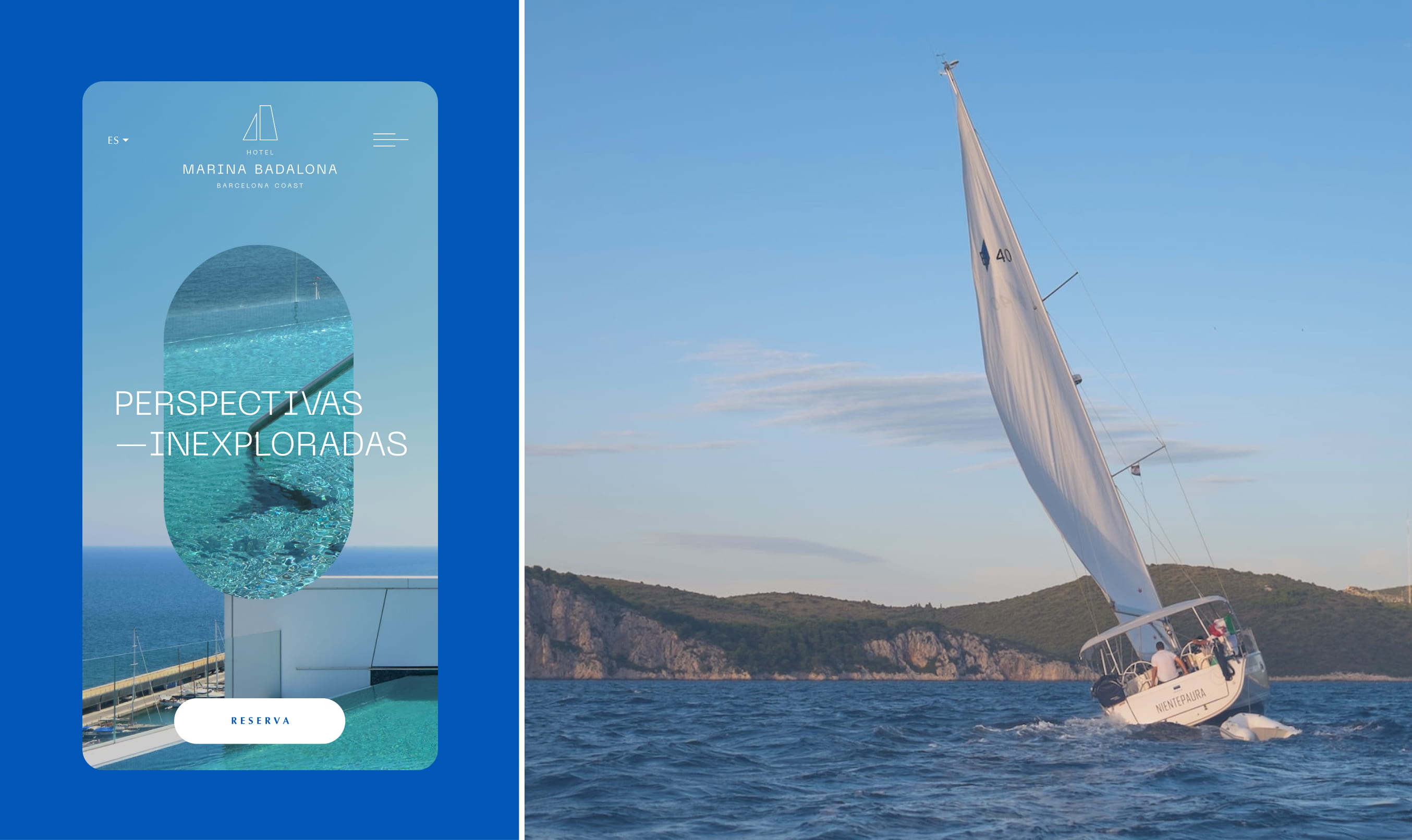
We transferred the window concept to the corporate web design, seeking to create another way into the hotel. We curated a catalog of experiences, focused on the sea, using ovals as portals and floating architectural elements.
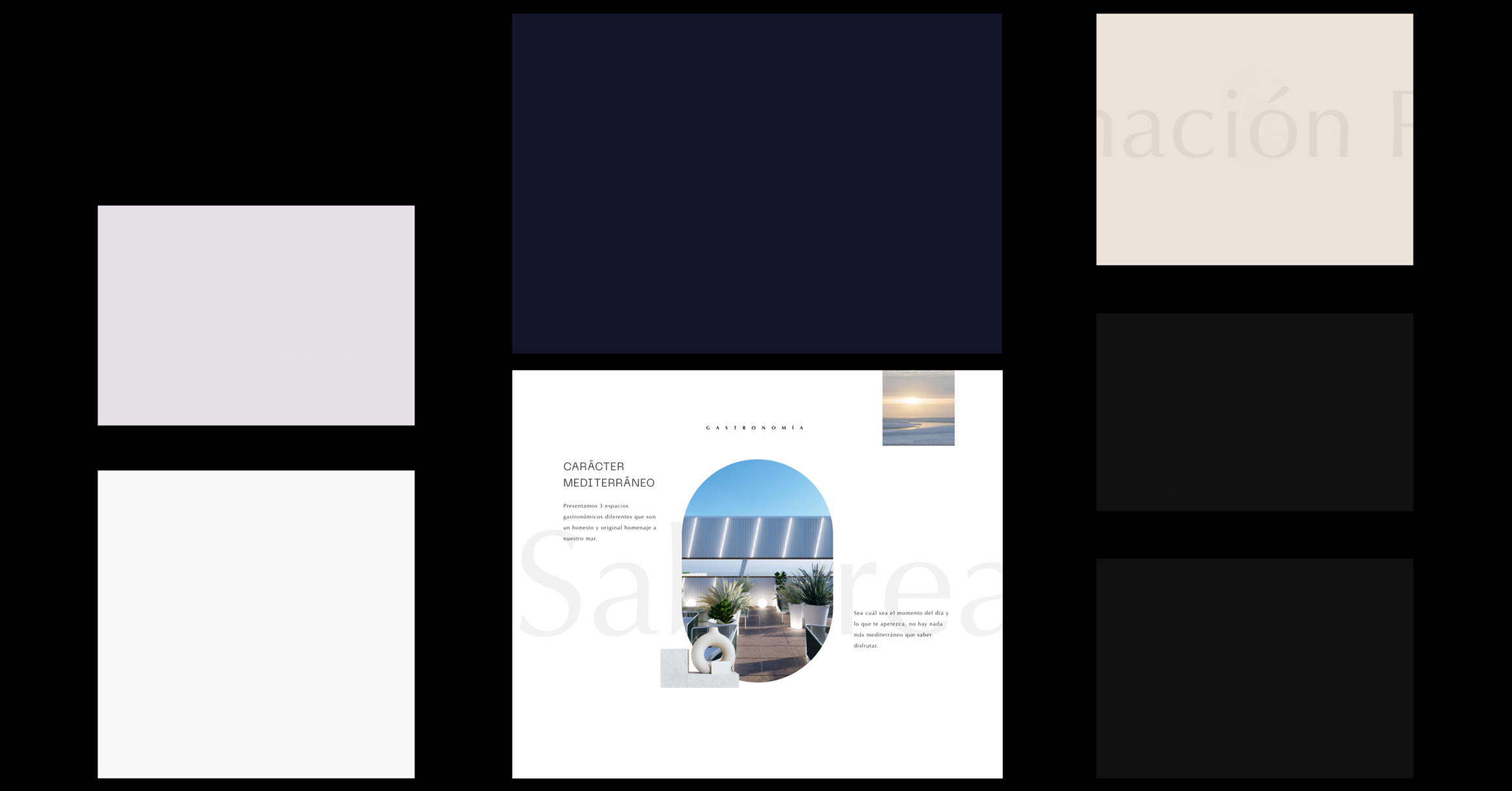
The goal was to launch a digital innovation product for Hotel Marina Badalona, through a website with powerful storytelling, conceptualization, creative direction, and editorial design inspired by the hotel, where different experiences, services and options for individual and MICE audiences could be showcased with the continuous objective of capturing as many leads as possible




OUTLET
Tela Marinera
A quintessential maritime
restaurant
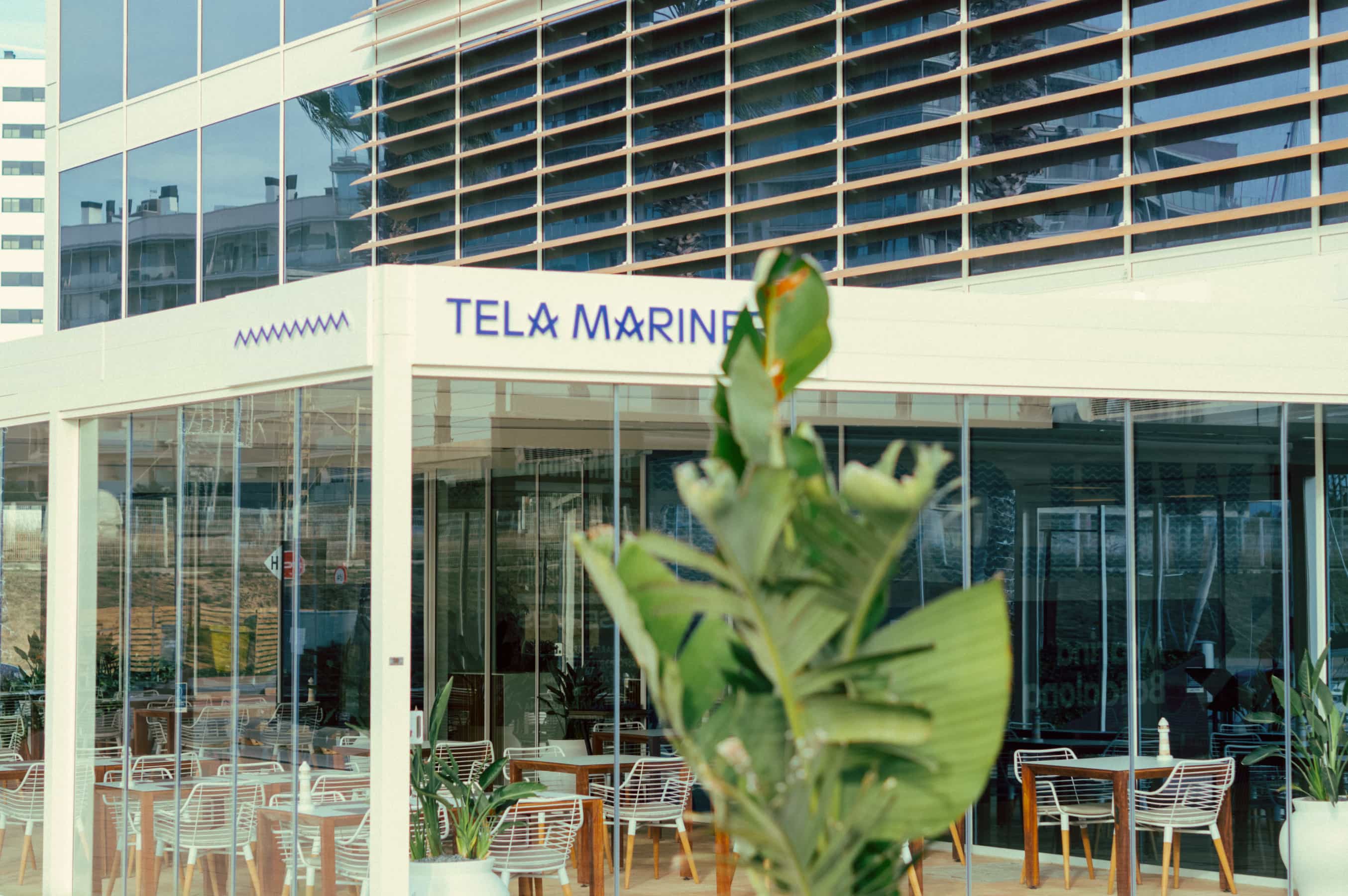
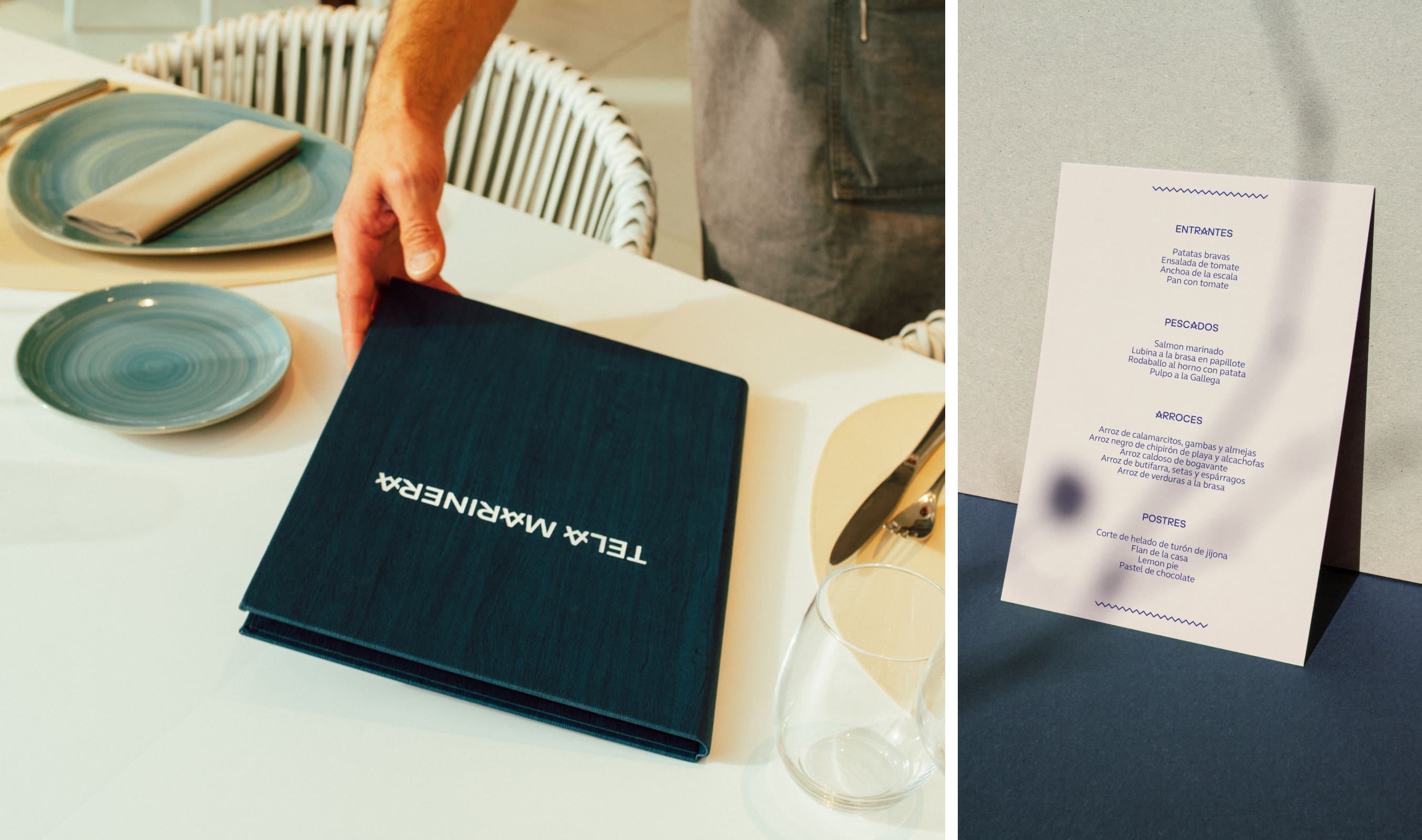
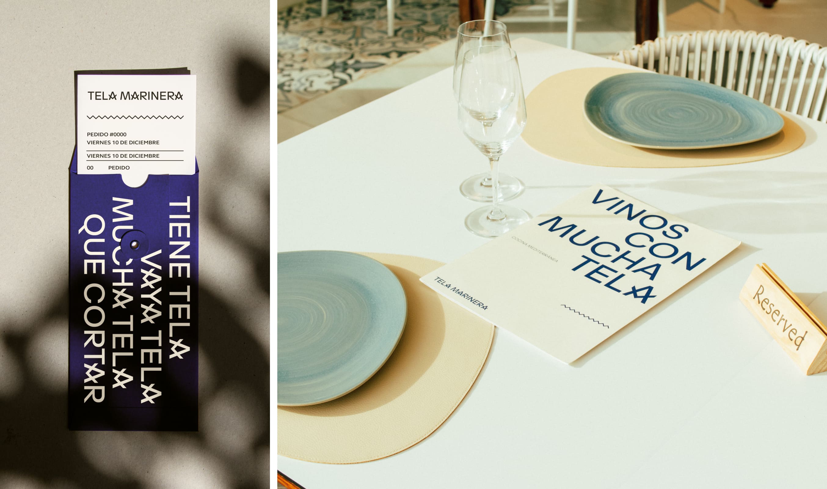
For the restaurant’s identity, we created the naming ‘Tela Marinera’, (Sailor’s fabric) in reference to the cloth with which sails were traditionally made, as well as to evoke the affectionate term for something that is laborious.
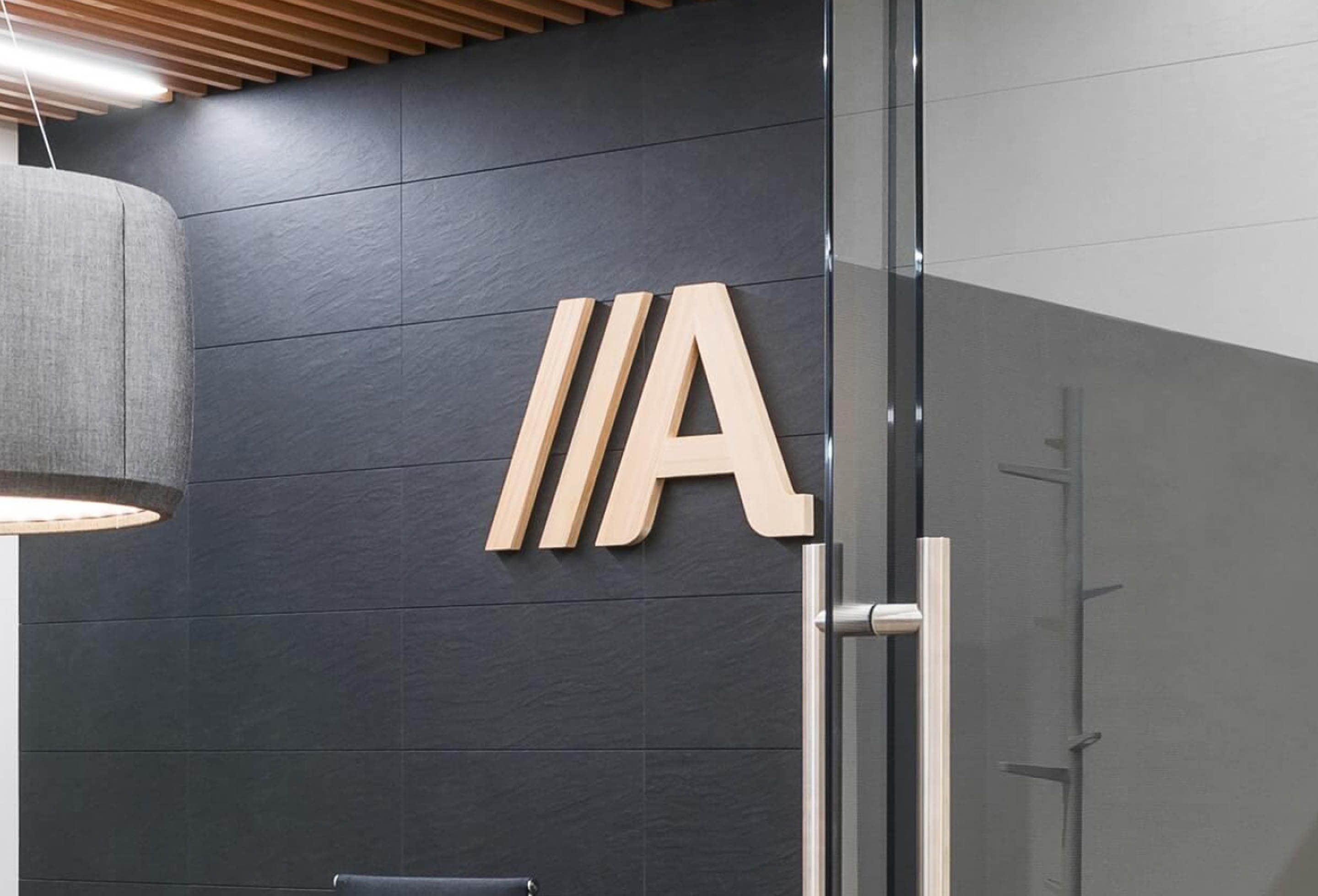
We were inspired by the stitching of the fabric to create the logo, emphasizing that feature in the "As", as well as using the iconic cream and blue colors of the classic striped fabric for this outlet’s color palette. We built the graphic language from the diagonals and zigzag lines that form the stitching and to recreate the casual tone of the naming, the communicative style is fun and humorous.



El Fanal
A classic, modernist
vermouth bar

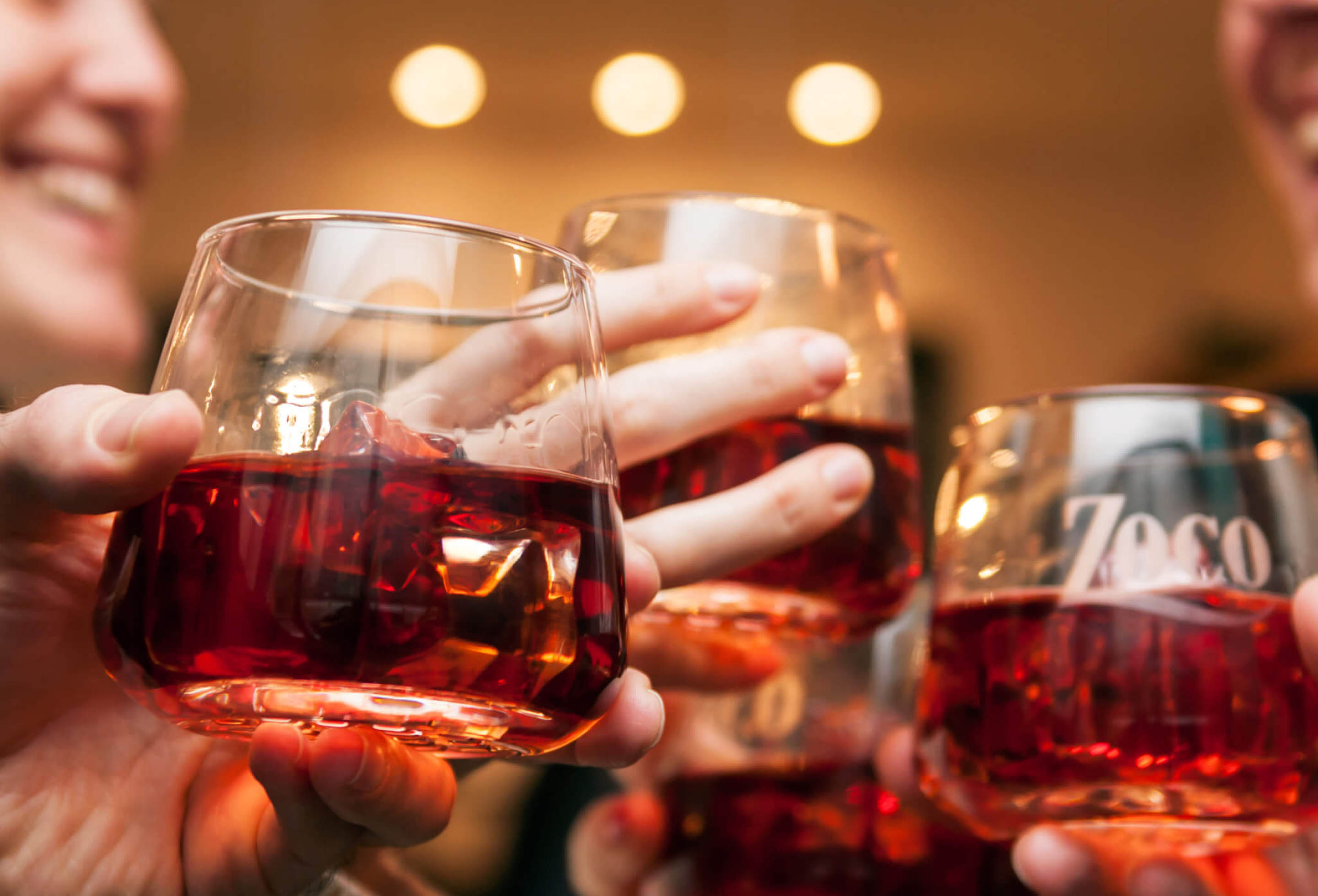
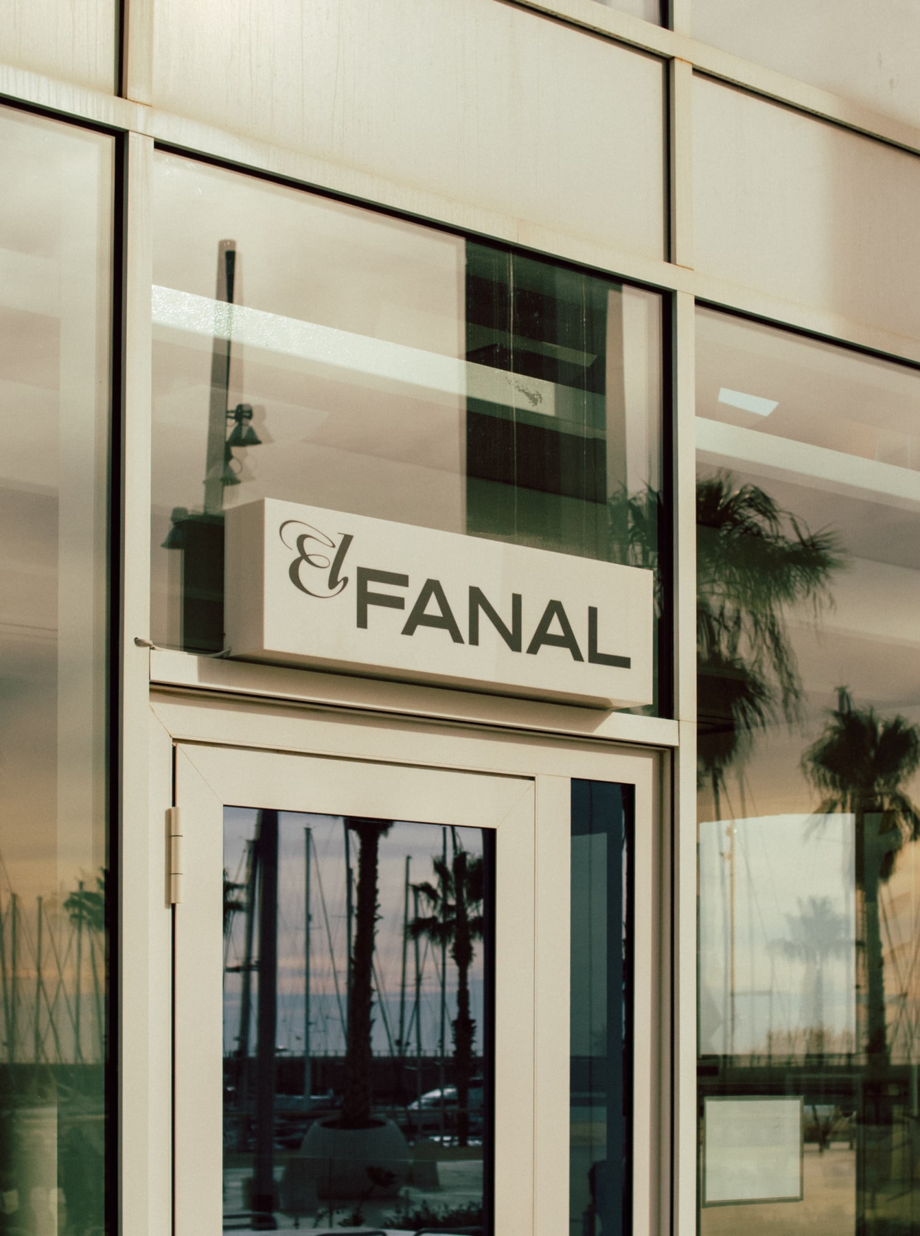
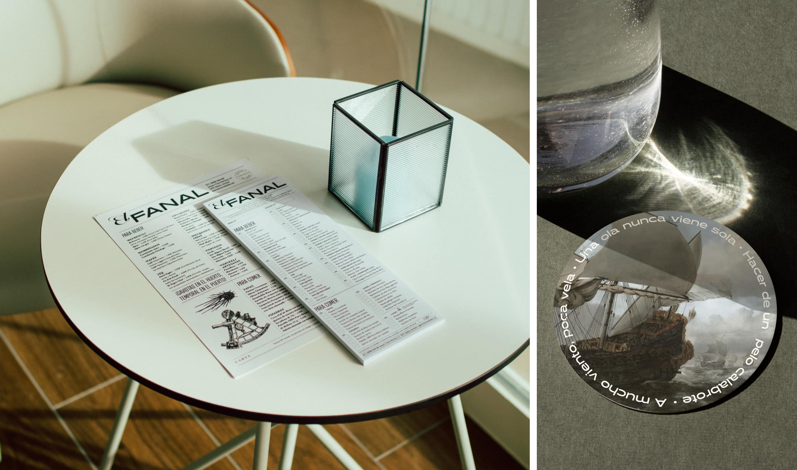
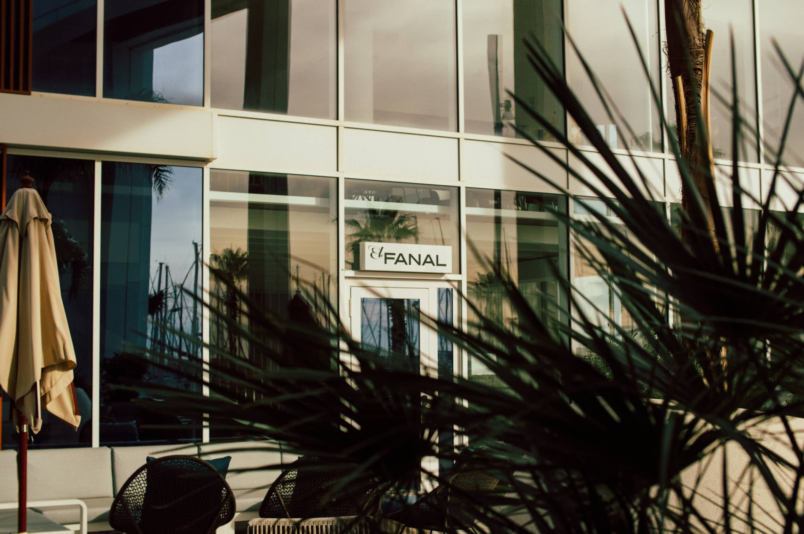
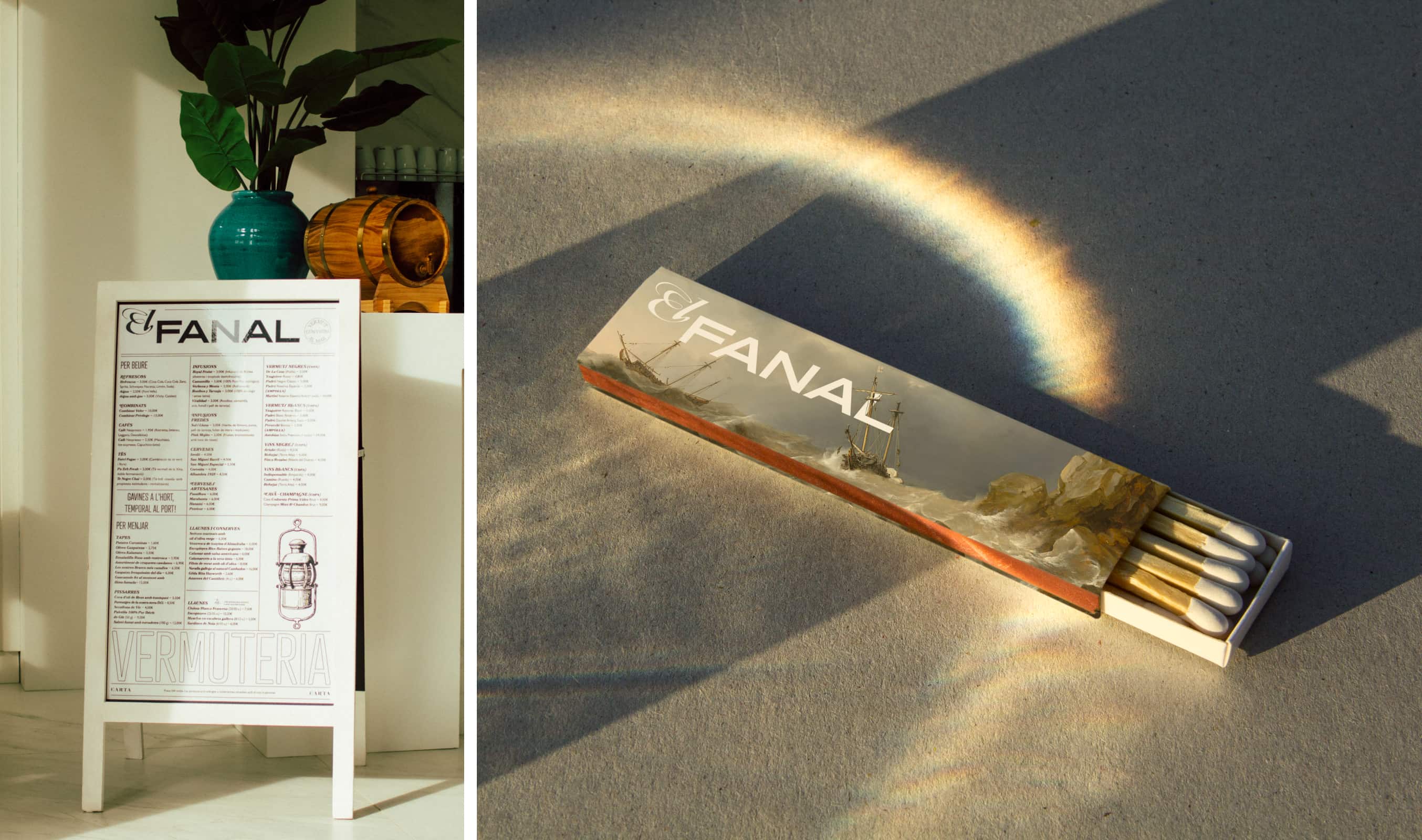
With a name inspired by the beacons that guided the ships, this outlet is the current leader of Badalona's vermouth bars. With a sophisticated and irreverent personality and a modernist identity, it honors the classic vermuteria.
It is characterized by a clean aesthetic, with black and white colors, and touches of dark blue, which are combined with illustrations of classic engraving, representing the best of the sea and the land in a contemporary way.



Amaina
An urban oasis
of calm and peace

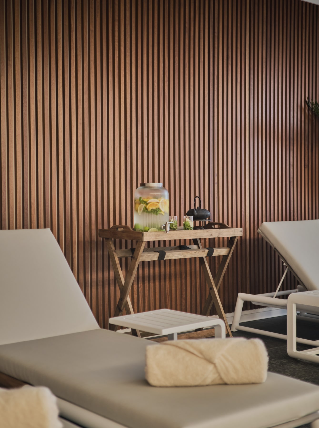
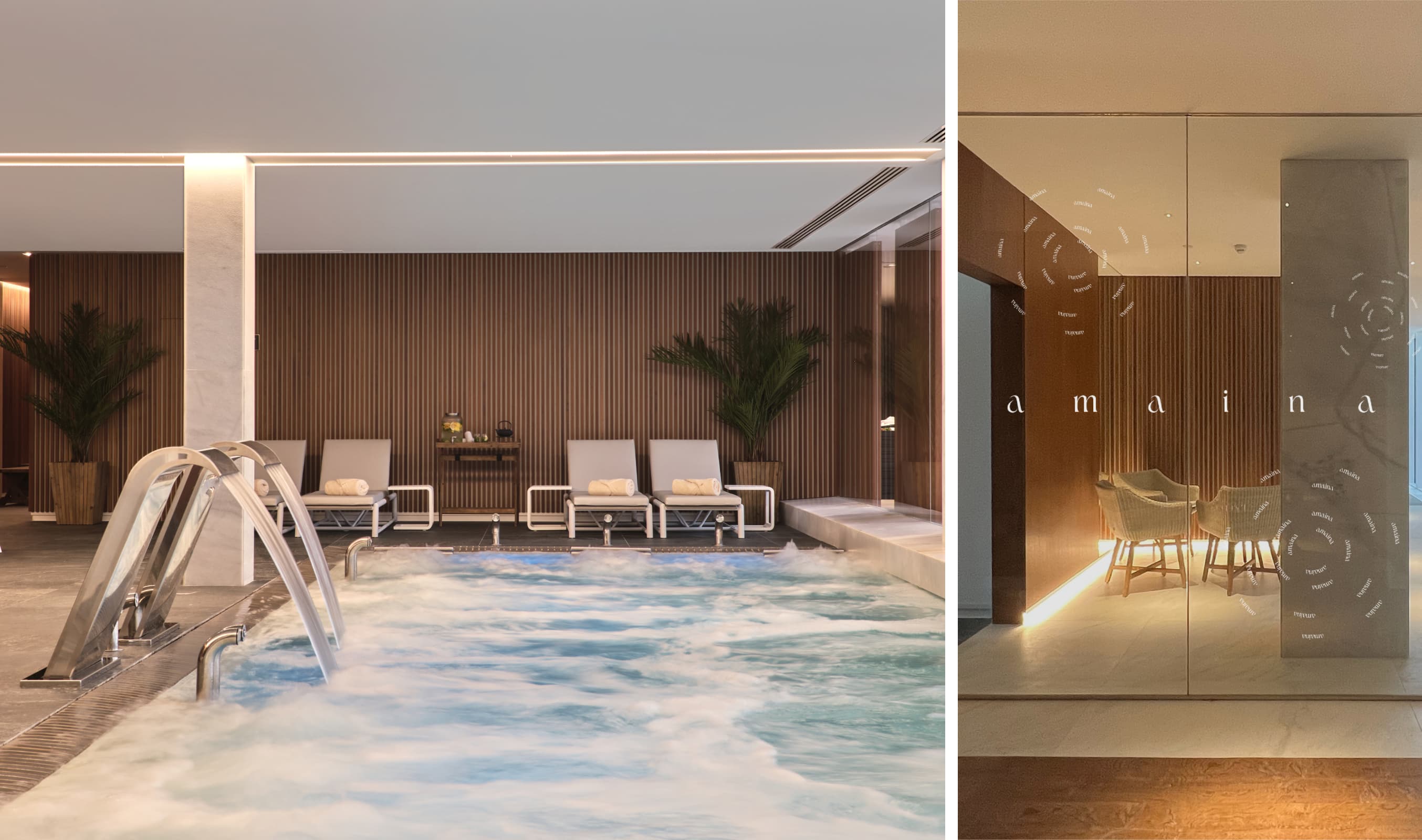
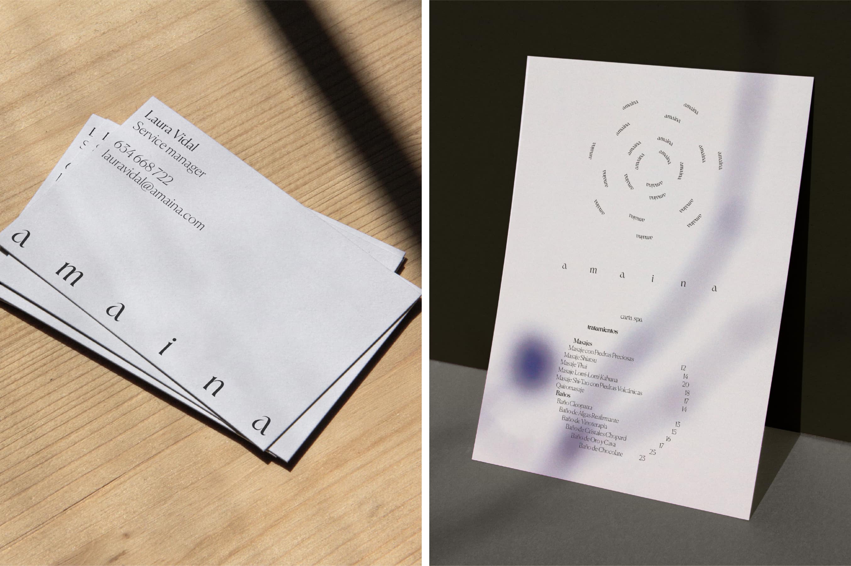
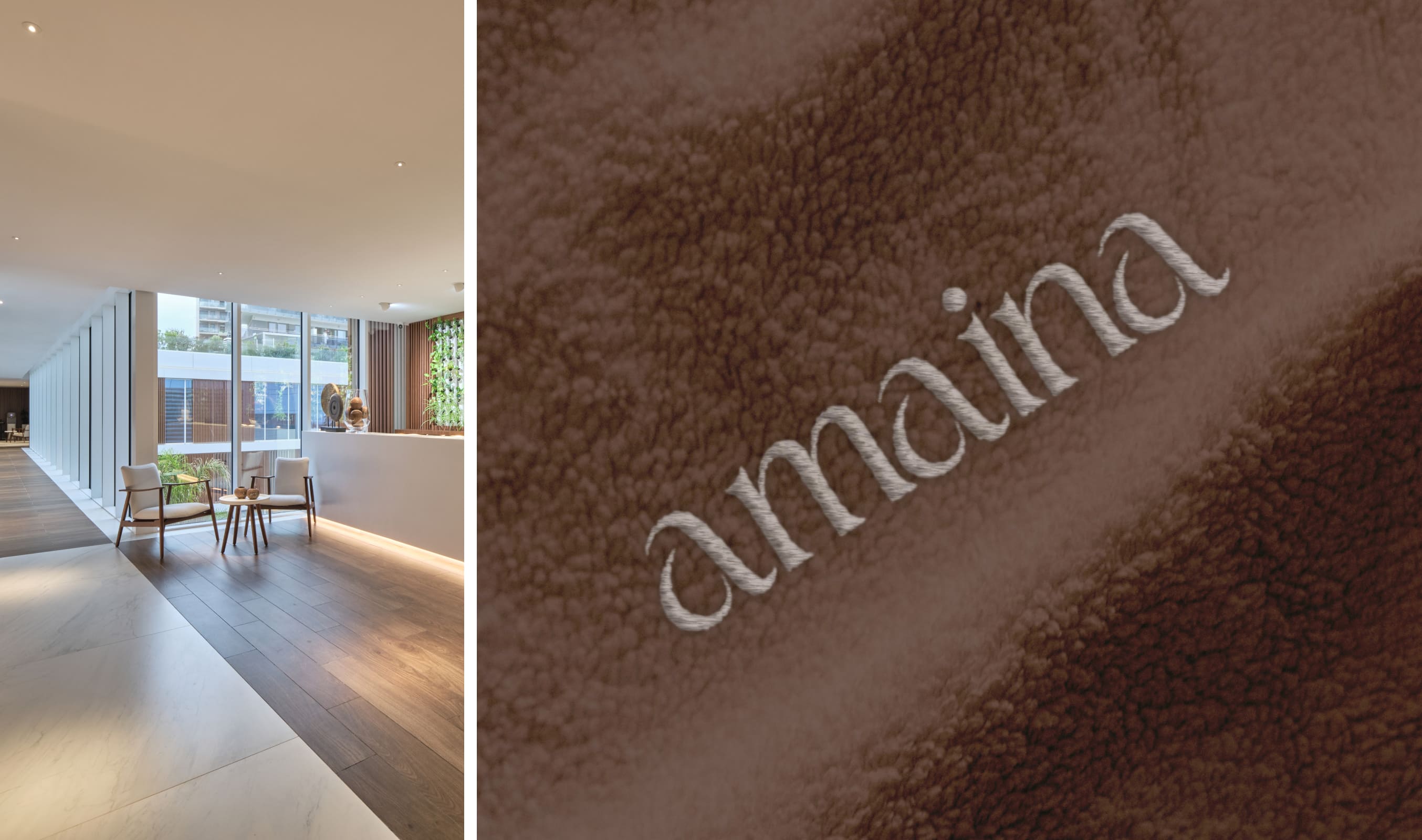
For the spa, we devised the name Amaina as a metaphor of what happens when negativity washes away and absolute relaxation washes over us. We also created the “last drop of the storm” concept, which embodies the process of reaching total calm.
The visual identity stems from the curved shapes that are created when a falling drop hits the water, starting from a central point of tension that dissipates until it completely disappears. From there, we generated a logo made up of curvy organic shapes, that would express the Flow of the water and embody this final drop. The entire visual identity reflects this curviness and highlights how the drop relaxes under pressure: from a variable logo that increases the space between letters, to messages and visual poetry that transmit this calm.



Tastavents
The fine-dining
restaurant
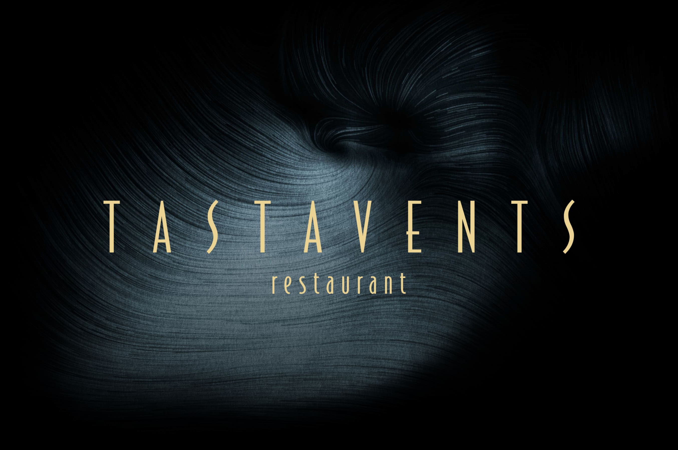
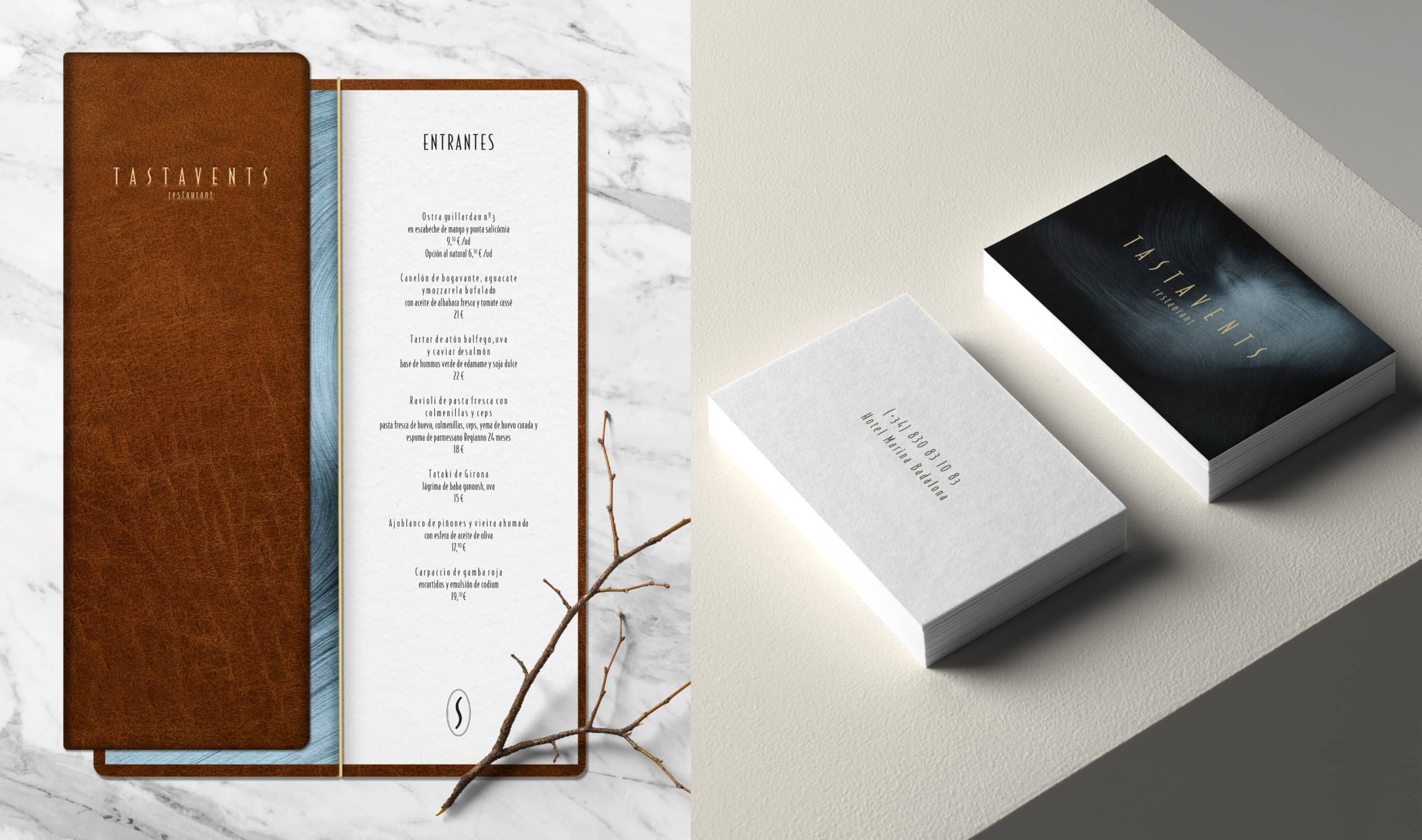
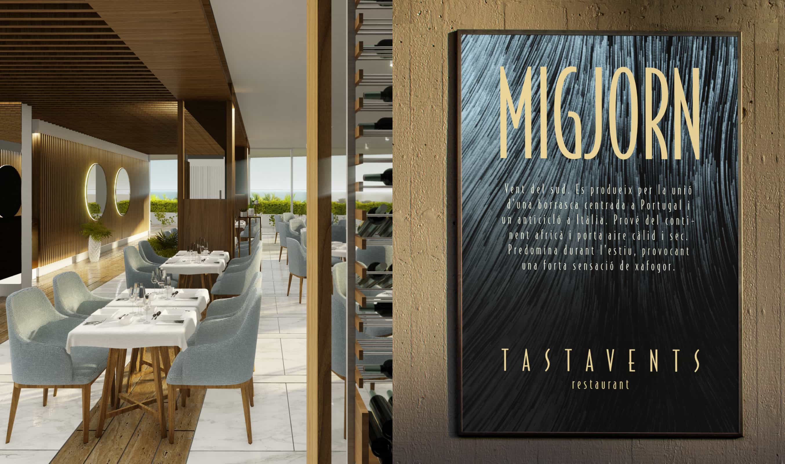
For the gastronomic restaurant, we created a sophisticated and elegant identity to represent its value proposition: an haute-cuisine menu, with open kitchen and spectacular sea views.
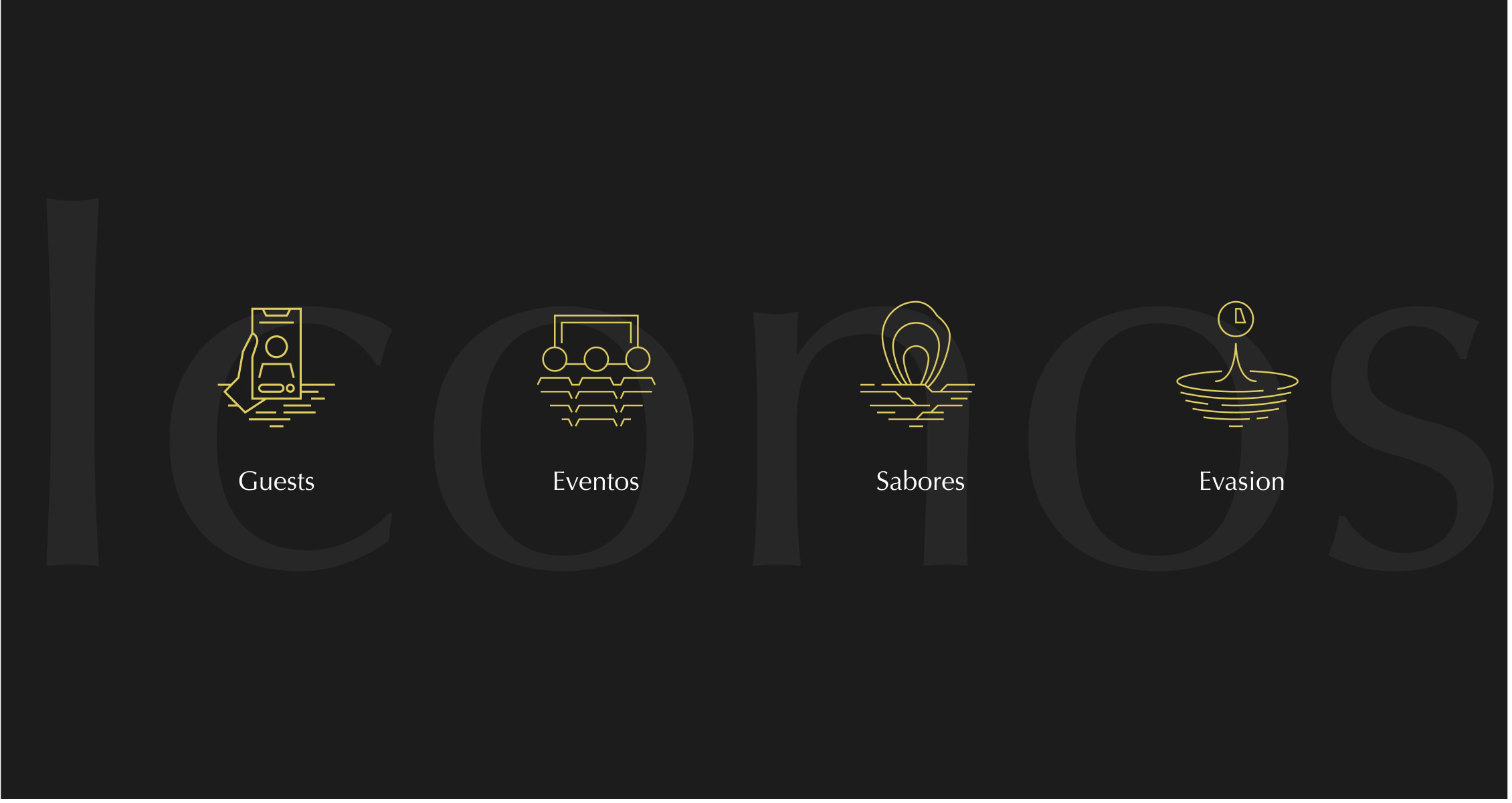
From a suggestive and inspiring name that refers both to the naval world (tastaviento – a grain stalk that indicates the direction of the wind) and the culinary world ("tastar", to taste in Catalan), we composed a graphic language, creating an analogy between gastronomic mastery and knowledge of the winds: we reinterpreted the maps that measure the intensities and directions of these forces, through abstract curvy shapes and gold and black colors, denoting luxury, and elegance



El Far
A rooftop with
endless views

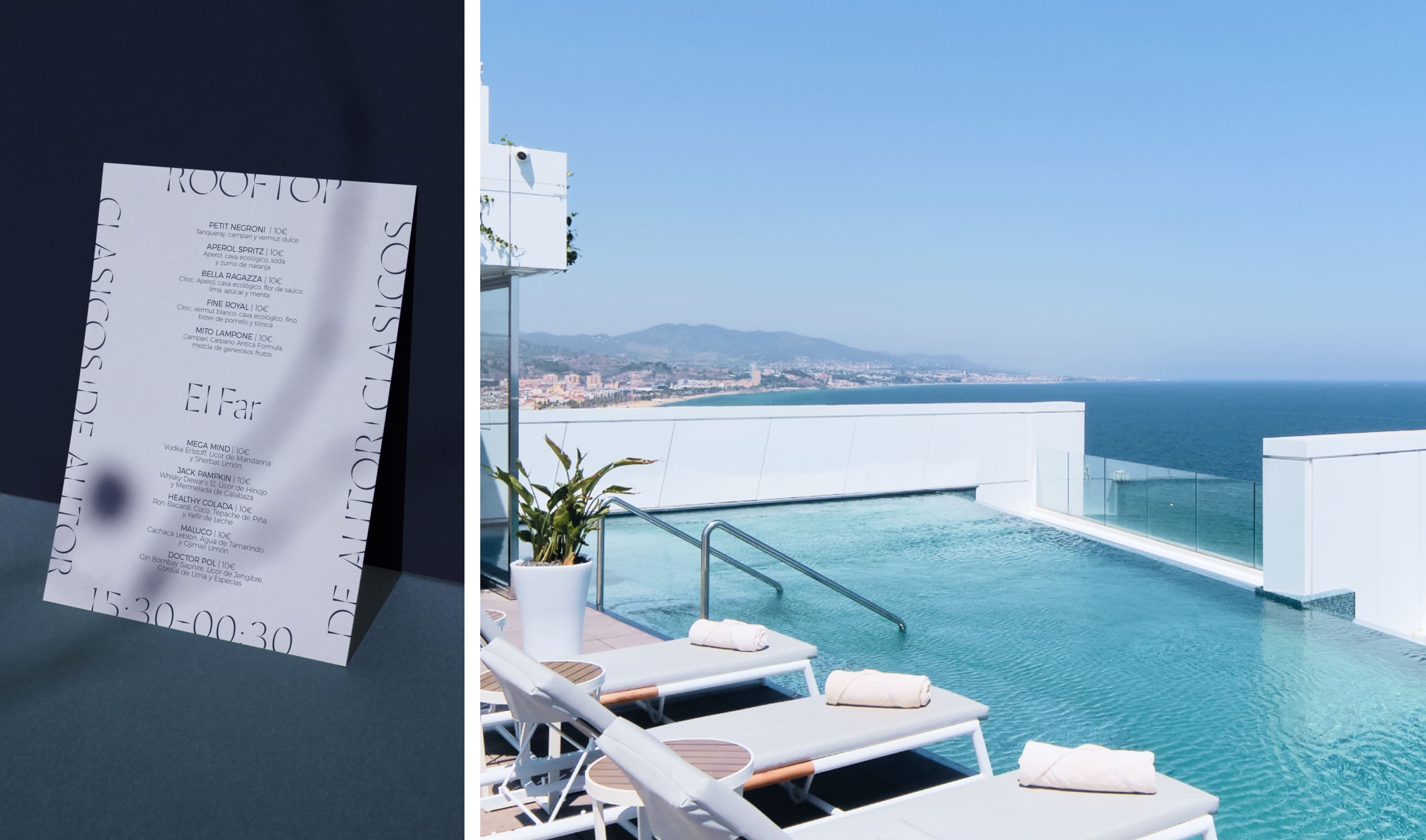
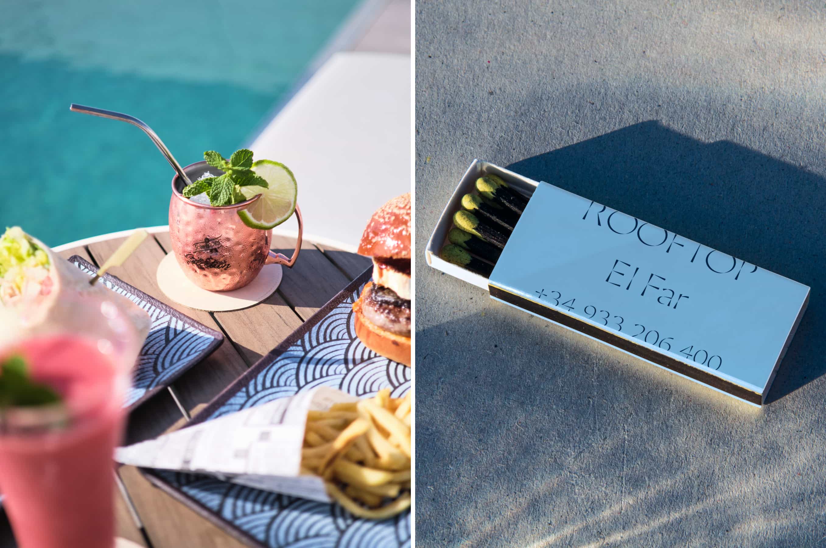
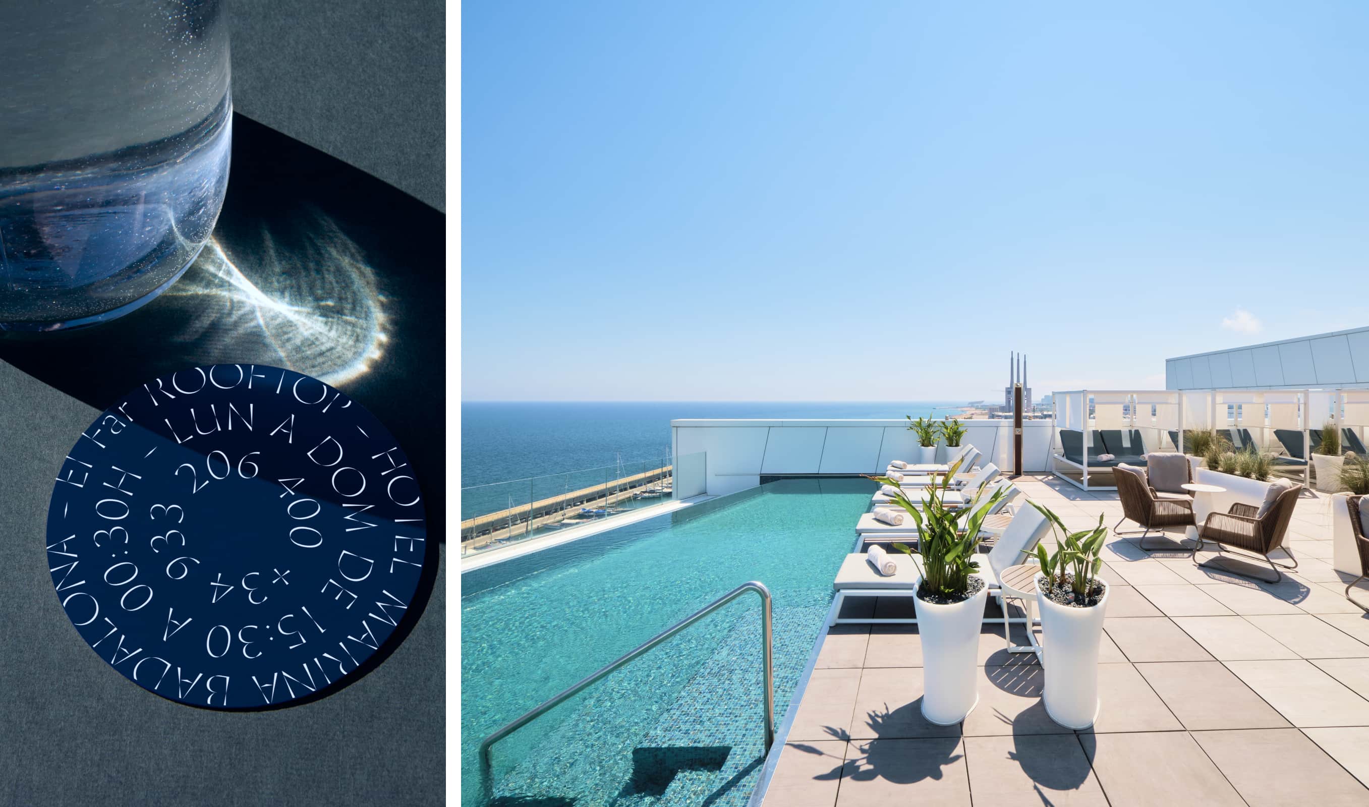
For the highest level, the rooftop and cocktail bar of the hotel, we were inspired by the figure of the lighthouse, by its height, views, and location, breathing life into the naming and visual identity that recreates these attributes.
The graphic language is based on the representation of the lighthouse in real nautical charts. Following the same narrative, its light blue color refers to the sky – since it is the closest point to it.

